I think they’re… okay. Glad to have picked one up, I do break it out for time to time, but I wish it was something resembling the team’s colors.
NinjaBuddha13
One of my absolute favorite designs. These and the USAFA Stadium Series.
Square_Saltine
Saved myself $300
ThunderGoalie35
Colorado flag logos and designs remain perpetually dull.
GotThatDoggInHim
I went from disliking them on reveal to thinking they were a super dope white jersey option for those who missed the white nordiques RR from a few years earlier
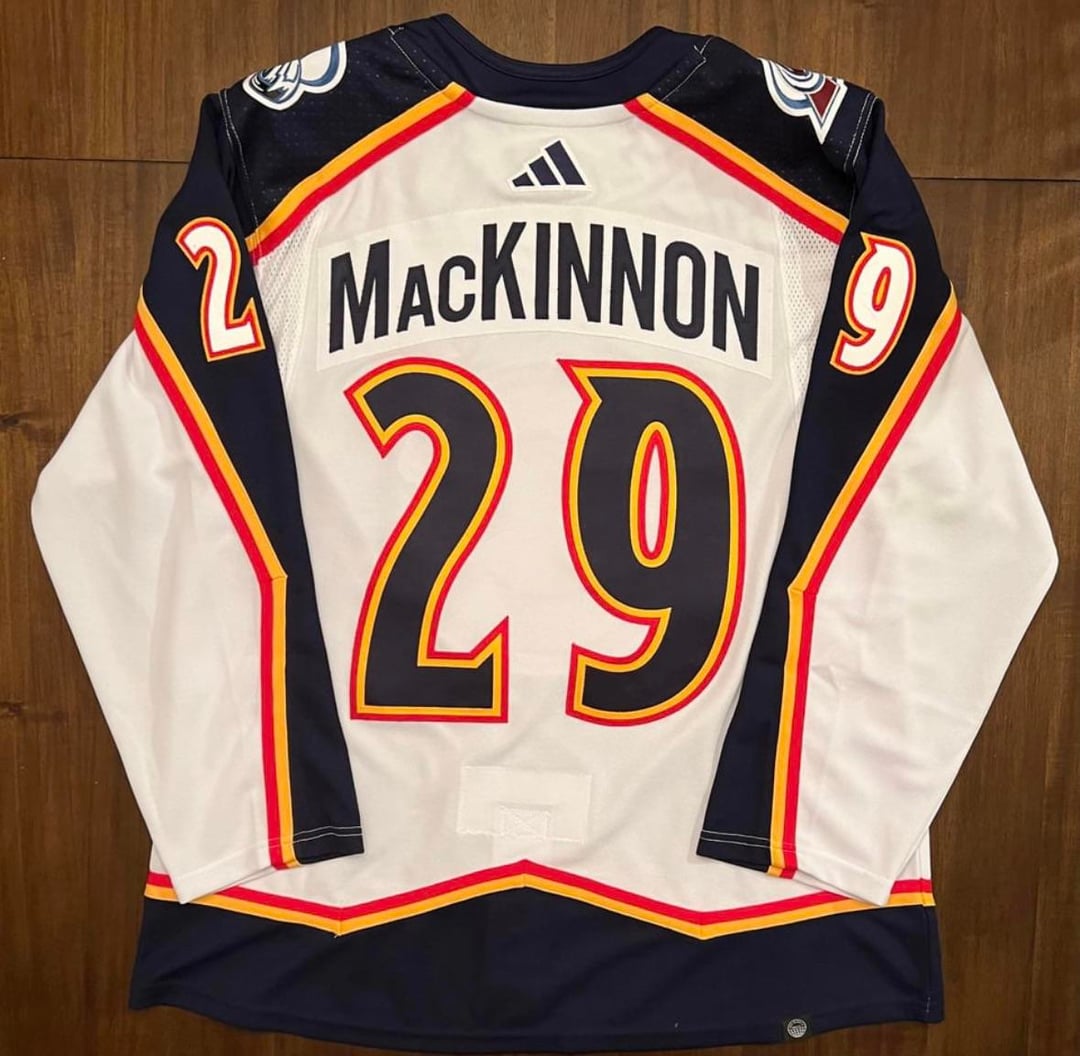
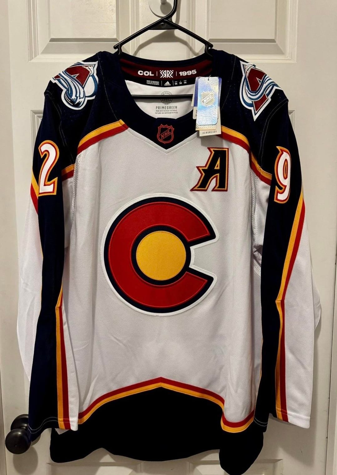
I have a Makar and it’s my go-to spring skiing jersey when its warm enough to not need my shell
SMF1834
The flag colors made sense to do, but the main crest should’ve been the foot.
Big_Nas_in_CO
I liked them paired with the socks the players had for their unis. Looked very good on ice.
higgy98
Love it. Got me a Makar one
cam_huskers
Meh. I wasn’t a huge fan
thriller1
Forgettable imo. Nowhere close to the RR 1.0 which was legendary
anemic_royaltea
Personally would not acquire any Avs related thing without burgundy, but as a special event these were well executed.
dhas19
I don’t think they’re as bad as some people think, but I think RR 1.0 set the bar so high with the white nordiques in maroon that it felt a bit meh.
I didn’t love them when they came out. I recently picked up a Makar, though, and they’re nicer in person.
_redacteduser
I have one because why not? Cool design.
Exciting_Fox2457
As a new fan, do we actually rock these on ice?
thejudeabides52
I desperately want one lol
kakyointhedonutman
Love them, actively searching for one right now. However, RR 1.0 is one of the best jerseys ever made and this is more of a “really cool but not iconic” tier
Not a fan of the patch on the shoulder. They just clash with the rest of the jersey.
tcn33
Big fan. Prefer them over the RR 1.0.
pemart22
Just okay for me. I was never crazy about using the state flag colors because they seemed to be an homage to the original Rockies. Plus New Jersey’s RR 2.0 used a similar color scheme for the same reason. They’re not horrible, but I probably wouldn’t pick one up unless it was game worn.
Bazirker
I initially hated them and now am kicking myself I missed out
tugnutter1
I picked up a blank last summer that I haven’t decided who to get on it yet.
not_taylorswift1213
They look great with the yellow socks
Impossible_Bug_6639
Ass
badguy303
I love it, it was my first jersey and its really comfortable
yemx0351
Perfection
willowmtn
When they were 1st revealed i wasn’t a fan but they have grown on me to the point where I would purchase one if I had the funds.

41 Comments

I think they’re… okay. Glad to have picked one up, I do break it out for time to time, but I wish it was something resembling the team’s colors.
One of my absolute favorite designs. These and the USAFA Stadium Series.
Saved myself $300
Colorado flag logos and designs remain perpetually dull.
I went from disliking them on reveal to thinking they were a super dope white jersey option for those who missed the white nordiques RR from a few years earlier
I have a Makar and it’s my go-to spring skiing jersey when its warm enough to not need my shell
The flag colors made sense to do, but the main crest should’ve been the foot.
I liked them paired with the socks the players had for their unis. Looked very good on ice.
Love it. Got me a Makar one
Meh. I wasn’t a huge fan
Forgettable imo. Nowhere close to the RR 1.0 which was legendary
Personally would not acquire any Avs related thing without burgundy, but as a special event these were well executed.
I don’t think they’re as bad as some people think, but I think RR 1.0 set the bar so high with the white nordiques in maroon that it felt a bit meh.
Love them. Wish I had picked one up.
I loved it, got myself Cale.
https://preview.redd.it/m1fimf52ckeg1.jpeg?width=4284&format=pjpg&auto=webp&s=fca7845360985bbae1575c4451759c1754e6606c
Game worn. I don’t mind them.
I didn’t love them when they came out. I recently picked up a Makar, though, and they’re nicer in person.
I have one because why not? Cool design.
As a new fan, do we actually rock these on ice?
I desperately want one lol
Love them, actively searching for one right now. However, RR 1.0 is one of the best jerseys ever made and this is more of a “really cool but not iconic” tier
Awesome, too bad mine is a Mikko :/

https://preview.redd.it/sxnyd78xekeg1.jpeg?width=1226&format=pjpg&auto=webp&s=de94f91f66efafcf333e2bcf1f02efeb03e3d71d
Picked up this game-worn recently. I love this one so much.
Hate the crest but love everything else about it.
Best aspect is the old numbering design/typeface.
I had a Landeskog jersey in my cart on the morning they released and chickened out of buying it and it is one of my single greatest regrets
I got the 1.0s and the Nordiques throwback from this year.
Can still go get the 2.0s easily if I wanted. Cant say the same for the other two.
I feel like that sums up the majority opinion.
I wasn’t a fan when they revealed them, but once I saw them on the ice, I liked them.
They weren’t bad – and really nice in person. (I just sold my game worn piece.)
Nothing beats the RR 1.0 though.
https://preview.redd.it/2kdgloi4skeg1.jpeg?width=2908&format=pjpg&auto=webp&s=0e935c5f7d580918f345397e5ba054eb35295798
Not a fan of the patch on the shoulder. They just clash with the rest of the jersey.
Big fan. Prefer them over the RR 1.0.
Just okay for me. I was never crazy about using the state flag colors because they seemed to be an homage to the original Rockies. Plus New Jersey’s RR 2.0 used a similar color scheme for the same reason. They’re not horrible, but I probably wouldn’t pick one up unless it was game worn.
I initially hated them and now am kicking myself I missed out
I picked up a blank last summer that I haven’t decided who to get on it yet.
They look great with the yellow socks
Ass
I love it, it was my first jersey and its really comfortable
Perfection
When they were 1st revealed i wasn’t a fan but they have grown on me to the point where I would purchase one if I had the funds.
For sale?