

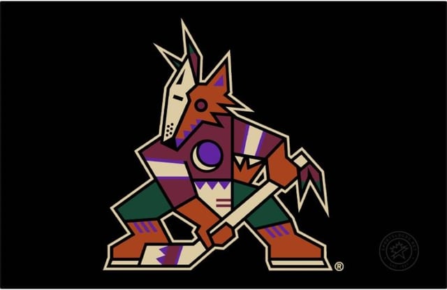
Lequel avez-vous préféré ? En tant qu’enfant des années 2000, j’ai grandi avec le logo Howler, mais le logo Kachina est malade. Lorsque l’équipe reviendra à Phoenix, j’espère vraiment qu’elle utilisera au moins le logo Howler comme alternative.
—
canadianpackersfan03
13 Comments
Kachina is much more Arizona, and pays homage to the people and culture that were here long before we were. It’s also the only AZ sports logo to really do that, so by far it gets my vote.
The Kachina is a classic but I loved the howler jerseys, they always looked so clean to me
Kachina
I know I’m in the minority, but I prefer howler
Jumping coyote 😔
I enjoy both and hope they use both when they return
Howler fir sure
I love both. I would not mind the howling head branding at the very least as an alternate uniform. The Coyotes had their 3 most successful seasons while wearing it.
I always preferred the Howler because when I became a fan it was the Howler that was the main logo. Also really love the Running Coyote.
Kachina.
I’ll admit, I wouldn’t mind having an alternate that uses [something like one of these unusued logos as a primary](https://static.wikia.nocookie.net/logopedia/images/0/04/Coyotes_concepts.jpg) to blend the eras, but the Kachina branding is what made the Coyotes have a very unique and iconic look amongst the big four sports leagues.
The Howler as it stands is just a much more…generic sports brand. It doesn’t really say *Arizona* in the same way the Kachina does, it feels like it’d be just as fitting in Kansas City or something.

Kachina. My first jersey which I still have was a home black CCM. I had the third jersey with the head but it got lost in a move. Been scouring the internet to find a place to make a white personalized one to go with my other black one.
The Kachina has to be one of the best logos in sports.