
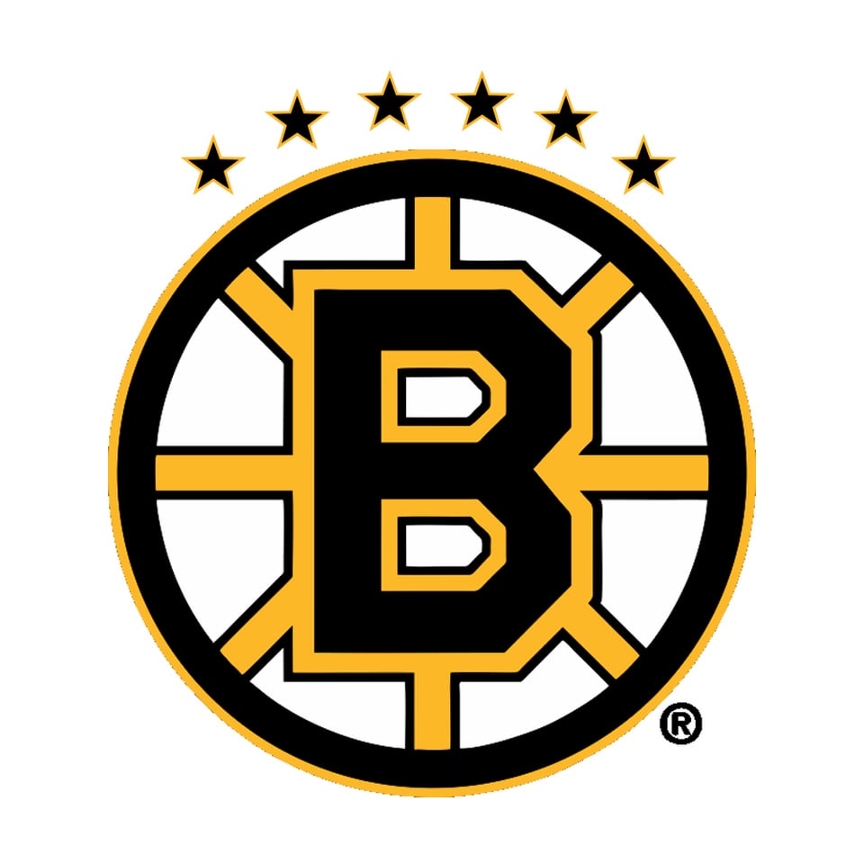

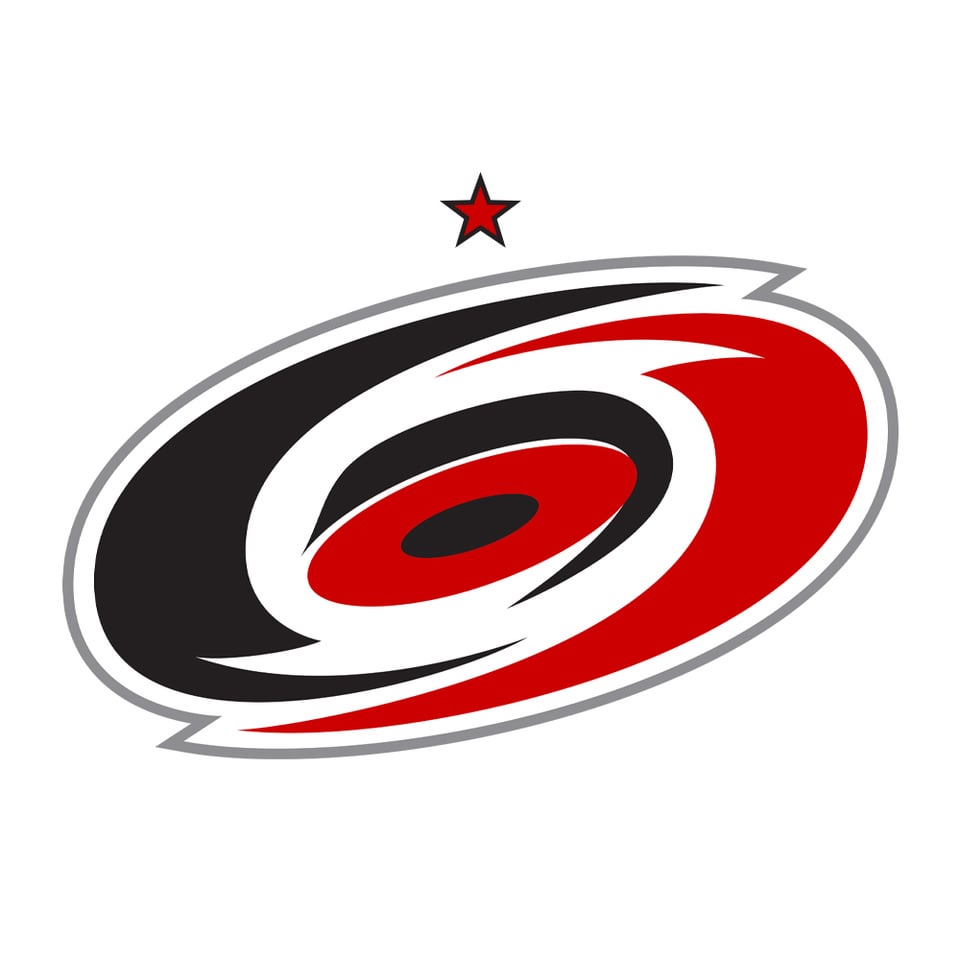
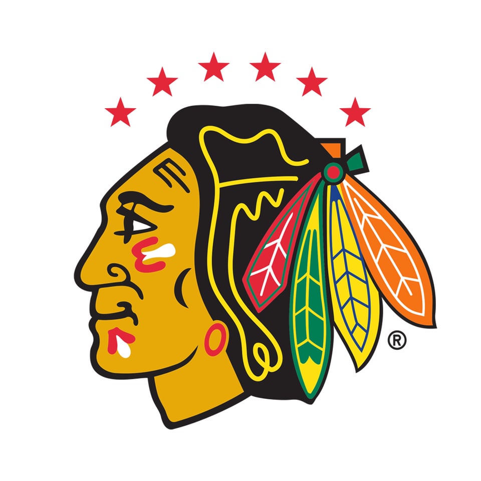

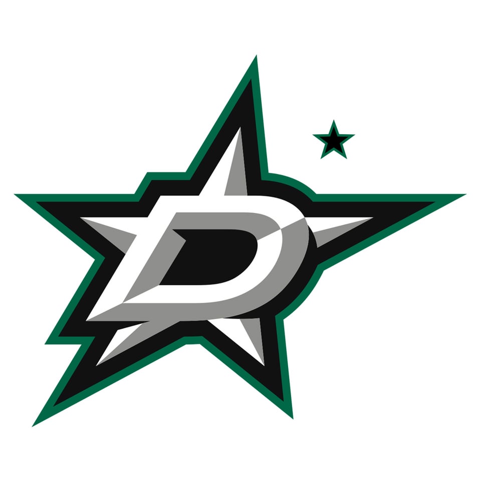
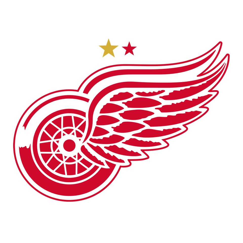
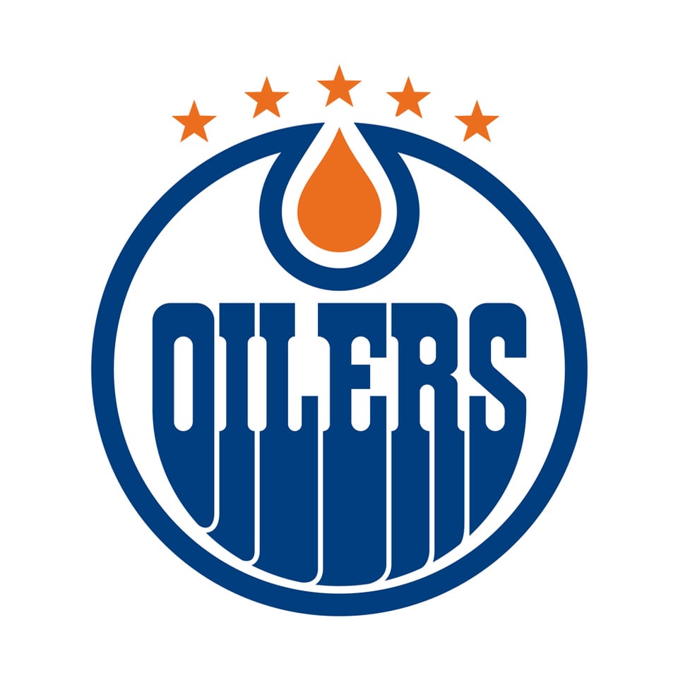
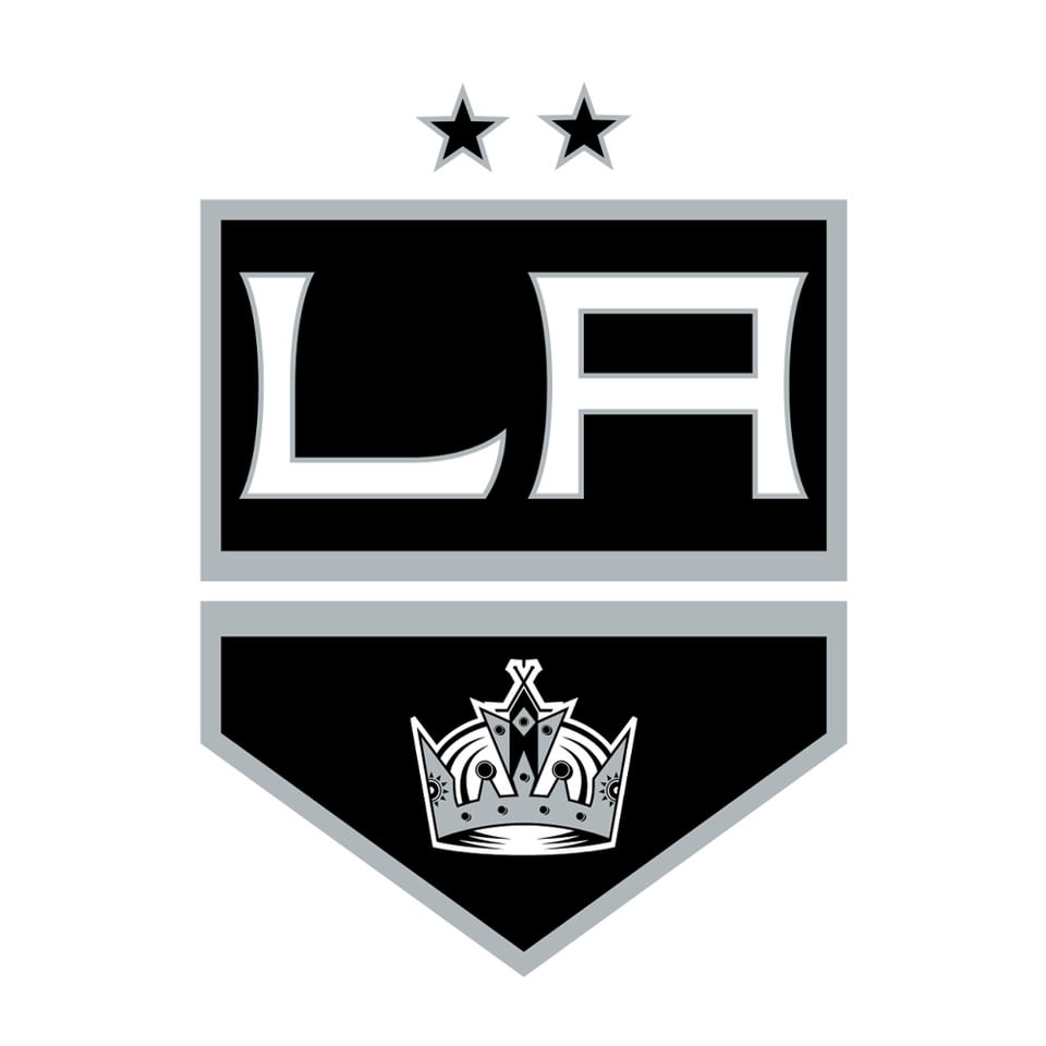
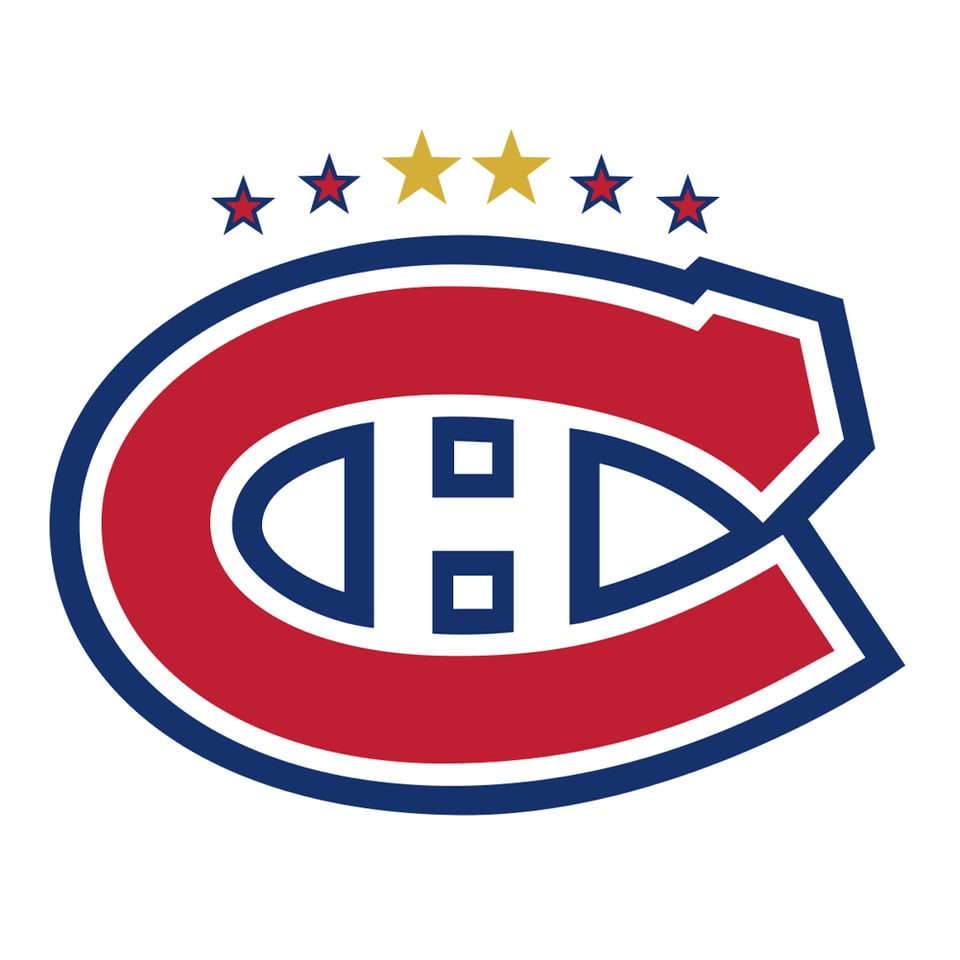
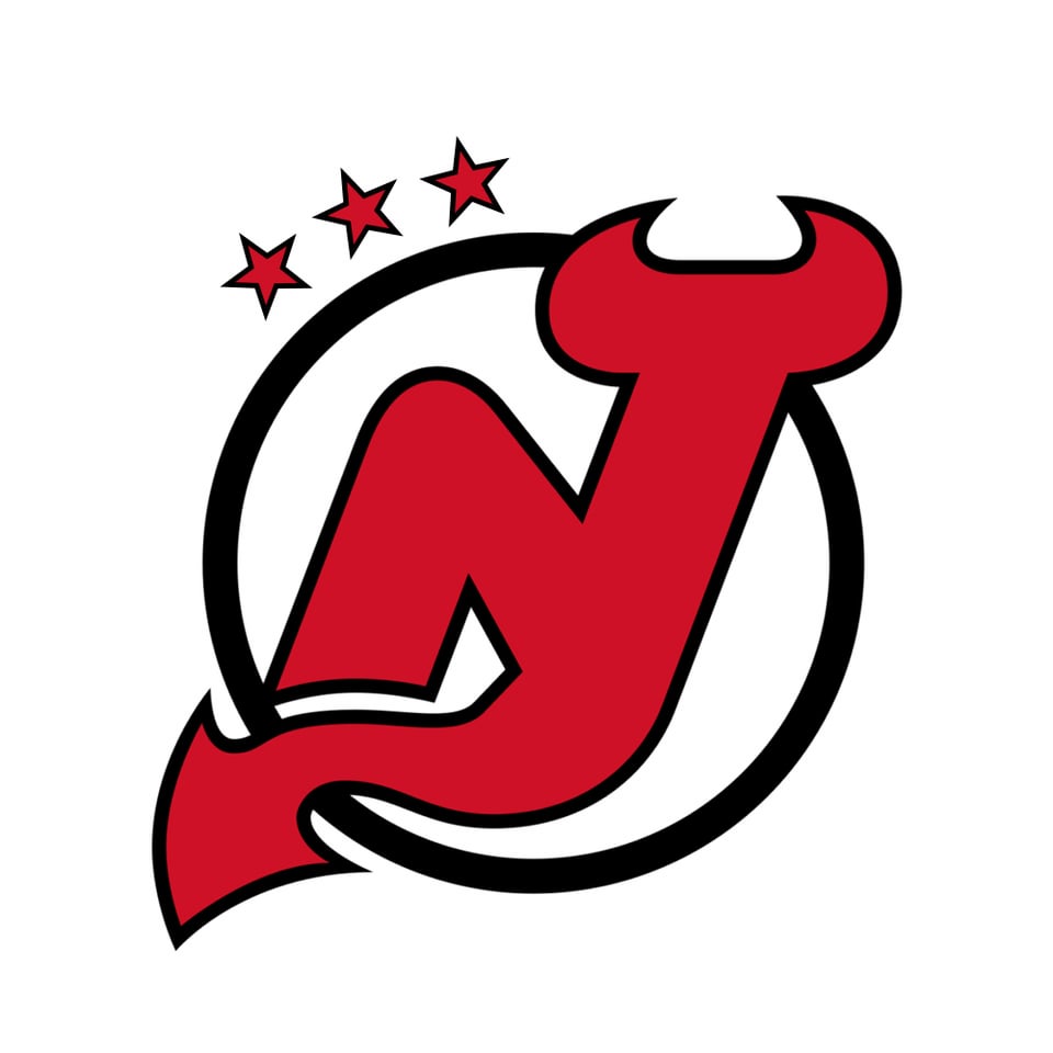
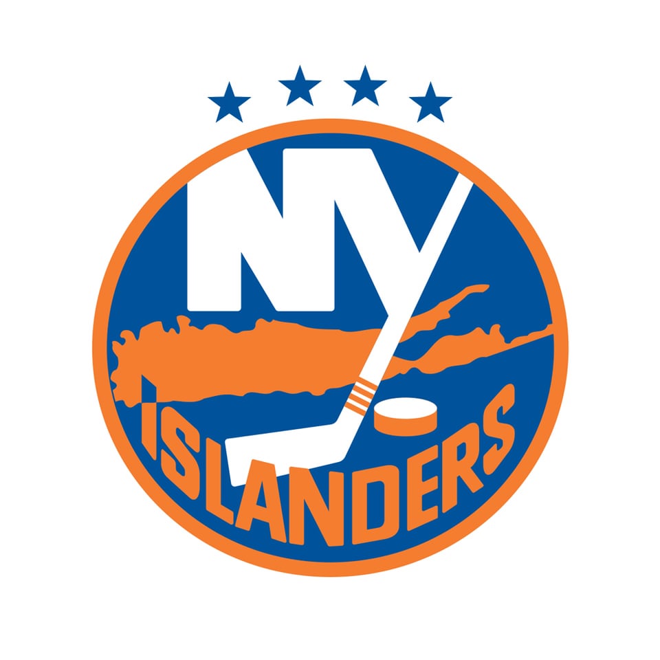
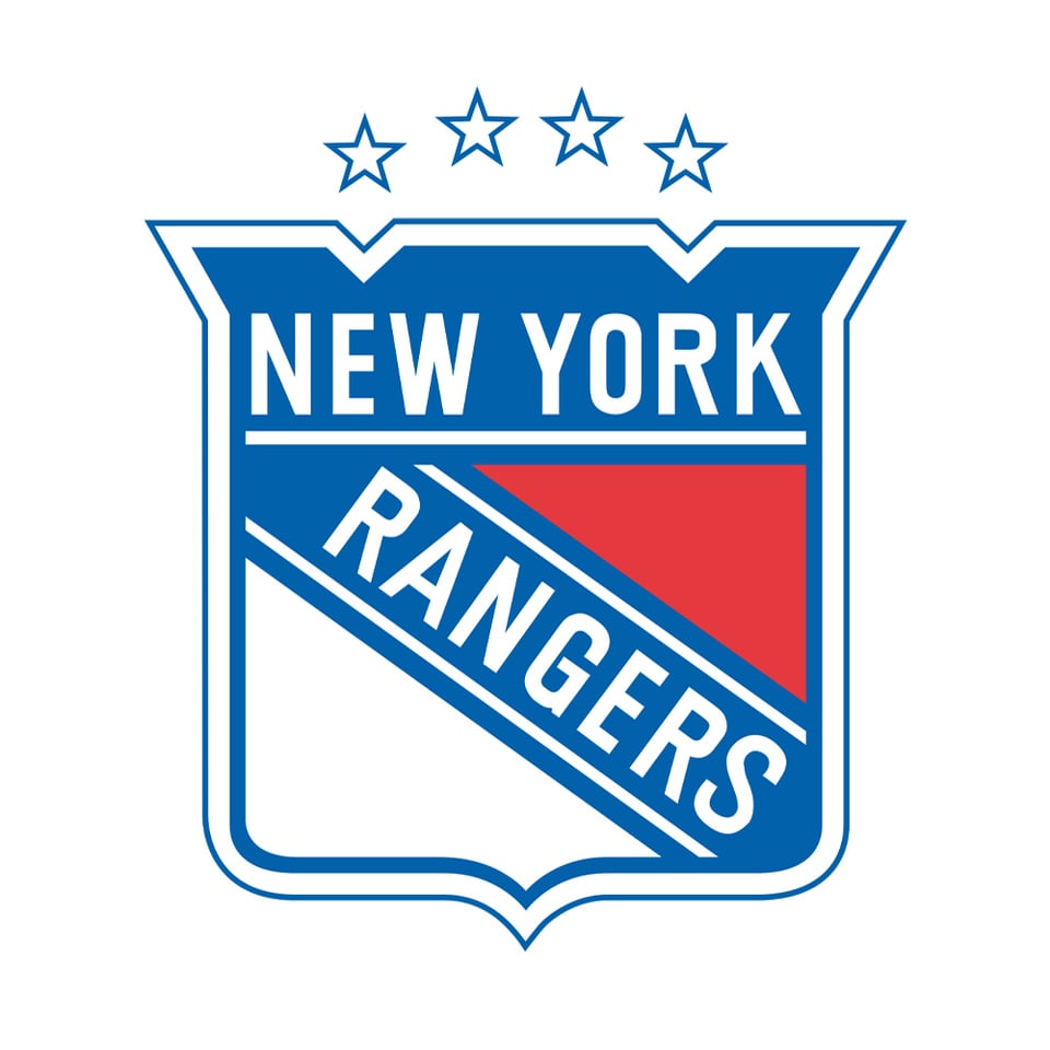
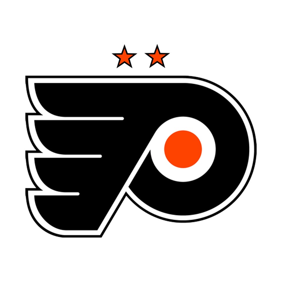
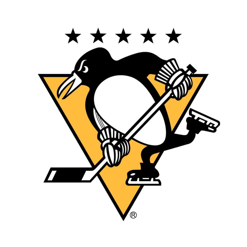
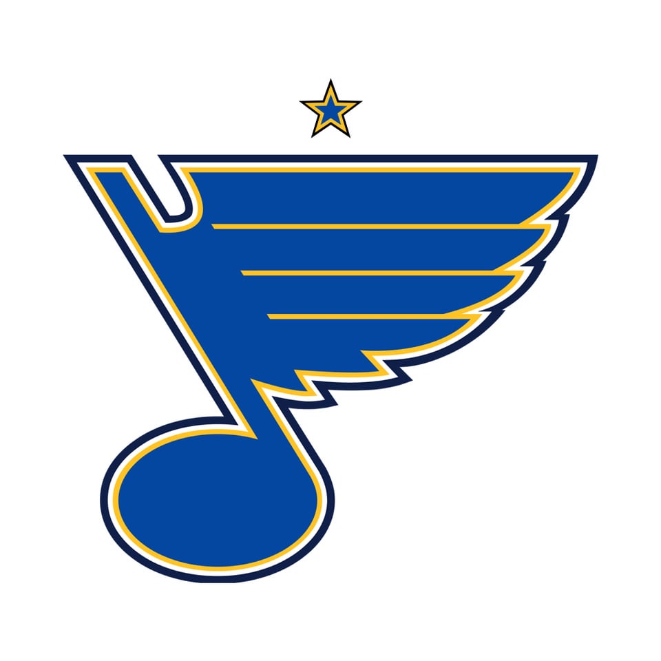
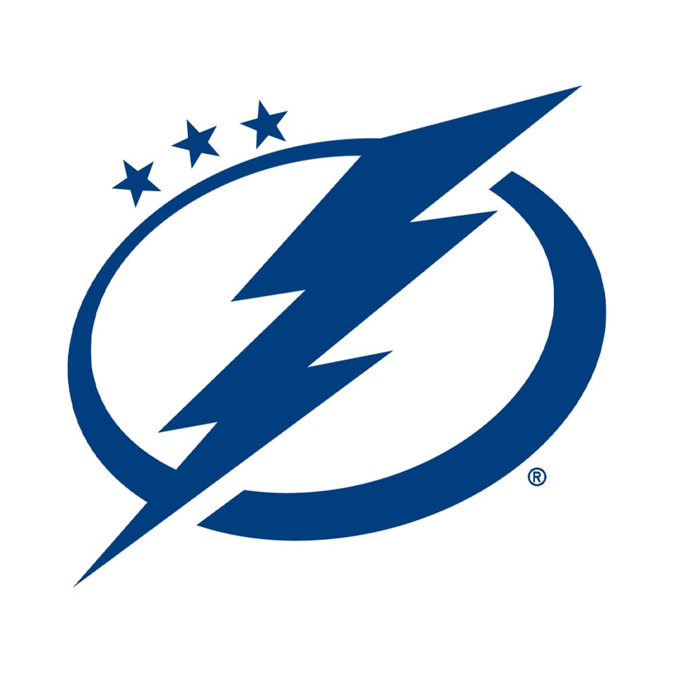
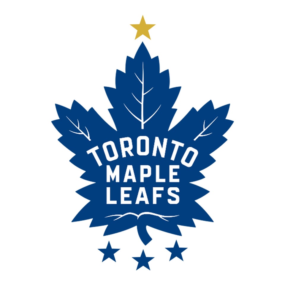

Le logo de la LNH s’ils ont ajouté des étoiles après une victoire de la Coupe Stanley. (Une étoile d’or représente 10 victoires)
—
anthonyd3ca

Le logo de la LNH s’ils ont ajouté des étoiles après une victoire de la Coupe Stanley. (Une étoile d’or représente 10 victoires)
—
anthonyd3ca
33 Comments
Silver would equal 5
The gold stars are a cop out. I demand all of them be shown. I want to see the ridiculous Canadiens logo.
Also, Stars only won the cup once, why are there two stars?
Honestly really cool
Also love that for Washington you actually had to remove two of their original stars
I didn’t see the Leafs stars (cups) on the bottom and got so confused
bs, i want to see 24 stars around the CH lol
It really exposes how pathetic a few O6 franchises are. I like it.
Leafs logo looks like a Christmas tree
Great stuff, OP. I love it when European clubs do this.
I was looking at the Caps one thinking « wow, that start actually looks really natural, I barely realized it was added » before it struck me that it’s actually in their damn logo already.
Me like
So does Dallas have 1 or 2 I’m confused
This was fun.
Where are the canucks 😔
Dallas’ logo should stay the same
Is it the off season already?
Dallas’ star looking like an asterisk is appropriate.
Are the Canucks and Sabres the oldest teams without one at this point?
I think the Flames one would look better if the star was in the middle of the C
What’s wrong with the penguins eyebrows
If Chicago did this in real life, you know they’d use the six-pointed stars from the city flag.
I kind of wanna see one where sad faces represent finals losses, and then one with both sad faces and stars.
Everyone probably already knows this, but just in case…
The Islanders actually do indicate their Cup wins by the stripes on the hockey stick.
Coward, I want to see the Habs logo with an uncomfortable and claustrophobic amount of stars
I’m confused on how one star represents ten Stanley Cup wins.
Fun fact: Leafs logo already depicts cup wins with the points on the leaf veins on upper part. This was part of the logo redesign
The Canadiens best student!
The Stars’ one even looks like an asterisk. Lmao
This feels blasphemous and/or sacrilegious to say… but I honestly like OP’s approach with the Maple Leafs’ stars.
…I’m going to go wash my hands quickly.
I don’t know why I kept swiping hoping to see The Sharks 🙁
Now do the sharks!
The leafs’ stars should all be black because as we all know they have no Stanley Cups in color 😁😁😁
The Canucks one looks great. It’s so natural it practically looks just like the one on our jerseys today
I did cbj:
https://upload.wikimedia.org/wikipedia/en/thumb/5/5d/Columbus_Blue_Jackets_logo.svg/1200px-Columbus_Blue_Jackets_logo.svg.png