Wait til you look really hard at the Devils logo, NJ and a D.
gazzalp23
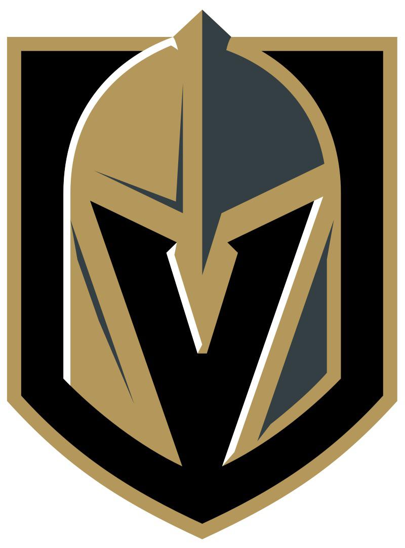
They also used this as their season 5 logo (V being the Roman numeral for 5)
commandomeezer
Nope, just saw it, hopefully will not unsee after this much needed explanation
kotacross
Dude I love these posts.
Because I like to remind everyone that I only found out this year that the Red Wing**s** logo has *two* wings.
SensualLips95
Haha, that’s really dumb of you (joke!).
It took me a few years to see the arrow pointing to the right in the FedEx logo, so that really makes you think: what else do we not see around us that is staring right at us?
PercySnowsHandgun
I just now realized it’s a jousting helmet
cams0400
Goddamn it , never noticed it before you told so
DeC3x0
Have you noticed the bear in Minnesota’s?
upvotegoblin
Don’t feel too bad, there are much more stupid people out there. Like, me, for example. I’ve lived in Vegas my entire life and am a Golden Knights fan…. And I only realized this year
Ordinary_Day6135
Vicariously
albertogonzalex
Everyone was talking about it the day but was released six years ago. Not noticing it doesn’t make you dumb.
Ballsahoy72
It’s also the helmet for a Knight. A golden one
Confident-Forever-75
Hm, never noticed it. Thanks for the tip lol
JadeHellbringer
Want the one to add a cherry on top?
Their minor-league affiliate, the Henderson Silver Knights. Look at their logo, and see if you spot the ‘H’. (Not letting me link here, sorry!)
Zighoul
Also, if anyone didn’t notice the anchor on top of the Kraken shoulder pads is actually *whispers* the Space Needle
PlumbersNeverSmile
You only see one?
bluAstrid
Did you also juste notice the “C” in the Canadiens logo?
Stanski11
You’re not stupid. But it’s not exactly subtle.
SLRMaxime
Wait until he sees the G and K
GustyOWindflapp
Stupid
NukeKidOnTheBlock
How do you guys watch the hockey when you so clearly don’t have eyes
Brilliant_Worry8835
Stupid
No_Entertainer_9760
I was about to come in here guns blazing but I’ve learned a lot from these comments. None greater than what I learned about my own team’s logo.
JasonPlattMusic34
The St. Louis Blues logo has 4 “wings” on it, which makes the note a 64th note. The city of St. Louis was founded in 1764.

25 Comments
Welp, I’m also an idiot.
Yikes.
Wait til you look really hard at the Devils logo, NJ and a D.
They also used this as their season 5 logo (V being the Roman numeral for 5)
Nope, just saw it, hopefully will not unsee after this much needed explanation
Dude I love these posts.
Because I like to remind everyone that I only found out this year that the Red Wing**s** logo has *two* wings.
Haha, that’s really dumb of you (joke!).
It took me a few years to see the arrow pointing to the right in the FedEx logo, so that really makes you think: what else do we not see around us that is staring right at us?
I just now realized it’s a jousting helmet
Goddamn it , never noticed it before you told so
Have you noticed the bear in Minnesota’s?
Don’t feel too bad, there are much more stupid people out there. Like, me, for example. I’ve lived in Vegas my entire life and am a Golden Knights fan…. And I only realized this year
Vicariously
Everyone was talking about it the day but was released six years ago. Not noticing it doesn’t make you dumb.
It’s also the helmet for a Knight. A golden one
Hm, never noticed it. Thanks for the tip lol
Want the one to add a cherry on top?
Their minor-league affiliate, the Henderson Silver Knights. Look at their logo, and see if you spot the ‘H’. (Not letting me link here, sorry!)
Also, if anyone didn’t notice the anchor on top of the Kraken shoulder pads is actually *whispers* the Space Needle
You only see one?
Did you also juste notice the “C” in the Canadiens logo?
You’re not stupid. But it’s not exactly subtle.
Wait until he sees the G and K
Stupid
How do you guys watch the hockey when you so clearly don’t have eyes
Stupid
I was about to come in here guns blazing but I’ve learned a lot from these comments. None greater than what I learned about my own team’s logo.
The St. Louis Blues logo has 4 “wings” on it, which makes the note a 64th note. The city of St. Louis was founded in 1764.