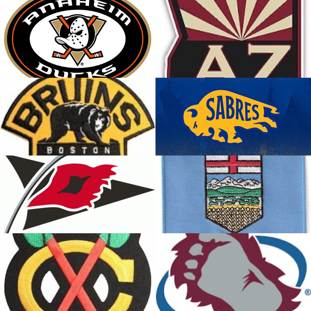
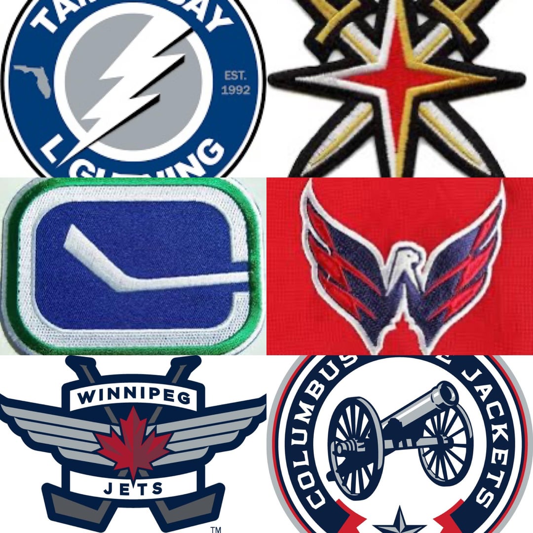
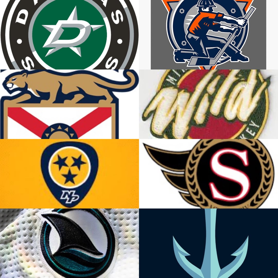
J’ai remarqué que quelques équipes n’ont pas d’écusson d’épaule ou en ont incorporé un ancien dans un 3e maillot. Équipes exclues : Detroit LA Montréal New Jersey NY Rangers NY Islanders Philadelphie Pittsburgh St. Louis Toronto
—
Kapeter

J’ai remarqué que quelques équipes n’ont pas d’écusson d’épaule ou en ont incorporé un ancien dans un 3e maillot. Équipes exclues : Detroit LA Montréal New Jersey NY Rangers NY Islanders Philadelphie Pittsburgh St. Louis Toronto
—
Kapeter
47 Comments
Caps, Sharks, Kraken in some order
For me it’s been: Avs, Knights, Kraken, Sharks in no particular order.
Hate to say it but NSH guitar pick is pretty awesome. Lose the NP
Anecdote: a friend of the family worked for Denver Nuggets when the Avs came to town. During the naming process he pitched the name Colorado Yeti and offered the design that’s now on their shoulder. They chose Avs but kept the Foot
I’m glad the Avs are getting love of course, but the foot was replaced a few years ago for the Colorado C
1. Caps
2. Kraken
3. Sharks
4. Canes
5. Blue Jackets
Hawks
Sharks
Sens
Bruins
Da Hawks!
As a Bruins fan for 64 years, I am completely unbiased when I say Boston.
No love for the flems Alberta and Canada flag patch I see
Always loved Colorado’s
Kraken and Oilers
I think they’re all really well designed
Hot take but I love the Yotes shoulder crest of the state outline. So cool looking
Ducks. Should’ve never changed
I will always be a homer and say that Kraken Anchor is the best logo I’ve ever seen.
I’m a little biased
Hawk, Sharks, Kraken, Avs, Oilers
Red Wings.
Hawks is so good it could be a primary logo
Chicago
Stars, Avs, Oilers, Hurricanes, Sharks, Panthers
Top 3. Caps, kraken, avs
I don’t follow the NHL closely or at all but I really like the one with the cannon.
Hawks by far
Chicago Blackhawks without a doubt
Bruins is a classic.
Avalanche
Bruins
Capitals.
Kraken, I just appreciate the simplicity of it
Sabres. Reminds me of an old pennant.
Panthers, but it has to be a Barkov jersey since it has « Captain » on the shoulder, too.
Boston, but I’m biased
The Ducks and that should be their primary logo.
Hate to say it but I always thought the Blackhawks one fucked.
Capitals, Jets, Blue Jackets, and Kraken
Definitely not the Oilers.
Washington oilers and Winnipeg
Lightning, Jets, Capitals
i always loved the blackhawks logo
Canucks, Hawks and Caps
Blackhawks
Blackhawks
Chi
Blackhawks, by a mile
Caps and jets
Chicago
Blackhawks all day
a lot of teams have better shoulder crests than actual logos but people are not ready for that conversation