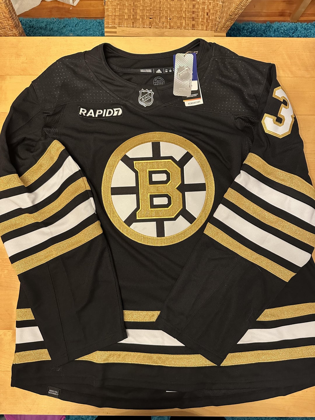
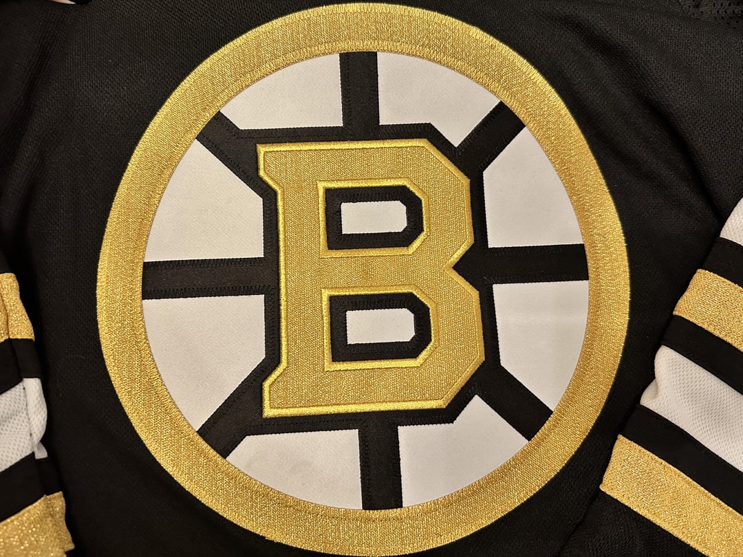


Je les aime! Le maillot domicile est magnifique de près. Tout le monde ne va pas l’aimer à cause de l’or, mais je pense que c’est vraiment cool.
—
maebyfunke

Je les aime! Le maillot domicile est magnifique de près. Tout le monde ne va pas l’aimer à cause de l’or, mais je pense que c’est vraiment cool.
—
maebyfunke
28 Comments
I dislike the sparkles. And absolutely fuck off with the Rapid patch. That’s an instant no sale for me.
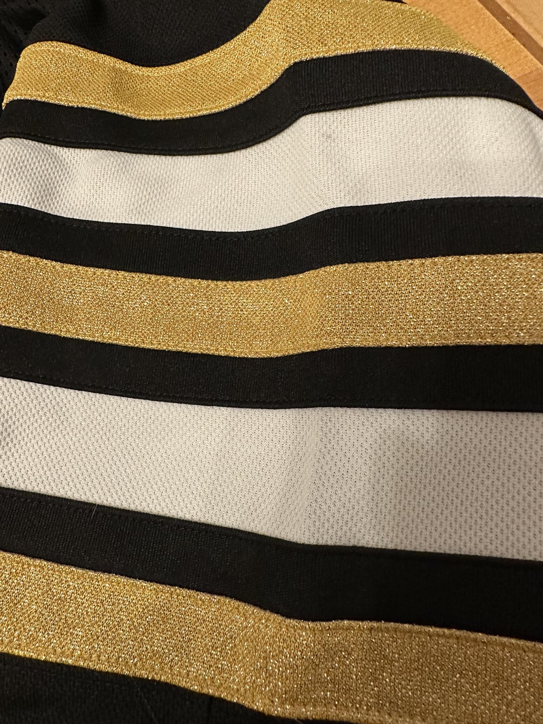
Not digging the extra stripes.
Interesting to see no letters on them.
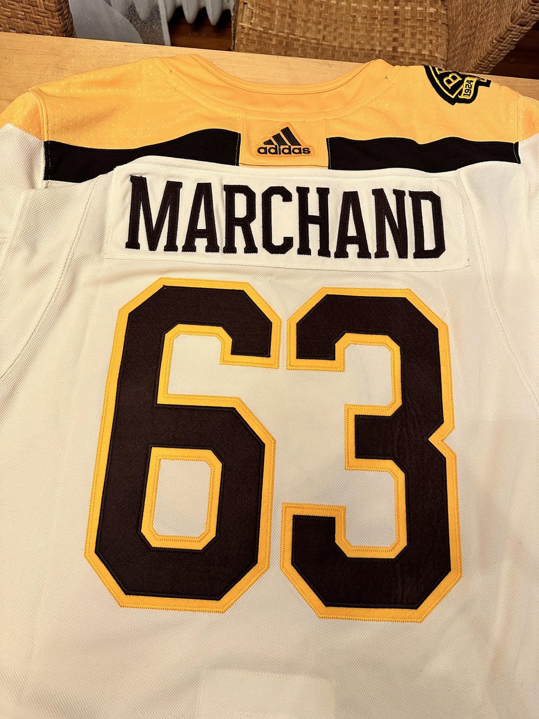
Does anyone know why the pro shop doesn’t do the names in the authentic, on-ice font size? It’s always smaller than what the players wear. Even the jersey Marchand wore tonight has the bigger font than this. It may be a me thing but this bothers me a lot
Love them so much, time to upgrade my Tim Thomas jersey this season I guess lel
Jacobs is the worst current owner in sports. Of all the great Bruins jerseys to draw inspiration from and to wind up with this jersey set for the 100 year anniversary celebration is sad. The arm stripping on the home and away jersey looks like he hired a design team from the local mentally challenge society. The third jersey is eh- boring and the logo looks pathetic with the 1924 on it. Wow. Just pathetic. Bruins fans deserved better, especially when the team choked hard in the playoffs last season.
It’s going to be a long season in Beantown, aging stars, a goalie who chokes and sucks more than a working girl after a night at the local sex club, and a cheap ass owner who not only has horrible jersey ads, his fashion sense with his new once in a lifetime jersey set is worse than Jack the Ripper’s dating record.
You big cheater! It’s not even 2024!
(Also: looks amazing, am super jealous.)
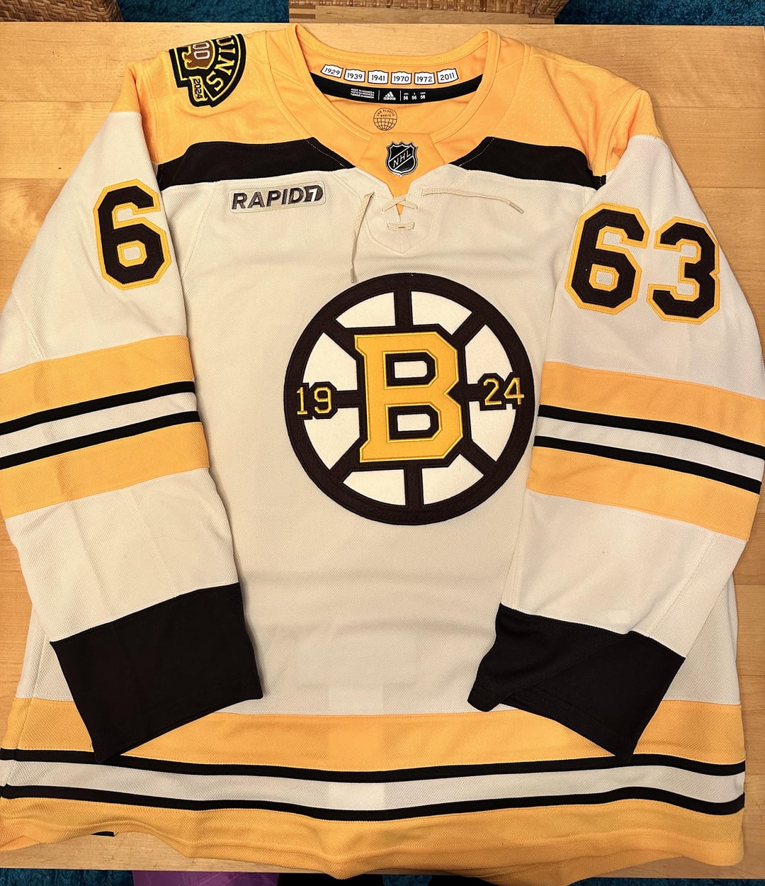
The white one with the yellow shoulders is so good
These photos look better than the leaked. Home jersey up close in this picture changed my opinion on them forsure
I guess the third is ok. Bland, but ok. Super dislike the gold on the other two.
Couple of thoughts…
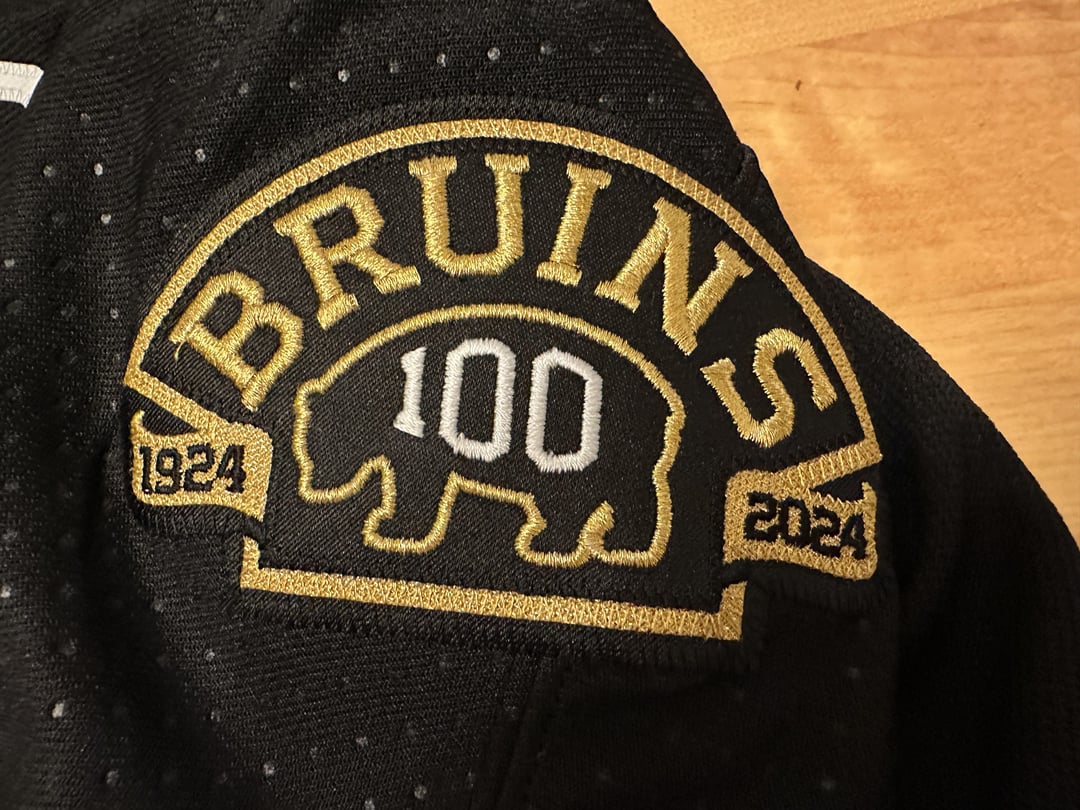
1.) I’m generally not a « sparkle » fan (although I think it works for the Golden Knights because, well, Vegas, baby), but for the 100th year, I can get on board.
2.) Something about the beige and the homage to the 25th season on the third jersey does it for me, too.
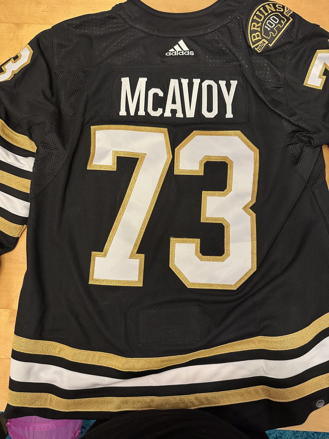
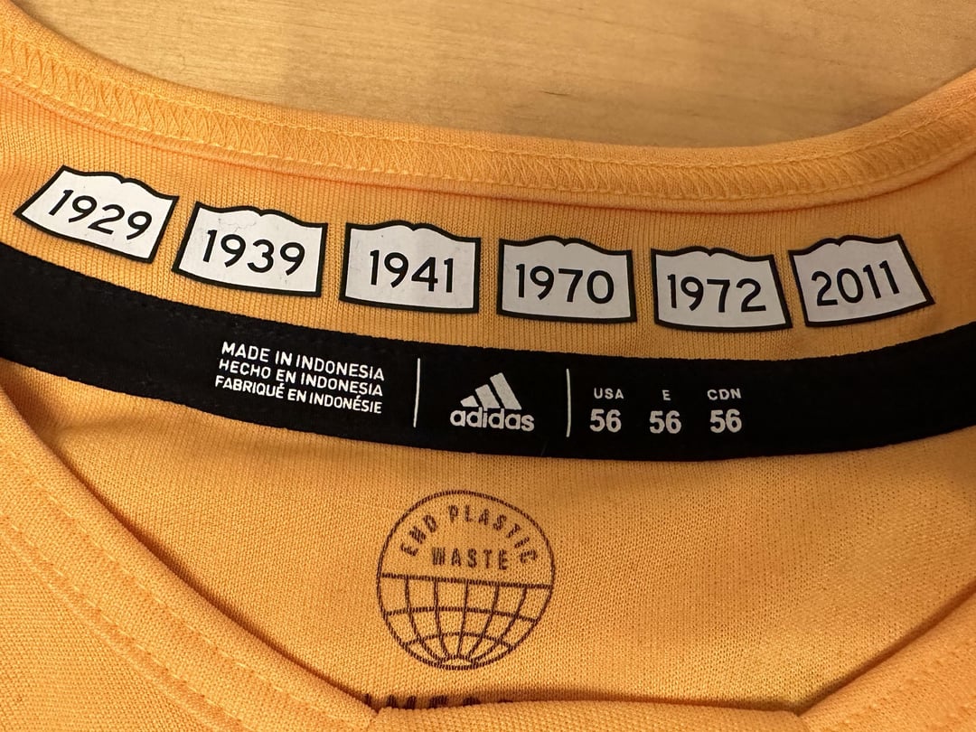
3.) The nods to the six Stanley Cups through the stripes on the sleeves, and the years emblazoned in the Massachusetts « Open Book » Town signs inside the collar are reallynice touches.
So yeah, I am a fan, and will likely buy one!
I had to leave this sub after the Florida series. I needed some time away, but the release of the jerseys and the end of summer has me excited for the season, once again.
Will be buying a new jersey, and getting ready to have my heart broken again. And I love it. Go B’s!
Nice. What did you think of the event and how many beers did you have?
I’m a Leafs fan, but that 100 patch is epic. Love the jerseys too tbh
Love the jersey, hate the Rapid7 badge. They fucking ruined hockey jerseys. Fuck advertisements.
I hate the double stripes on the arms. If they just went with one set, I’d like these.
Hideous
Jesus Looch is looking old in that pic
it is absolutely insane to me that they sell these w/ the rapid 7 patch on them.
it’s like buying a season of tv with the commercials included
Very cool
If they had done the exact same thing on the homes with less elbow stripes and shoulder patches on both sides it would be fine. Wish they were wearing these for a few games and not the whole year, they aren’t better than the normal jerseys, especially the road ones.
Chucky is a good choice
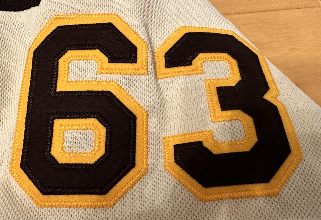
I got a nameless 3rd jersey really love these designs and I don’t get people complaining about the shine of the gold
I don’t think Looch’s smile has left his face since he came back home.
So they’re just sparkly?
Edit: I don’t hate it. Idk what I expected really.
They were selling the jerseys with the ads? Yuck.
Looks amazing!!!
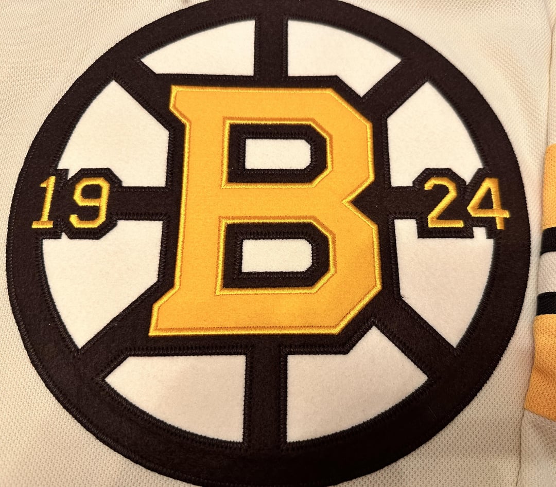
I didn’t realize it was actually GOLD, that’s very cool
Too bad they didn’t go with yellow socks with the black sweater.