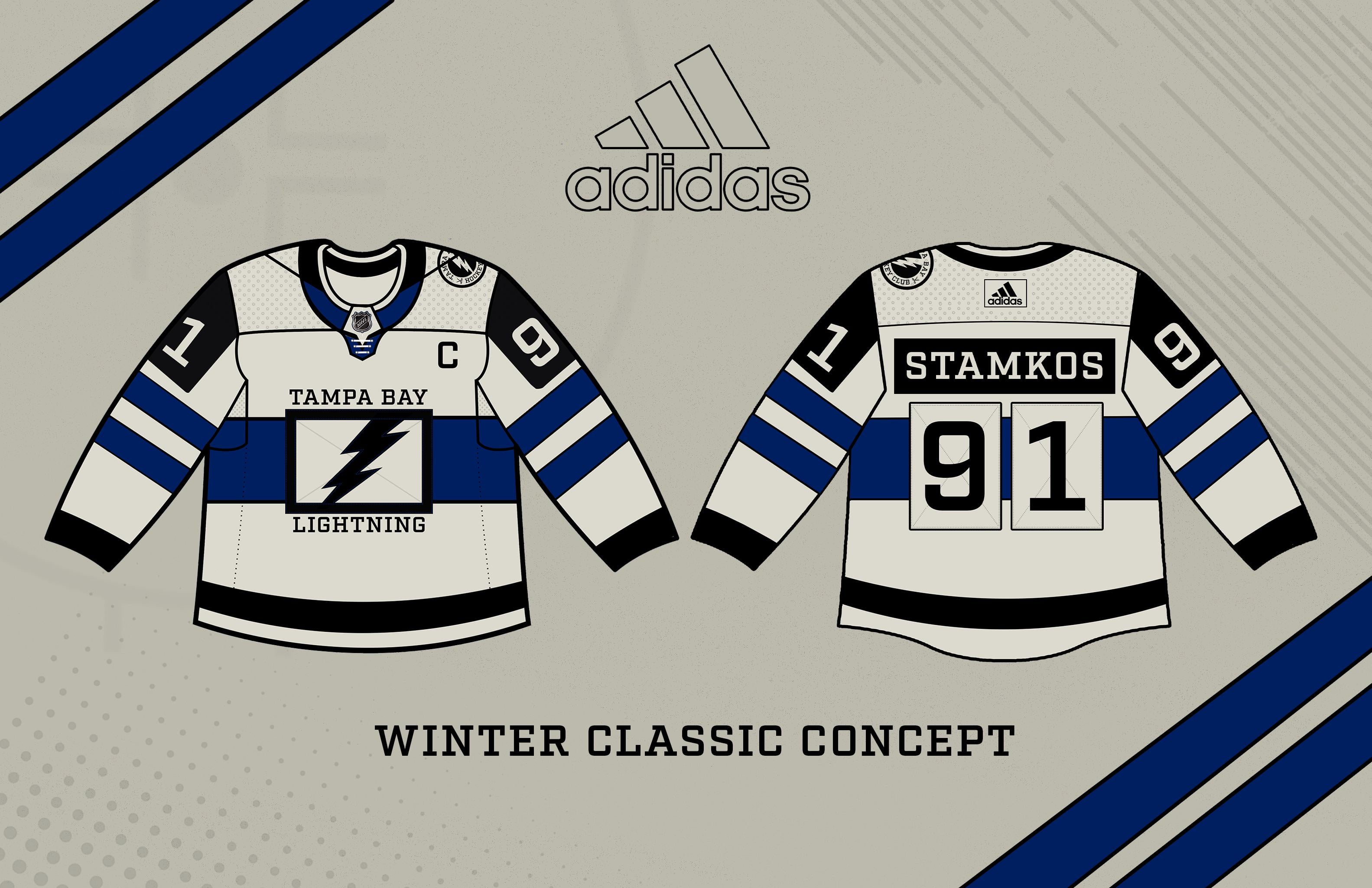
Après la fuite du prétendu 3ème maillot, j’ai décidé de passer plus de 5 minutes à concevoir un maillot. Les maillots classiques d’hiver sont généralement de style rétro, alors essayez un maillot de style rétro.
—
Coopinator22

Après la fuite du prétendu 3ème maillot, j’ai décidé de passer plus de 5 minutes à concevoir un maillot. Les maillots classiques d’hiver sont généralement de style rétro, alors essayez un maillot de style rétro.
—
Coopinator22
12 Comments
I like the stripes
The chest logo is ehhh
The colors are perfect
Don’t love the chest logo, but this is pretty cool, makes me think of a kit from a European pro league without being covered in ads. Good stuff!
Colors and stripes…chefs kiss
Chest logo…I think I see what you’re doing, mirroring the block numbers on the back, but it just doesn’t work.
Definitely the box logo throwing off a really good base design
Wow this is astrologically worse
I like the box logo, something different. You’re thinking outside the… circle.
Nope
Nah
I was about to say that would be a great WC jersey before I read the text lol
Logo is the only meh thing about for me
You may want to replace stamkos name with the Kuch because stammer is playing and looking like the old guy he is. Probably getting traded soon for some picks.
Every time I see concepts and proposals I think of the same thing. Take out regular jersey. Make the blue black. Make the white silver. Use letter and number fonts from 2003. Simple.
I love the name plate, but agree with others on the logo. Any way to incorporate some yellow? Always felt we needed Philly style nameplates and some yellow thrown in.