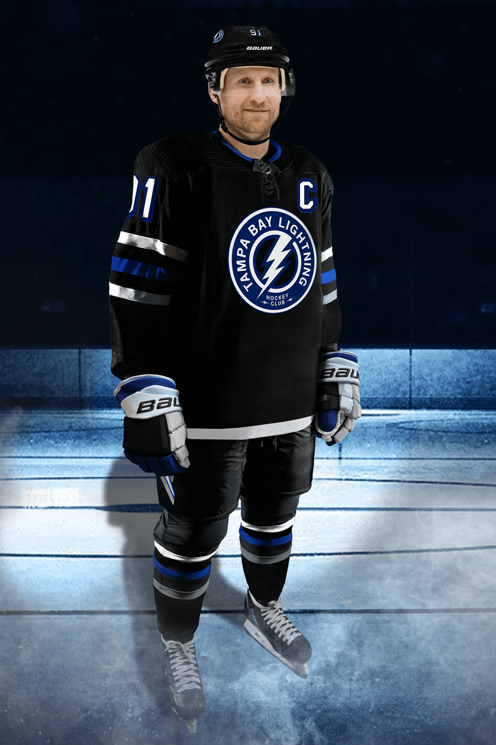
J’ai fait cela juste pour m’amuser et avoir une idée de l’apparence de l’uniforme dans son ensemble. J’aurais aimé qu’ils ajoutent le logo principal en blanc avec un contour bleu sur les épaules. Pensées?
—
n1ght0wl89

J’ai fait cela juste pour m’amuser et avoir une idée de l’apparence de l’uniforme dans son ensemble. J’aurais aimé qu’ils ajoutent le logo principal en blanc avec un contour bleu sur les épaules. Pensées?
—
n1ght0wl89
9 Comments
Thanks, I hate it.
These are fire 🔥
It’s definitely growing on me, but we definitely could’ve had a number of far better designs. This honestly screams lack of effort on Adidas’ part.
It’s just so boring
Only issue is the big circular shoulder logo on the chest. A lightning bolt by itself would be fine
Is this official? I thought there was a stripe across the bottom of the jersey.
yeah its not bad in full kit, if this the actual full kit they going with, but the jersey itself is just boring its bland idk
Not completely awful, but agree, boring.
don’t love it. we’ve always had good 3rd jerseys in my opinion, this breaks the trend