Looks like they are supporting the Grateful Dead ?
/s
PhilJones4
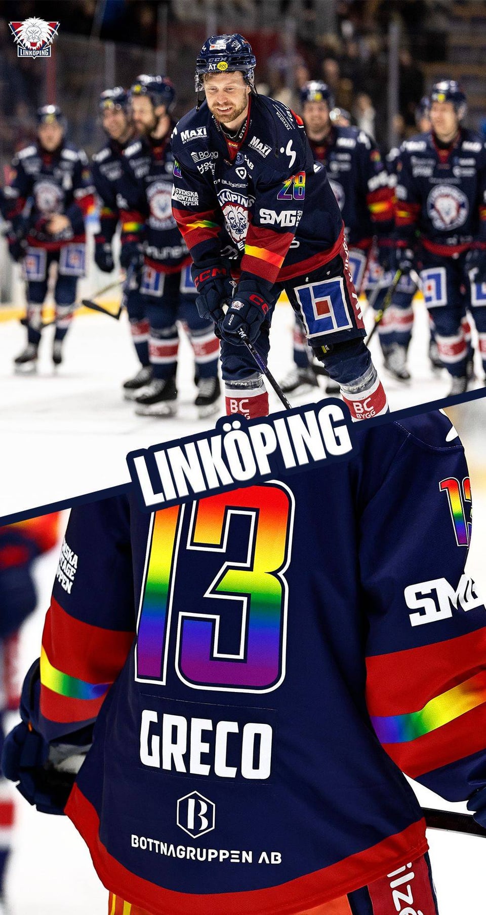
The first one is the nicest obviously.
buerglermeister
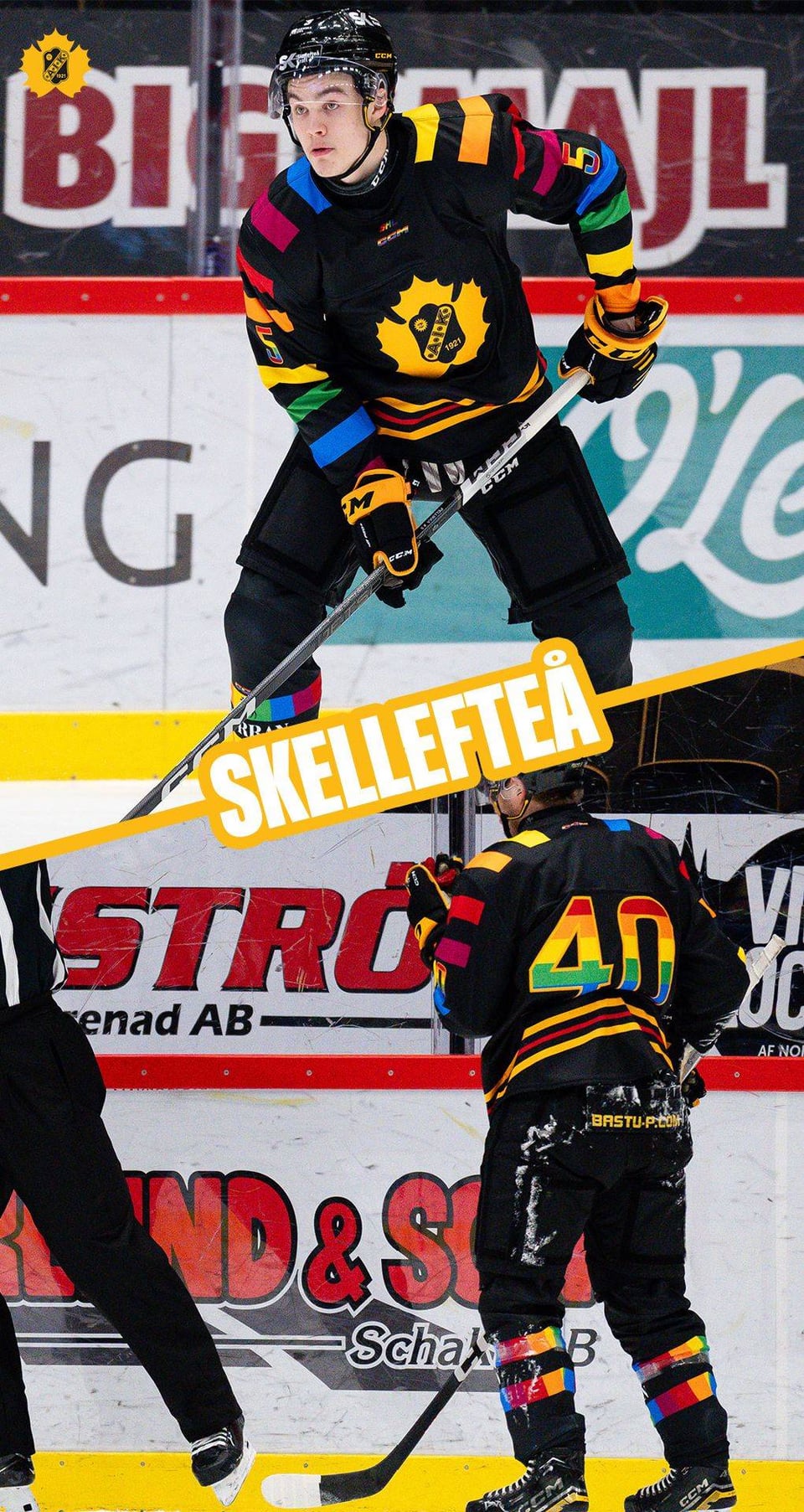
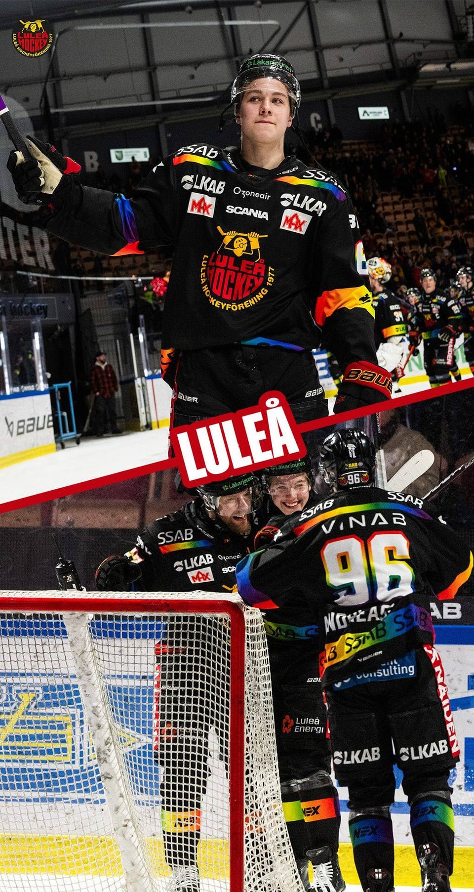
Skelleftea is 🤩🫶
Shoddy-Wear-9661
They’re fire, It looks like they’re actually wearing them in game and not only a warmups gimmick. Yet another L for the NHL and an absolute W from the SHL
ultrafil
Question to SHL fans in Sweden – Do Swedish hockey fans have to put up with the same * »no politics in hockey!!1″* bullshit for your league that us North American fans do? Just wondering if this is causing a stir in Sweden the same way it does every fucking time it happens over here.
I can’t even imagine the toxic discussion that would happen over here if teams wore rainbows on the ice for an entire week. Boomers would be tripping over their own beer guts in furious anger over some colours and acknowledgement.
Red_AtNight
Love that we can’t have this in the NHL anymore so we can protect the feelings of some has beens and never weres like James Reimer
PorkRollEggAndWheeze
Well done SHL, all of these are beautifully garish and exactly what they should be, I love it
CalumH91
Skellefteå and Luleå’s are great. Gives a whole new meaning to Northern Pride
AmeriCanadian98
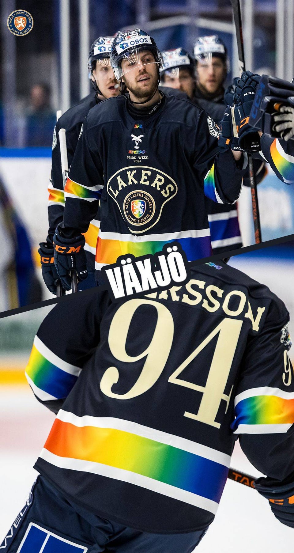
The Skelleftea and Vaxjo jerseys both go unbelievably hard
4N0NYM0US_GUY
I played against Greco …people talked highly of him when we were 2nd year squirts hahaha
Back in his Long Island Royals days
Glad to see he’s made a career out of it!
Ih8n3rdz
Is the seeming preference for gradient rainbows over striped rainbows a cultural thing or just a coincidence in designs? In the U.S. it seems like the striped rainbow is far more commonly associated with pride than gradient rainbows. Obviously we do still use gradient rainbows here for the same purpose, but the history and iconography of the striped rainbow flag seems to make the usage of stripes more prevalent. Is there some sort of cultural or historic reason the gradients seem more popular, or am I just reading to much into a small sample size?
HolyPizzaPie
Well this is actually against my religion so I’m not even allowed to look at these pictures, or at people being empathetic in general.
backchecklund
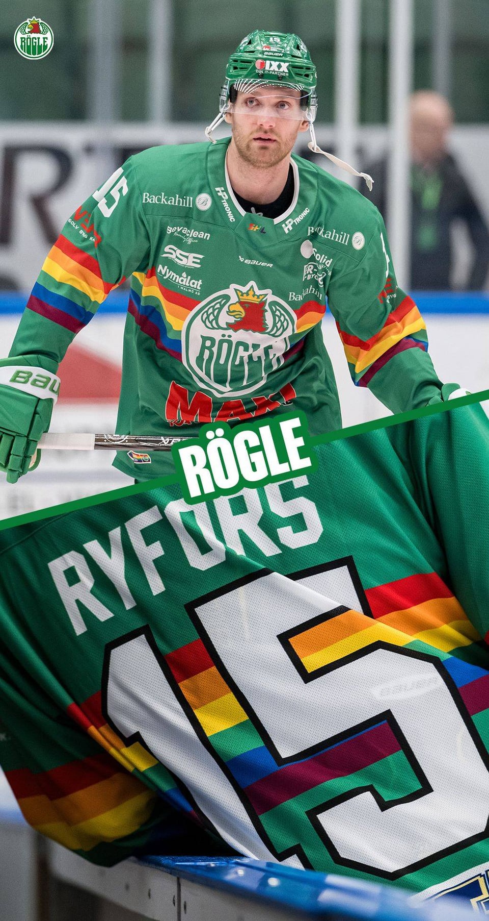
Skelletfea and Vaxjo are the coolest ones, the least amount of ads too
[deleted]
[deleted]
Steppyjim
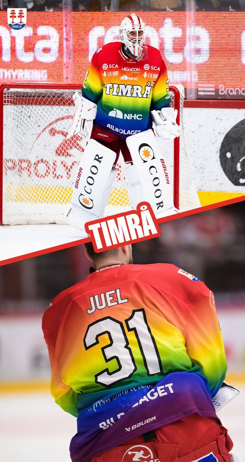
I really dig Timra and Skelleftea.
[deleted]
[removed]
smbiggy
anyone else think the first picture was adam larsson and wonder what the hell happened to him to land him in the SHL so fast?
FxDriver
Some of these are great: Linkoping and Skelleftea . Some of these shouldn’t be allowed to exist: Timra
hjhof1
Gary Bettman in shambles
Paradoxikles
Noice. Hockey is taking the rainbow back!
pokeroots
Some of them are good, some of them are awful. I mean I think the refs are the best ones. But hey at least they’re doing it.
IllustriousSearch838
Too bad the NHL is too soft to support this
oceanic8675
These are spectacular
letoiledunordstars
All the ads make the jerseys look so cluttered and messy, but the rainbow is still really nice
JohnYCanuckEsq
That Rogle logo font looks familiar
CuidadDeVados
I’d punch a baby or two for one of the Skelleftea jerseys.
Quinto376
Very nice designs.
sharpy10
Can you buy these anywhere? Love skelleftea and rogles jerseys!
FingerGungHo
They’re like RGB lighting in hockey jerseys. I… I like it a lot for some reason!
TvHeadRobot
the NHL if it was good:
abstractabs
Timra kings of subtlety
texasguy7117
*sorts by controversial*
Aetherflux27
All the ads on them remind me of motorsport team shirts
CrayZ_Squirrel
Skelleftea jersey is tops. Clear winner in my book.
trance1g
Timra goes hard
CampfireGuitars
But aren’t they shoving it down people’s throats? Must only be a North America thing then
Brilliant-Chapter202
This is over the top and painful to look at.
agent_1337
I wonder how many players with russian citizenship or because of their faith refused to wear these during this week? Doesn’t seem like a lot.
AdhesiveMuffin
Staals in shambles
PairRelative2778
Gayyyy
Drummer_Kev
Ah fuck, I’m seeing our future boys. The day the NHL jerseys look like this (the fuckin ads) I’ll kill bettman myself (my lawyers are telling me to say this is a joke. I do not condone violence)
Photorestoration1822
Ivan Provorov!
thirty7inarow
Some certainly look better than others, but seeing the support is #1.
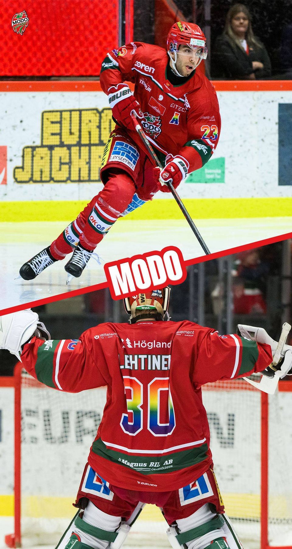
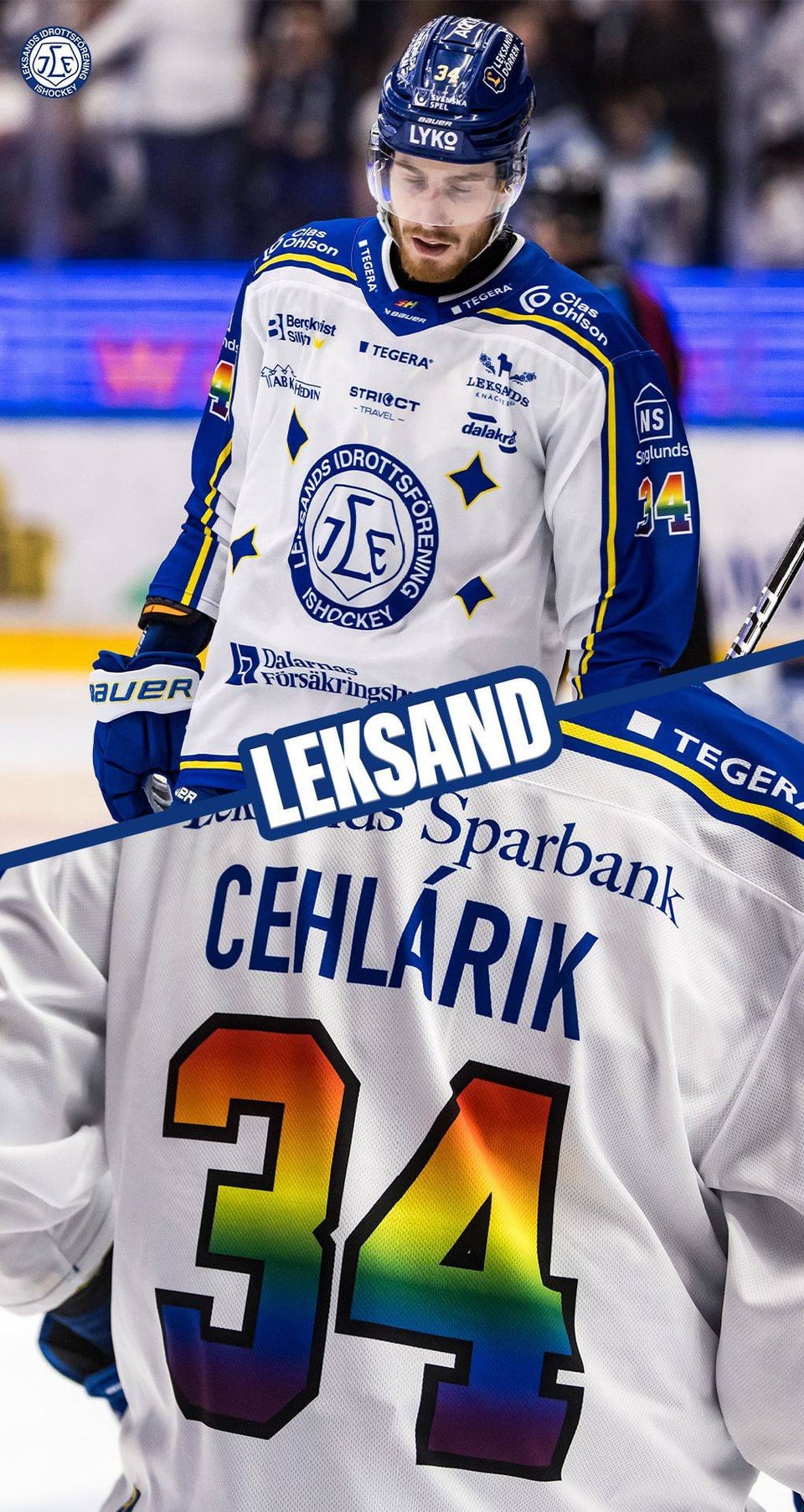
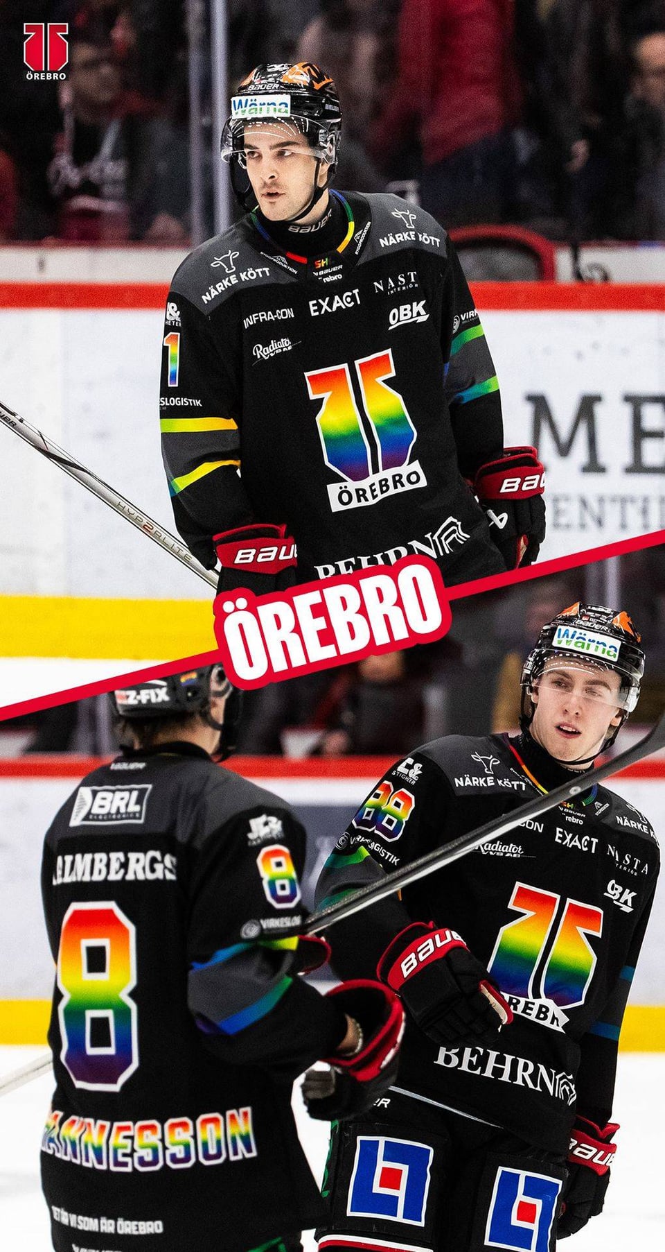
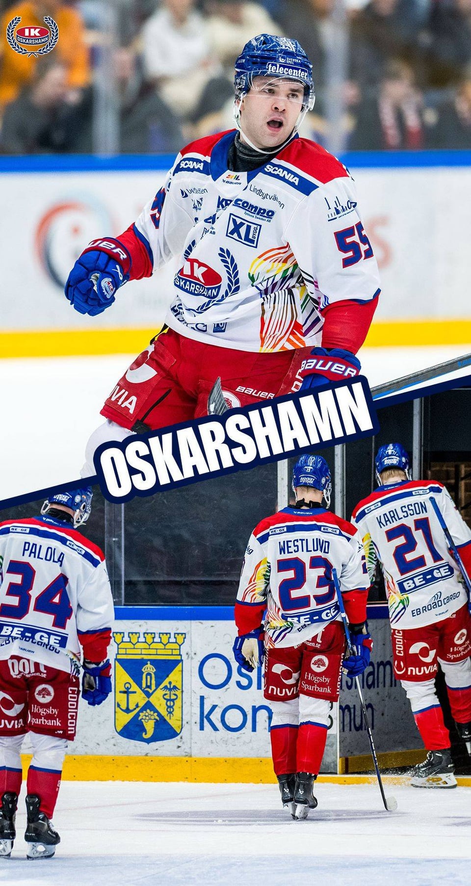
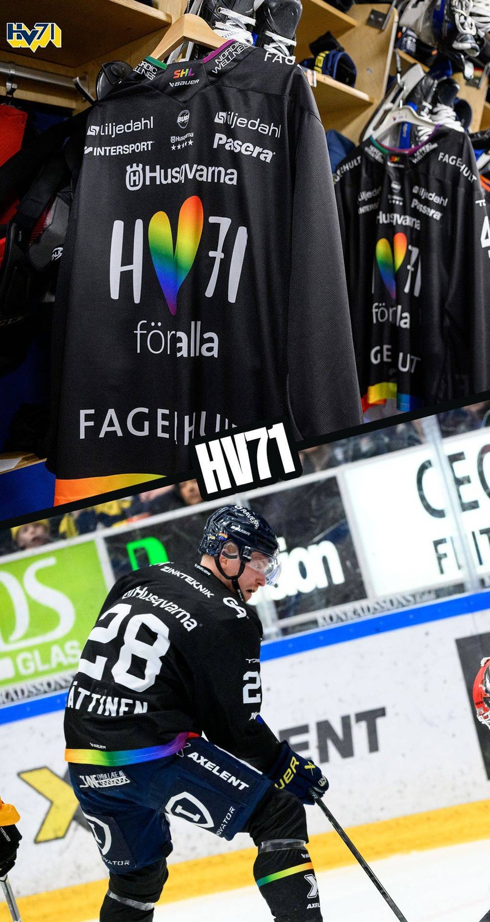
It’s nice to see that each team appears to have come up with their own idea of what worked for them. Timrä went all-out, some went with striping or just the numbers, and HV71 did a whole logo for it.
Eferver24
Man I need one of those Skellefteå jerseys
MonsterRider80
I love that they do this. The jerseys are ugly as fuck, but I still applaud the effort!
Three_Froggy_Problem
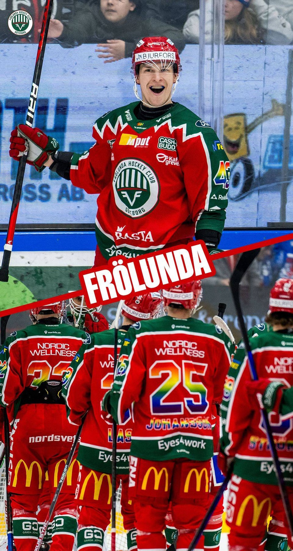
I find it hard to judge the quality of the jerseys because the amount of ads just makes them look so tacky to me. They look like NASCAR uniforms.
cactuscoleslaw
And I thought the advertising on NHL gear was excessive
Shortsideee
Lol gey
Sila371
I miss when people kept their shallow self righteousness inside of a church where we all didn’t have to hear about it.

50 Comments
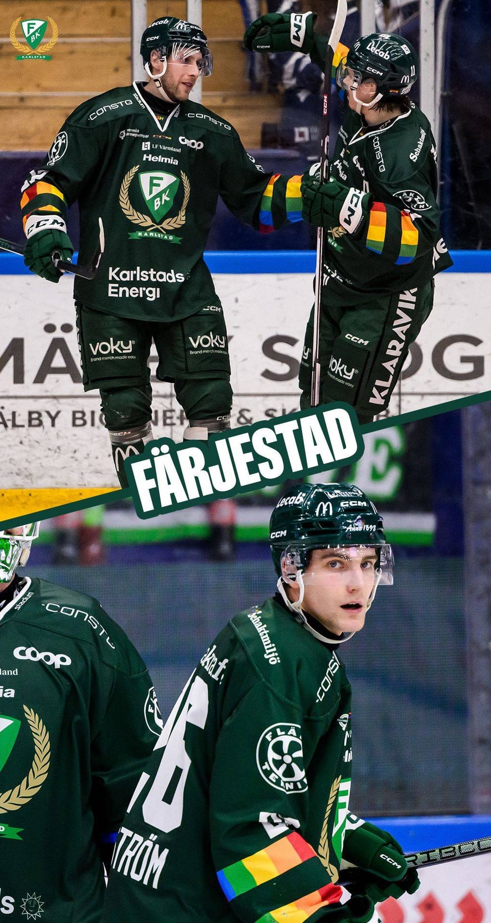
Ranked in no particular order of course.
Here’s a [bonus](https://cdn1-photos.shl.se/photos/24/02/da0059c8-4e70-4625-9a63-e180570aaf24domarrtroja.jpg?ixlib=js-3.8.0&w=1920&h=1080&auto=format&fp-debug=0&fp-y=0.5&fp-x=0.5&crop=focalpoint&fit=crop&s=4a778623fad94a903da8ab961e51bc9c) one for the referees.
Looks like they are supporting the Grateful Dead ?
/s
The first one is the nicest obviously.
Skelleftea is 🤩🫶
They’re fire, It looks like they’re actually wearing them in game and not only a warmups gimmick. Yet another L for the NHL and an absolute W from the SHL
Question to SHL fans in Sweden – Do Swedish hockey fans have to put up with the same * »no politics in hockey!!1″* bullshit for your league that us North American fans do? Just wondering if this is causing a stir in Sweden the same way it does every fucking time it happens over here.
I can’t even imagine the toxic discussion that would happen over here if teams wore rainbows on the ice for an entire week. Boomers would be tripping over their own beer guts in furious anger over some colours and acknowledgement.
Love that we can’t have this in the NHL anymore so we can protect the feelings of some has beens and never weres like James Reimer
Well done SHL, all of these are beautifully garish and exactly what they should be, I love it
Skellefteå and Luleå’s are great. Gives a whole new meaning to Northern Pride
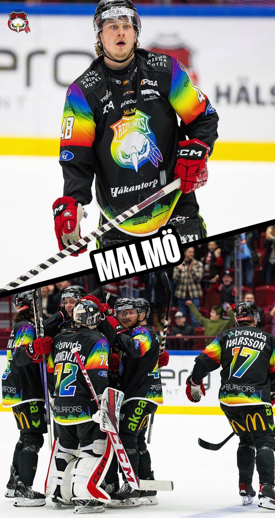
The Skelleftea and Vaxjo jerseys both go unbelievably hard
I played against Greco …people talked highly of him when we were 2nd year squirts hahaha
Back in his Long Island Royals days
Glad to see he’s made a career out of it!
Is the seeming preference for gradient rainbows over striped rainbows a cultural thing or just a coincidence in designs? In the U.S. it seems like the striped rainbow is far more commonly associated with pride than gradient rainbows. Obviously we do still use gradient rainbows here for the same purpose, but the history and iconography of the striped rainbow flag seems to make the usage of stripes more prevalent. Is there some sort of cultural or historic reason the gradients seem more popular, or am I just reading to much into a small sample size?
Well this is actually against my religion so I’m not even allowed to look at these pictures, or at people being empathetic in general.
Skelletfea and Vaxjo are the coolest ones, the least amount of ads too
[deleted]
I really dig Timra and Skelleftea.
[removed]
anyone else think the first picture was adam larsson and wonder what the hell happened to him to land him in the SHL so fast?
Some of these are great: Linkoping and Skelleftea . Some of these shouldn’t be allowed to exist: Timra
Gary Bettman in shambles
Noice. Hockey is taking the rainbow back!
Some of them are good, some of them are awful. I mean I think the refs are the best ones. But hey at least they’re doing it.
Too bad the NHL is too soft to support this
These are spectacular
All the ads make the jerseys look so cluttered and messy, but the rainbow is still really nice
That Rogle logo font looks familiar
I’d punch a baby or two for one of the Skelleftea jerseys.
Very nice designs.
Can you buy these anywhere? Love skelleftea and rogles jerseys!
They’re like RGB lighting in hockey jerseys. I… I like it a lot for some reason!
the NHL if it was good:
Timra kings of subtlety
*sorts by controversial*
All the ads on them remind me of motorsport team shirts
Skelleftea jersey is tops. Clear winner in my book.
Timra goes hard
But aren’t they shoving it down people’s throats? Must only be a North America thing then
This is over the top and painful to look at.
I wonder how many players with russian citizenship or because of their faith refused to wear these during this week? Doesn’t seem like a lot.
Staals in shambles
Gayyyy
Ah fuck, I’m seeing our future boys. The day the NHL jerseys look like this (the fuckin ads) I’ll kill bettman myself (my lawyers are telling me to say this is a joke. I do not condone violence)
Ivan Provorov!
Some certainly look better than others, but seeing the support is #1.
It’s nice to see that each team appears to have come up with their own idea of what worked for them. Timrä went all-out, some went with striping or just the numbers, and HV71 did a whole logo for it.
Man I need one of those Skellefteå jerseys
I love that they do this. The jerseys are ugly as fuck, but I still applaud the effort!
I find it hard to judge the quality of the jerseys because the amount of ads just makes them look so tacky to me. They look like NASCAR uniforms.
And I thought the advertising on NHL gear was excessive
Lol gey
I miss when people kept their shallow self righteousness inside of a church where we all didn’t have to hear about it.