Better than the awful black and webbed foot they had, but I think almost everyone loved their original color scheme the most.
Sc00tzy
Meh
DwayneStone
Why couldn’t they make a new variation of the old mighty ducks logo? I think the old logo looks dumb for a team playing in 2020’s.
GhettoLennyy
Man what a miss…
msp01986
They should’ve just use the 2022-23 reverse retro and make it black for home
Cookiemonger1
What does Anaheim have to do with New Jersey?
Dcroig
That’s a lovely accent.
BillyBrasky
They just keep getting it wrong.
They should have just kept the last year’s jersey but changed back to the original colors. Teal & Eggplant
And then use this new logo from time to time as a reverse retro.
LtSmash006
You may have paid for that jersey Mr. Ductwork, but you didn’t earn it
Worth_Bar314
Sick colors. Sick logo. Huge fan
FingerGungHo
The logo is great like it always was, but otherwise it’s pretty mid tbh. Eggplant is just so great colour, i don’t know why the hell they so doggedly refuse to use it.
Tremloc
Mighty ducks of whataburger.
I’m hoping in person it’s not as whataburgery as it seems because the revamped logo is awesome
johnnymavrigg
Just bring back the original Purple Mighty Duck jerseys
Sdgrevo
I love it.
lilPavs13
I like the orange
powerplay_22
so close and yet so far
AutomaticAccess3760
Lol
Fallen-Omega
Go back to the purple you cowards!!!!
Beginning-Primary-16
I feel like if the home jersey had different colored shoulders like the away one does, I’d like them better overall. Just to break up the big block of orange. Definitely don’t hate them tho.
StarKo010
Anaheim New Jersey Devil Ducks!!! YEAHHH!
Illustrious-Fold253
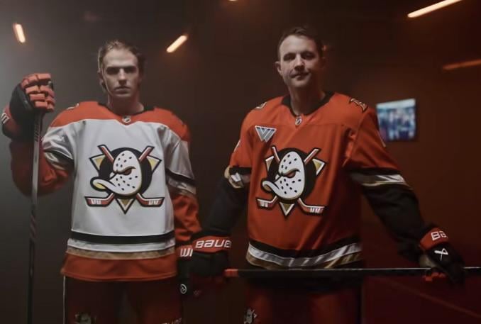
If this is our first true look at a Fanatics team jersey, it looks pretty solid to me. Embroidery and stitching on the logos and numbers looks good. I was worried they’d cheap out and make them printed single appliqués to save weight like they do on the consumer merchandise they currently sale.
Design wise, I like this Ducks jersey. If nothing else, it’s a big improvement on the numbers and nameplates.
MatsGry
New Jersey Ducks?
lew5252
This color scheme is just aweful. Swing and a miss
JuicyBoi8080
I feel like this has been posted every day for the past month.
Horvat53
The best crest is back. Don’t care for the orange, but the Mighty Ducks brand is elite.
The_Cozy_Burrito
I love it. Always been a fan of the mighty ducks logo and not that plain duck feet one.
More-Organization81
Those are amazing ngl
rwags2024
That orange is just so awful. Glad the logo is back but fuck those creamsicle ass jerseys
VancouverElated
As a kid who grew up loving the mighty ducks movies, I’m hyped for this 👌🏽
Blue_KikiT92
I want one 😍
Allen_Koholic
Man, those home kits look like traffic cones, which is apt for some of their defense.
driftwood_chair
Where’s the purple?? They aren’t going to have kids in Saskatchewan wearing mighty ducks track suits like in the 90’s without the classic purple and green, I’ll tell you that right now.
No_Tangelo_7919
I actually don’t hate these…
HarmonysWrath
These are actually pretty rad.
Odd_Philosopher1712
About damn time. Maybe we can get an alternate with some decent coloration
v13ragnarok7
Great logo and striping. Awful choice on colors. Yes there needs to be more Orange in the league, but why not go back to the purple/teal? that looked incredible and would have an awesome 90’s theme

40 Comments
We’re the pylons!
[A deeper dive into it on Sportslogos.net](https://news.sportslogos.net/2024/06/26/mighty-big-news-anaheim-ducks-reveal-new-logos-uniforms-a-mix-of-modern-and-retro/hockey-2/)
Way too heavy on the orange
Better than the awful black and webbed foot they had, but I think almost everyone loved their original color scheme the most.
Meh
Why couldn’t they make a new variation of the old mighty ducks logo? I think the old logo looks dumb for a team playing in 2020’s.
Man what a miss…
They should’ve just use the 2022-23 reverse retro and make it black for home
What does Anaheim have to do with New Jersey?
That’s a lovely accent.
They just keep getting it wrong.
They should have just kept the last year’s jersey but changed back to the original colors. Teal & Eggplant
And then use this new logo from time to time as a reverse retro.
You may have paid for that jersey Mr. Ductwork, but you didn’t earn it
Sick colors. Sick logo. Huge fan
The logo is great like it always was, but otherwise it’s pretty mid tbh. Eggplant is just so great colour, i don’t know why the hell they so doggedly refuse to use it.
Mighty ducks of whataburger.
I’m hoping in person it’s not as whataburgery as it seems because the revamped logo is awesome
Just bring back the original Purple Mighty Duck jerseys
I love it.
I like the orange
so close and yet so far
Lol
Go back to the purple you cowards!!!!
I feel like if the home jersey had different colored shoulders like the away one does, I’d like them better overall. Just to break up the big block of orange. Definitely don’t hate them tho.
Anaheim New Jersey Devil Ducks!!! YEAHHH!
If this is our first true look at a Fanatics team jersey, it looks pretty solid to me. Embroidery and stitching on the logos and numbers looks good. I was worried they’d cheap out and make them printed single appliqués to save weight like they do on the consumer merchandise they currently sale.
Design wise, I like this Ducks jersey. If nothing else, it’s a big improvement on the numbers and nameplates.
New Jersey Ducks?
This color scheme is just aweful. Swing and a miss
I feel like this has been posted every day for the past month.
The best crest is back. Don’t care for the orange, but the Mighty Ducks brand is elite.
I love it. Always been a fan of the mighty ducks logo and not that plain duck feet one.
Those are amazing ngl
That orange is just so awful. Glad the logo is back but fuck those creamsicle ass jerseys
As a kid who grew up loving the mighty ducks movies, I’m hyped for this 👌🏽
I want one 😍
Man, those home kits look like traffic cones, which is apt for some of their defense.
Where’s the purple?? They aren’t going to have kids in Saskatchewan wearing mighty ducks track suits like in the 90’s without the classic purple and green, I’ll tell you that right now.
I actually don’t hate these…
These are actually pretty rad.
About damn time. Maybe we can get an alternate with some decent coloration
Great logo and striping. Awful choice on colors. Yes there needs to be more Orange in the league, but why not go back to the purple/teal? that looked incredible and would have an awesome 90’s theme
No purple and green. Cowards!