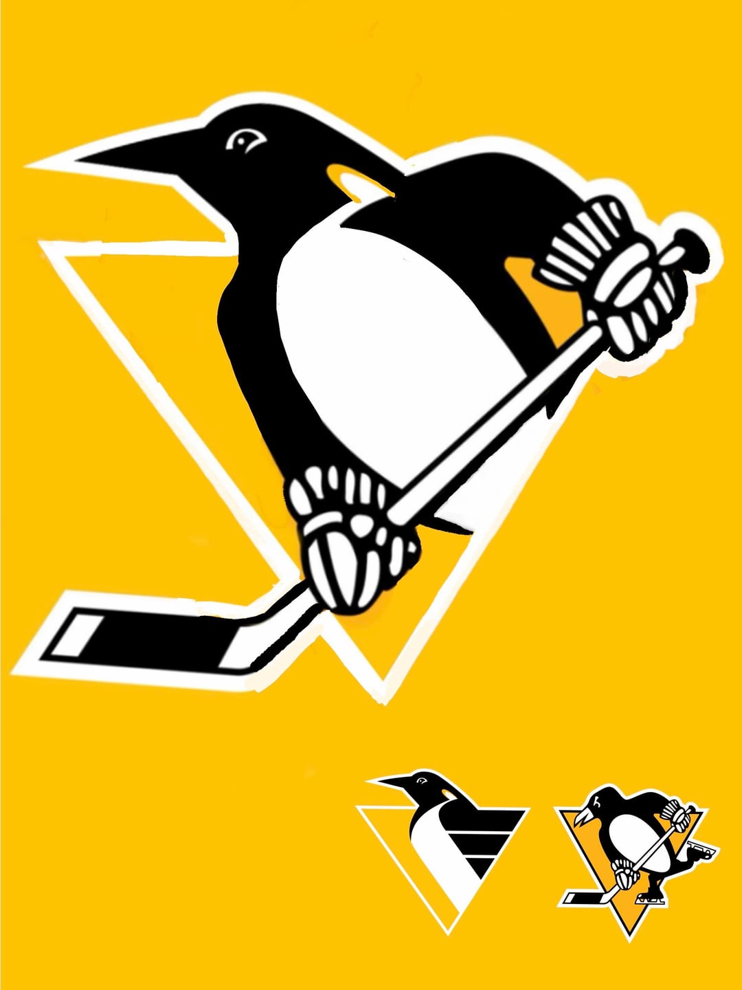
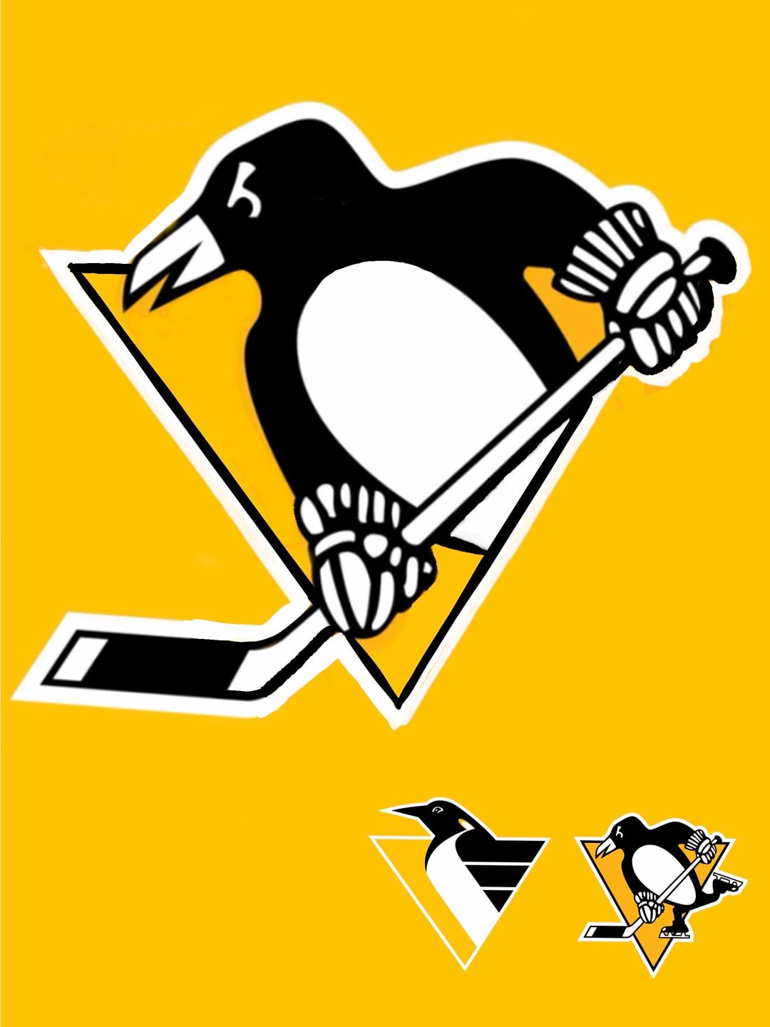
Je jouais avec la combinaison des logos. Des idées ? — OutrageousDiscount31 Association de l’EstEastern ConferenceMétropolitaine DivisionMetropolitan DivisionPenguins de PittsburghPittsburgh Penguins 28 Comments Scooterbum03 3 mois ago I like pic #1 slightly better. Good job on both. I would rock either one on a t shirt or hoodie No_Entrepreneur_9134 3 mois ago I like the Robo Penguin carrying the stick. I would steal that as phone wallpaper. Analogmon 3 mois ago The problem with the current design is the amount of excessive detail. Especially in the gloves and skates. You’ve kept far too much of it. If you clean up the gloves the 2nd one could work. Blackn35s 3 mois ago Not feeling either. Nothing you did wrong, just the two style just don’t jive artistically IMO. fuzzyberiah 3 mois ago First one’s quite good; second one feels too much like the current logo, to the point that you might as well use that one. rival_22 3 mois ago No urheadypal 3 mois ago I dig the first one a lot! Fritschya 3 mois ago First one is interesting no on two Vercingetirex 3 mois ago now do the head of the old 90s logo onto that first one. The first one looks pretty good, like a tough buff version nudniksphilkes 3 mois ago Noooo bottom right my beloved Excellent_Sector_463 3 mois ago  thomps000 3 mois ago  penguins8766 3 mois ago No quanscoffee12 3 mois ago Reminds me of like the third alternate jersey logo for the Wilkes-Barre penguins lol kickn-it-old-skool 3 mois ago I kinda dig the 1st one. Maybe you can make that penguin look even tougher somehow SpazFactorial 3 mois ago I could live with the second one. The first one looks like ine of those $5 grocery store shirts isnt_it_weird 3 mois ago You’re scientists were so preoccupied with whether or not they could do it, they never stopped to think whether or not they should do it. icee_light 3 mois ago I think the second one is kind of cool. First one is kind of nightmare fuel to me City_Of_Champs 3 mois ago Number 2 for sure CurlingFool 3 mois ago Zero need. Don’t mess with perfection. ChiAndrew 3 mois ago Both would the second choice the_salsa_shark 3 mois ago Could probly find this dahn sathside. Buttercupia 3 mois ago My favorite has always been the one with the little scarf. BobithanBobbyBob 3 mois ago Im not in love with the old one but nice try :3 Captain_Sarcastica 3 mois ago  DesignerAd7136 3 mois ago That first one is awesome fvrdog 3 mois ago I believe I’m in the minority but I’ve always loved the robo-penguin. Bald_and_Important_3 3 mois ago First one is disgustingly good. IMO the current logo is the best in all of sports. I don’t mind the robopenguin I just never saw a need to change. Write A CommentVous devez vous connecter pour publier un commentaire.
Scooterbum03 3 mois ago I like pic #1 slightly better. Good job on both. I would rock either one on a t shirt or hoodie
No_Entrepreneur_9134 3 mois ago I like the Robo Penguin carrying the stick. I would steal that as phone wallpaper.
Analogmon 3 mois ago The problem with the current design is the amount of excessive detail. Especially in the gloves and skates. You’ve kept far too much of it. If you clean up the gloves the 2nd one could work.
Blackn35s 3 mois ago Not feeling either. Nothing you did wrong, just the two style just don’t jive artistically IMO.
fuzzyberiah 3 mois ago First one’s quite good; second one feels too much like the current logo, to the point that you might as well use that one.
Vercingetirex 3 mois ago now do the head of the old 90s logo onto that first one. The first one looks pretty good, like a tough buff version
quanscoffee12 3 mois ago Reminds me of like the third alternate jersey logo for the Wilkes-Barre penguins lol
kickn-it-old-skool 3 mois ago I kinda dig the 1st one. Maybe you can make that penguin look even tougher somehow
SpazFactorial 3 mois ago I could live with the second one. The first one looks like ine of those $5 grocery store shirts
isnt_it_weird 3 mois ago You’re scientists were so preoccupied with whether or not they could do it, they never stopped to think whether or not they should do it.
icee_light 3 mois ago I think the second one is kind of cool. First one is kind of nightmare fuel to me
Bald_and_Important_3 3 mois ago First one is disgustingly good. IMO the current logo is the best in all of sports. I don’t mind the robopenguin I just never saw a need to change.

28 Comments
I like pic #1 slightly better. Good job on both. I would rock either one on a t shirt or hoodie
I like the Robo Penguin carrying the stick. I would steal that as phone wallpaper.
The problem with the current design is the amount of excessive detail. Especially in the gloves and skates.
You’ve kept far too much of it.
If you clean up the gloves the 2nd one could work.
Not feeling either. Nothing you did wrong, just the two style just don’t jive artistically IMO.
First one’s quite good; second one feels too much like the current logo, to the point that you might as well use that one.
No
I dig the first one a lot!
First one is interesting no on two
now do the head of the old 90s logo onto that first one. The first one looks pretty good, like a tough buff version
Noooo bottom right my beloved


No
Reminds me of like the third alternate jersey logo for the Wilkes-Barre penguins lol
I kinda dig the 1st one. Maybe you can make that penguin look even tougher somehow
I could live with the second one. The first one looks like ine of those $5 grocery store shirts
You’re scientists were so preoccupied with whether or not they could do it, they never stopped to think whether or not they should do it.
I think the second one is kind of cool. First one is kind of nightmare fuel to me
Number 2 for sure
Zero need. Don’t mess with perfection.
Both would the second choice
Could probly find this dahn sathside.
My favorite has always been the one with the little scarf.
Im not in love with the old one but nice try :3

That first one is awesome
I believe I’m in the minority but I’ve always loved the robo-penguin.
First one is disgustingly good. IMO the current logo is the best in all of sports. I don’t mind the robopenguin I just never saw a need to change.