
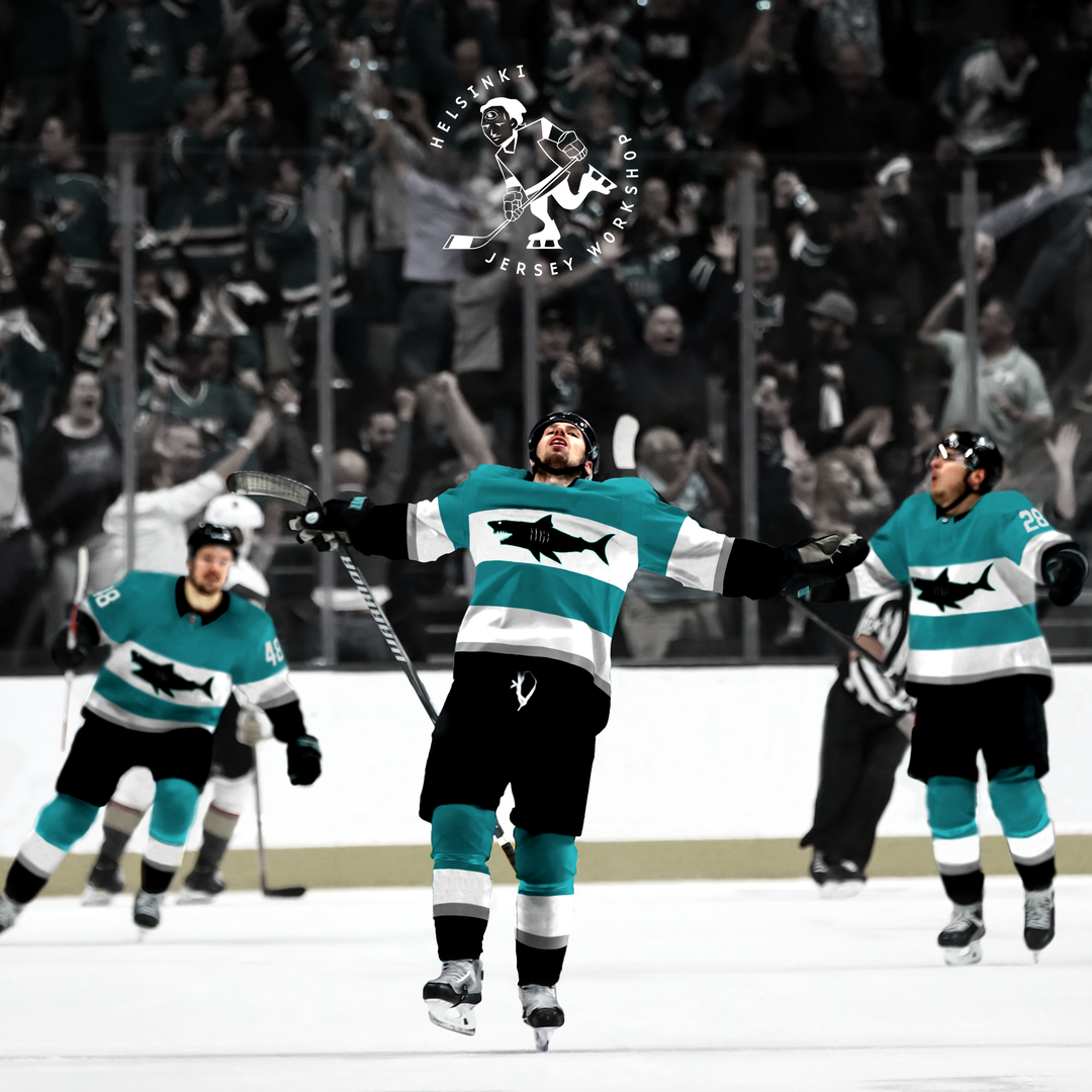
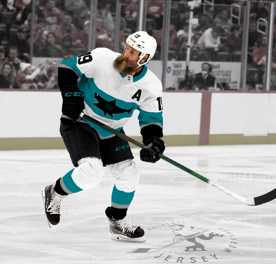
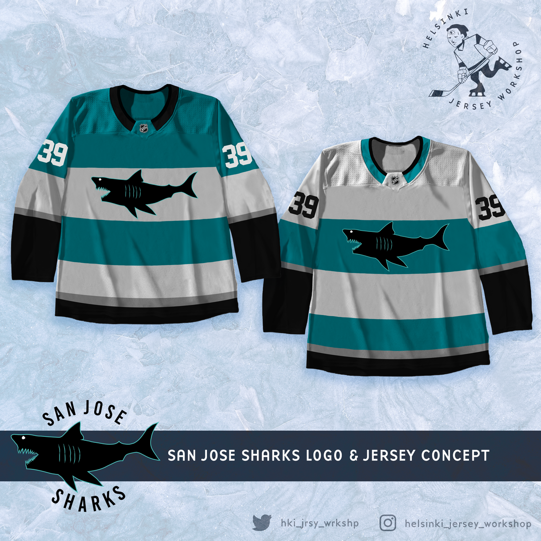
Salut les fans des Sharks. Ici, un graphiste basé à Helsinki – bouleversant à tour de rôle les fans de la LNH en réinventant les designs de leurs équipes bien-aimées. Les Sharks ont l’une des marques visuelles les plus cool du sport – j’ai essayé de trouver quelque chose qui soit peut-être une fraction aussi agréable. Qu’est-ce que tu penses?
—
helsinkianthropoid
32 Comments
I actually really like the stripes look. Not a big fan of that shark but it’s a solid looking jersey design imo
At first I thought “oh god what an abomination” but on further viewings it’s not too bad. I mean it looks a little off because of the photoshop into the actual jerseys but I’m kinda digging the full body shark. It reminds me of the full desert dog logo the Coyotes had. I’m not the biggest fan of horizontal stripes/blocks and I wonder what these would look like on a full teal background. I’ll add the caveat that I’m not a graphic designer nor can I draw anything even resembling a straight line
These are nicer than the ’15 Stadium Series Jerseys
I love this
Love it!
If he’s trying to upset us, all he had to do was paint our helmets gold.
I don’t hate the jersey design but that logo is a big OOF
Definitely fractionally as cool. Spot on!
Not going for insult, just agreement and accuracy.
Nice to hear people in Helsinki think our logo and branding is one of the coolest in the NHL.
[Menacing and terrifying for over a decade](https://www.youtube.com/watch?v=GCpKp73kJtI)
Are you fucking kidding me? I’d buy one of these in a heartbeat.
The logo makes me laugh, I love it
These jerseys are amazing!! I’d buy these in a heartbeat
I’m actually liking those rugby teal stripes
It’s a lot better than the all teal look this season
It looks like the media department had massive budget cuts and the designers had to download one of those free design programs that’s like a step above Microsoft paint.
I like it!!
Hi. Actual graphic designer here.
Concept is fine. We forgive your slightly crude shark, as I know you weren’t going to spend hours on it just to get your point across.
A couple things to improve:
1. Most logos face to the right, implying forward motion. Left can feel backwards.
2. Too little difference between the home and aways. Similar to that point, neither jersey has a hero color. Teal, white, and black have a strong presence on both. You should choose a primary color for each and use the other two colors (plus silver) as supports.
Keep designing!
It is good? No. But do I hate it? Also no. I guess you could say I’m pleasantly indifferent.
these look solid, love the striping, the contrast is nice, the logo kinda feels like something the nhl would break out in an outdoor game though, good job
I love the laughing shark!
Happy to see Jumbo back in teal!
I don’t love these, but I don’t hate them either. 7/10
Uh this is actually amazing
I actually like this
I like them. If Seattle isn’t going to use their traditional green barber pole jerseys, San Jose should.
NHL 95 create a jersey
Jesus. It looks like you genuinely hate the Sharks and tired to put in as little effort as possible. That logo is egregious in the worst way possible.
The home one would be a great fauxback.
I freaking love it. The stripes are awesome and the logo doesn’t take itself too seriously but it’s still cool. These are really great.
Logo is EA level, but other than that don’t hate the stripes
I would hate it if these were our regular home/away jerseys.
But I would absolutely love them as an outdoor or special occasion one off.
They are horribly excellent.
Dope
i’d actually wear that lol