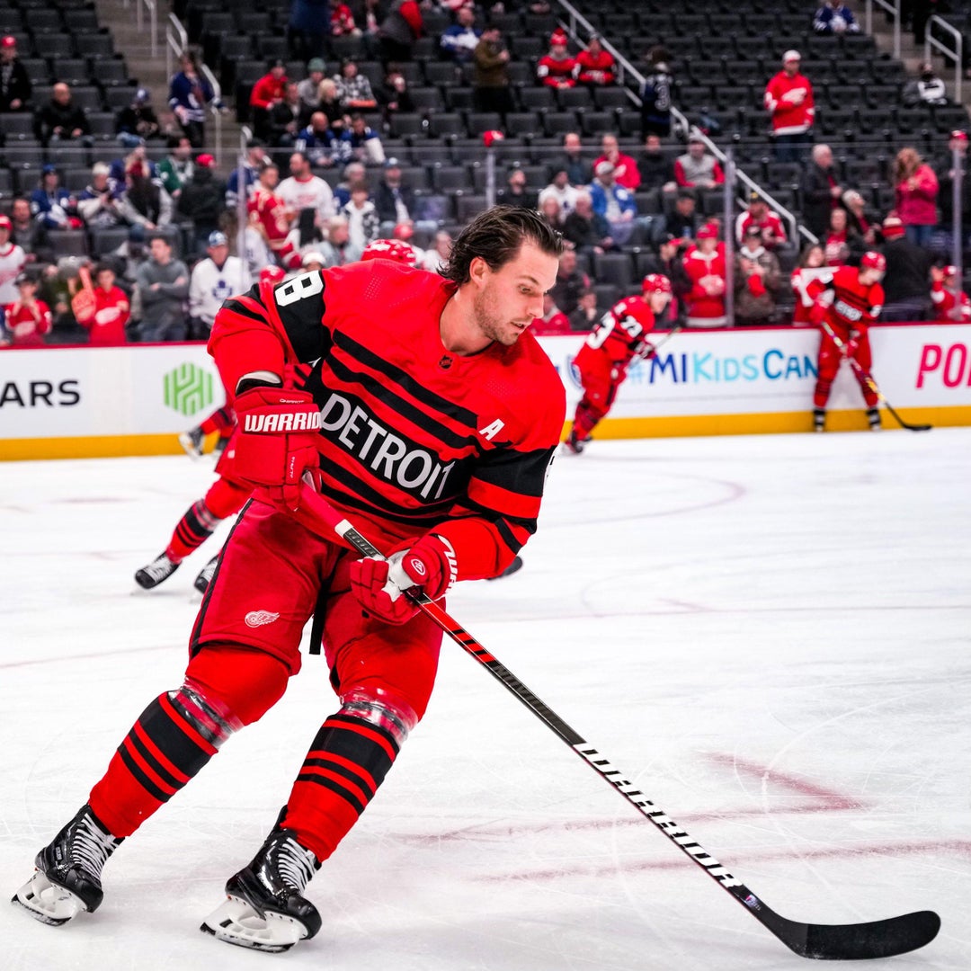
I wasn’t a fan upon initial reveal but they’ve grown on me. Owning one and seeing it as a full uniform with the white numbers looks pretty solid. Compared to the last RR, this one is actually being marketed through the team’s social media and they’re even sharing player reactions to them. At least they’re confident in the design choice this time.
I still wish the stripes were white.
TheToeTag
I’m not even a Red Wings fan but I’m kind of offended they would ruin that classic Red Wings look by using black on their jerseys.
PrimisClaidhaemh
I have to admit, that since the initial reveal, until now…
…I still think they’re ugly and I find them embarrassing. Like God, why are they making them go out into the ice wearing *those*?…
thatsong
Needs more stripes
dsjunior1388
The tacky little details make it worse.
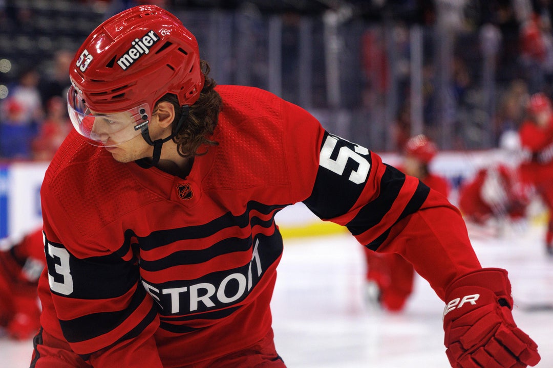
The black loops and strap on the helmet, black stripe on the pants and especially the black background making the Meijer ad stand out more just make this look so much more shitty.
humorous_
Okay I’m convinced now: the socks complete the look and make the sweaters look even better
Firebitez
Its not that they are bad on there own its that the potential for much better is there.
TheCarrier89
They’re actually kind of cool. I wouldn’t want them to be any more than a reverse retro but they aren’t as bad as I initially thought. The pants and socks definitely complete the look.
HillariousRodham
I predict this monochromatic trend – in increasingly brighter & brighter colors – will start popping up in NHL a lot more, like it did in NFL a few seasons back and college ball before that.
Looks sick tho, I’m on board.
twilz
Coke Zero.
ProfessorBaxter
Like Chicago’s but even worse. Just has the name of the city and no logo which is boring, and then all those unnecessary stripes bring it down another notch.
Jay105
I like that better than Chicago’s
IEatSkeletons
I think it looks great. I know people are usually grumpy about black and with changing up classic looks. But man, for one limited use jersey, this is fantastic
leflur
Love it!
Mackee58
I like them. I just wish they had the same style numbers as their regular sweaters.
aircavrocker
They look like the bad guys in an 80s hockey movie
Stubbly_Poonjab
a sweater that looks like a sweater
Tokasmoka420
*Hear me out, what if we created a jersey with just stripes?*
facefear
Looks better than i thought. Strange seeing black on a detroit jersey tho.
slabby
I hate it.
Avs_Leafs_Enjoyer
Better in person but still bad
mcleary82
These really suck. I love red/black but they really phoned it in here.
RingRingBananaPwn
Probably the Hurricanes fan in me, but I dig the red, black and white. Clean look here fam
Gillz13
What is this
ChapelHeel66
I like.
Aezetyr
Yeah after this game, I’ll be happy to never see them again. Those jerseys are terrible.
BEzzzzG
Detroit lines
onlinepresenceofdan
They should play chicago in reverse retro battle.
Joshottas
Whoooo buddy. These are 🔥
albertogonzalex
If Jack White wasnt on the ice to do the national anthem, someone on their marketing team needs to be fired.
3OrangeWhip
Good thing the weren’t playing Chicago in their RRs. Yeeesh.

41 Comments
Actually looks kind of sweet
I wasn’t a fan upon initial reveal but they’ve grown on me. Owning one and seeing it as a full uniform with the white numbers looks pretty solid. Compared to the last RR, this one is actually being marketed through the team’s social media and they’re even sharing player reactions to them. At least they’re confident in the design choice this time.
I still wish the stripes were white.
I’m not even a Red Wings fan but I’m kind of offended they would ruin that classic Red Wings look by using black on their jerseys.
I have to admit, that since the initial reveal, until now…
…I still think they’re ugly and I find them embarrassing. Like God, why are they making them go out into the ice wearing *those*?…
Needs more stripes
The tacky little details make it worse.
The black loops and strap on the helmet, black stripe on the pants and especially the black background making the Meijer ad stand out more just make this look so much more shitty.
Okay I’m convinced now: the socks complete the look and make the sweaters look even better
Its not that they are bad on there own its that the potential for much better is there.
They’re actually kind of cool. I wouldn’t want them to be any more than a reverse retro but they aren’t as bad as I initially thought. The pants and socks definitely complete the look.
I predict this monochromatic trend – in increasingly brighter & brighter colors – will start popping up in NHL a lot more, like it did in NFL a few seasons back and college ball before that.
Looks sick tho, I’m on board.
Coke Zero.
Like Chicago’s but even worse. Just has the name of the city and no logo which is boring, and then all those unnecessary stripes bring it down another notch.
I like that better than Chicago’s
I think it looks great. I know people are usually grumpy about black and with changing up classic looks. But man, for one limited use jersey, this is fantastic
Love it!
I like them. I just wish they had the same style numbers as their regular sweaters.
They look like the bad guys in an 80s hockey movie
a sweater that looks like a sweater
*Hear me out, what if we created a jersey with just stripes?*
Looks better than i thought. Strange seeing black on a detroit jersey tho.
I hate it.
Better in person but still bad
These really suck. I love red/black but they really phoned it in here.
Probably the Hurricanes fan in me, but I dig the red, black and white. Clean look here fam
What is this
I like.
Yeah after this game, I’ll be happy to never see them again. Those jerseys are terrible.
Detroit lines
They should play chicago in reverse retro battle.
Whoooo buddy. These are 🔥
If Jack White wasnt on the ice to do the national anthem, someone on their marketing team needs to be fired.
Good thing the weren’t playing Chicago in their RRs. Yeeesh.
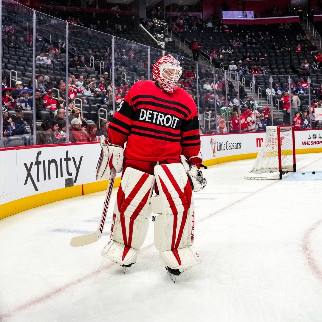
I wish Husso had made a red and black version of the [minimalistic mask he wore last year](https://media.gettyimages.com/id/1240453107/photo/ville-husso-of-the-st-louis-blues-defends-his-net-against-the-minnesota-wild-in-the-second.jpg?s=612×612&w=0&k=20&c=TEwgRh5UR2o2dbRisCDepiIwmwHWu5T6FSMlAka5upw=) to go along with these jerseys.
Sharks still win so far this year for retro
We are the red crayon from [this set](https://photos1.blogger.com/blogger/6826/1813/1600/000_0005.jpg), you cannot convince me otherwise.
These look great! They didn’t grab me at first, but I’ve grown to love them.
I oddly like this
[No sir, I don’t like it.](https://youtu.be/cDGlN6mluGA)
The font seems off for some reason. Too modern? Computer-y?
Boring
L