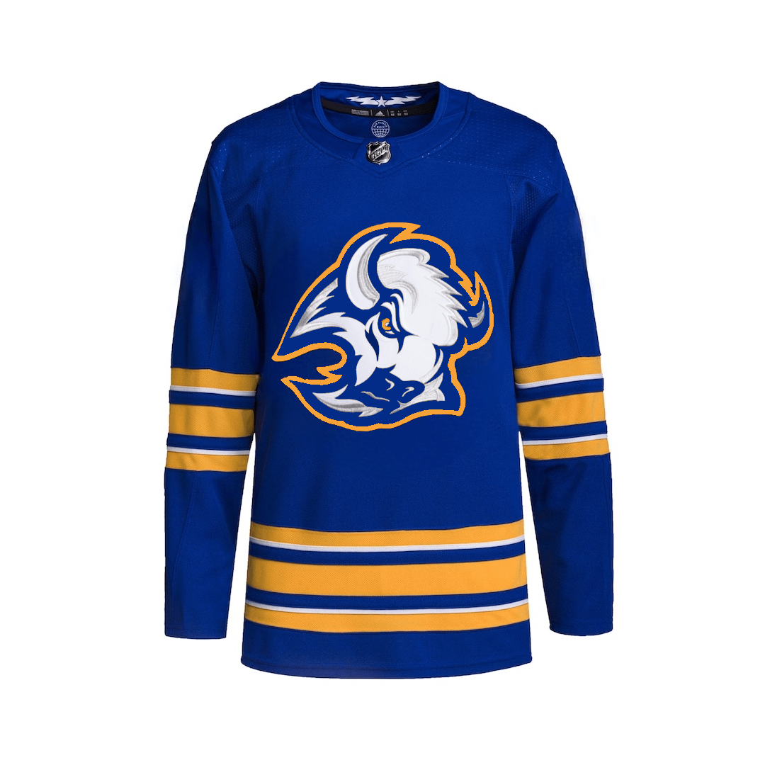
Fuck no. The classic royal blue and gold Sabres unis are awesome just as they are.
GrandpaMofo
NO.
PhilG1989
As a bruins fan I’ve always loved the “goat head” buuuut their not called the Buffalo Bison sooooo it doesn’t really make sense
khutuluhoop
I like the goathead, bring back the black and red too
TyWebbTheLegend
There needs to be at least one sabre on a Sabres jersey.
dylanknez
Why do people call it a goat head? That is not a goat
4merican_Gopnik
looks a lot like Dinamo Minsk, I like it!
IsstvanIII
It’s only cool in black n red
daboot013
Yes yes yes. Bring back the black jersey
nicksj2023
Yes
Otterslayer22
Yes
Zealousideal-Bat8242
as a buffalo fan, they should be wearing the black goat head as their permanent home sweaters. the place is absolutely electric when they wear them and all the guys play with some kind of satanic fire in their belly when they wear them.
the royal blue should be the alternate and the logo should be the 90s swords logo
JeffersonStarscream
No. It’s perfect as is. Blue and gold primary and black and red as the alternate for 10-15 games a year. Best of both worlds.
jarpio
No. But they should keep it around because it’s fun to mix things up.
I think every team should have as many jerseys and uniforms as possible and wear them as often as possible. I see no downside to it. People love jerseys, they’ll buy them. Suppliers can ramp up production. They’re making blanks after all. Equipment managers are the ones sewing names and numbers on
SaturnDE
I really like the logo
mehrt_thermpsen
Nah, the regular Sabres jersey is top 5 in the league imo
jstols
I’ve never understood this. The team is called the Buffalo Sabres not the Buffalo Buffalo. This would be like if the LA Kings had an Angel on their sweaters instead of a crown.
mattcojo2
No. What they’ve got is perfect.
the_trump
No. People got sick of the black and red until it was gone and nostalgia set in. The logo is only cool on the black and red jerseys and is a PERFECT alternate jersey for a team.
In fact more teams should use a completely different color scheme for alternates.
Rashnakk
I prefer this, but the shoulders should have the sabre logo
Different_Cod_1394
I like lots of them. Mix it up
NefCanuck
Nope, always thought it was a ridiculous idea to have that bison head as a logo considering the name of the team 🤷♂️
theManWOFear
This is a beautiful third jersey that should be worn every season. However, I am huge fan of their current threads, especially the whites.

28 Comments
No
bring back the goathead
Fuck no. The classic royal blue and gold Sabres unis are awesome just as they are.
NO.
As a bruins fan I’ve always loved the “goat head” buuuut their not called the Buffalo Bison sooooo it doesn’t really make sense
I like the goathead, bring back the black and red too
There needs to be at least one sabre on a Sabres jersey.
Why do people call it a goat head? That is not a goat
looks a lot like Dinamo Minsk, I like it!
It’s only cool in black n red
Yes yes yes. Bring back the black jersey
Yes
Yes
as a buffalo fan, they should be wearing the black goat head as their permanent home sweaters. the place is absolutely electric when they wear them and all the guys play with some kind of satanic fire in their belly when they wear them.
the royal blue should be the alternate and the logo should be the 90s swords logo
No. It’s perfect as is. Blue and gold primary and black and red as the alternate for 10-15 games a year. Best of both worlds.
No. But they should keep it around because it’s fun to mix things up.
I think every team should have as many jerseys and uniforms as possible and wear them as often as possible. I see no downside to it. People love jerseys, they’ll buy them. Suppliers can ramp up production. They’re making blanks after all. Equipment managers are the ones sewing names and numbers on
I really like the logo
Nah, the regular Sabres jersey is top 5 in the league imo
I’ve never understood this. The team is called the Buffalo Sabres not the Buffalo Buffalo. This would be like if the LA Kings had an Angel on their sweaters instead of a crown.
No. What they’ve got is perfect.
No. People got sick of the black and red until it was gone and nostalgia set in. The logo is only cool on the black and red jerseys and is a PERFECT alternate jersey for a team.
In fact more teams should use a completely different color scheme for alternates.
I prefer this, but the shoulders should have the sabre logo
I like lots of them. Mix it up
Nope, always thought it was a ridiculous idea to have that bison head as a logo considering the name of the team 🤷♂️
This is a beautiful third jersey that should be worn every season. However, I am huge fan of their current threads, especially the whites.
This with the current logo on the shoulders
No
No. It’s ugly