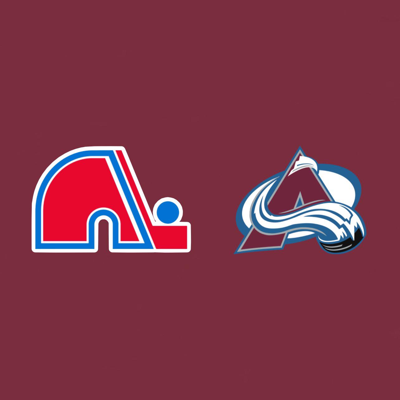
Old. Hasn’t been in the league in 30 years and it’s still iconic.
cam_huskers
I honestly think if the current logo wasn’t great, we would have reverted to the Nordiques logo.
The current logo is clean, unique colors, and has 3 cups associated with it. I’m sticking with it.
GlitteredRoomForView
Waiting for someone to say they never realized the N also doubles as an igloo.
Or have their minds blown the avalanche falling down the A is also a C for Colorado
gentleman_bronco
Old.
Mr_Sausage__
There’s only one Colorado logo here. The other is a Quebec logo.
TucsonTacos
I’m gonna come out and say it.
It might be nostalgic but the Nordiques logo is ugly af
The fleur on the shoulders was cool though
Yung_Corneliois
New.
The Nordiques logo is fun because it’s an old throwback but without nostalgia glasses the logo is mid. There’s a reason they were going to rebrand to a Wolf.
I’ll take my downvotes.
ThisGuyRight__Here
They’re not the same team.
OhmyGhaul
Yeah this isn’t entirely accurate. It’s like saying the Thrashers logo is an older version of the Jets logo.
🤔
skeezoydd
The new ones sick. Clean af
KeyserSoze_atlarge
Have the Avs ever done a throwback night and suited up with the Nord logo?
yemx0351
Hard to compare as they are not an updated logo it’s a complete change of a team that moved.
Both are cool. One is a failed/ moved franchise with lots of nostalgia.
New is existing and has built its own history and nostalgia.
I like the new one.
I do like alternate or throwbacks.
mojo_rasin
Aw that’s not fair.
CitizenNaab
Both ❤️
glitchycat39
Are they in Quebec? If no, then the new logo.
dbag3o1
Only one where there’s no wrong answer.
ViacomCEO
I think the avalanche logo is terrible
Constant_Cucumber689
New
Vault204
I love both!
GroundbreakingCow775
In a perfect world we have both teams
Absurdity-is-life-_-
As an Avs fan I really like the alternative logo.
CallMeTeff
Always hated the Nordiques logo. Always thought it was ugly. Uniform colors and everything else. But when they did the reverse retro with this logo along with the Avs colors, it was perfection, almost reconcile me with the logo.
So, to answer the question, I have to say new.
Sparrowhawk996
It would be one thing if you compared the Yeti foot to the ‘C’ but there’s only one Avalanche logo here
Nashtak
Nordiques is iconic, but the A is a better design imo
69dawgystyle69
two classic looks, two different teams
headerman420
I think the Avalanche logo is fine, albiet a little busy, but the Nordiques logo was so of its time it can’t not be cool.
idislikehate
Obviously only one of these is actually a Colorado logo but the Nordiques logo is one of the worst in sports history. People love it for fake nostalgia that doesn’t actually exist.

28 Comments
Nordiques
Old. Hasn’t been in the league in 30 years and it’s still iconic.
I honestly think if the current logo wasn’t great, we would have reverted to the Nordiques logo.
The current logo is clean, unique colors, and has 3 cups associated with it. I’m sticking with it.
Waiting for someone to say they never realized the N also doubles as an igloo.
Or have their minds blown the avalanche falling down the A is also a C for Colorado
Old.
There’s only one Colorado logo here. The other is a Quebec logo.
I’m gonna come out and say it.
It might be nostalgic but the Nordiques logo is ugly af
The fleur on the shoulders was cool though
New.
The Nordiques logo is fun because it’s an old throwback but without nostalgia glasses the logo is mid. There’s a reason they were going to rebrand to a Wolf.
I’ll take my downvotes.
They’re not the same team.
Yeah this isn’t entirely accurate. It’s like saying the Thrashers logo is an older version of the Jets logo.
🤔
The new ones sick. Clean af
Have the Avs ever done a throwback night and suited up with the Nord logo?
Hard to compare as they are not an updated logo it’s a complete change of a team that moved.
Both are cool. One is a failed/ moved franchise with lots of nostalgia.
New is existing and has built its own history and nostalgia.
I like the new one.
I do like alternate or throwbacks.
Aw that’s not fair.
Both ❤️
Are they in Quebec? If no, then the new logo.
Only one where there’s no wrong answer.
I think the avalanche logo is terrible
New
I love both!
In a perfect world we have both teams
As an Avs fan I really like the alternative logo.
Always hated the Nordiques logo. Always thought it was ugly. Uniform colors and everything else. But when they did the reverse retro with this logo along with the Avs colors, it was perfection, almost reconcile me with the logo.
So, to answer the question, I have to say new.
It would be one thing if you compared the Yeti foot to the ‘C’ but there’s only one Avalanche logo here
Nordiques is iconic, but the A is a better design imo
two classic looks, two different teams
I think the Avalanche logo is fine, albiet a little busy, but the Nordiques logo was so of its time it can’t not be cool.
Obviously only one of these is actually a Colorado logo but the Nordiques logo is one of the worst in sports history. People love it for fake nostalgia that doesn’t actually exist.