They should have done the fisherman in the original colors.
Roguemutantbrain
I like some of the ideas in the new one but Jesus is it a mess. The metro logo that’s not quite the metro logo. The uneven “y” hockey stick, the general balance of it all being a little off to the left. I sort of like that it points to the arena, but it feels like it’s trying to do way too much and is only half successful at any of it.
It is recognizable tho so I’ll give it thay
TheIncredibleHork
I’m a jerk. I want them to go back to the Gorton’s Fisherman because I think it looks stupid and I like calling them fishsticks. In playful rivalry jest, not serious hate of course.
But if I’m being fair, the traditional Long Island logo is a classic and it’s the better one.
headerman420
I always did like the I KNOW WHAT YOU DID LAST SUMMER killer logo.
Fatboiii_69
I’ve seen the fisherman get so much hate but I think it’s fucking great honestly.
replayer
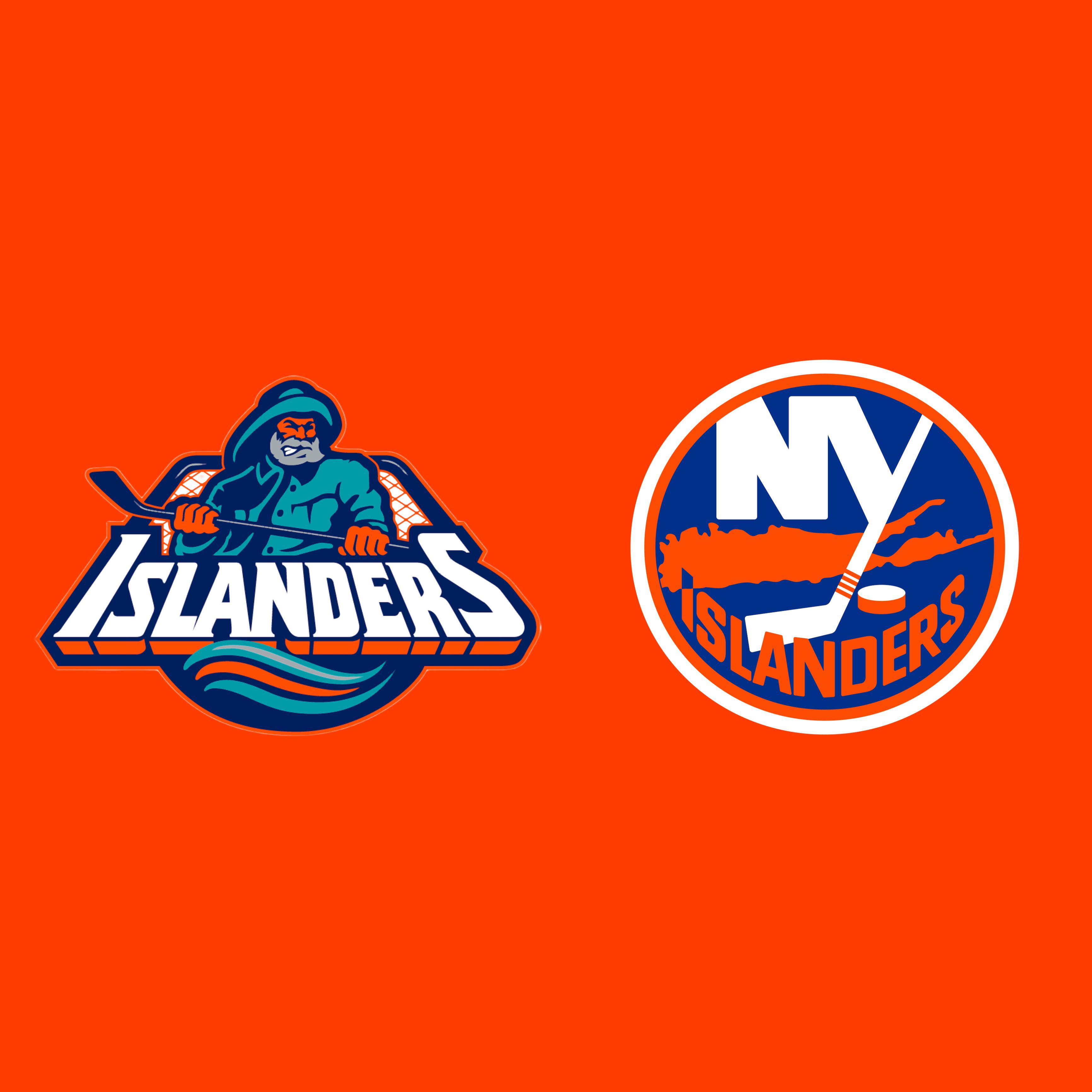
The fisherman is the « new » logo. The other Island logo has been mostly unchanged since 1972, and was only replaced for a couple seasons.
ToweringIsle27
The old new one, or the new old one?
Fit_Use9941
I’m probably in the heavy minority here but I love their current logo
Yung_Corneliois
I genuinely think the new logo is my least favorite in American Sports atm. Every aspect of it is hideous and poorly designed.
ConstructionOk765
One of the few times that both logos are good but I’ll go new because it has 4 cups on it
Usual-Environment-49
Old
zachofalltrades47
FISH STICKS
GoRangers5
I kinda like the fisherman logo, the real cardinal sins of those uniforms were the crooked names and numbers on the back.
Pip_n_Piper
Move the team and get a new logo.
StumptownRetro
I love the fisherman
theManWOFear
Like the Penguins, I think both logos are great. Old Gordon shouldn’t be used all the time, but he should have a consistent presence every season.
BlurTriX
Idk but they need a new logo in general lol
gdoubleyou1
I’d like to see them merge their current logo with the fisherman uniform.
BubbaSpanks
I like the original…the fish sticks should always be the alternate
jwt6577
Liking the fisherman’s logo is a sign of mental illness.
DarthCraw
I know what you did with the last logo?
Neilpuck
No one under the age of 40 should be allowed to post these. Or at the very least do a full dive on the history of the logos of any particular team before posting an original logo and calling it the new one.
silentswift7
Leafs fan here but the fisherman is my god damn childhood!
LarryD217
I like the fisherman
suckmyfuq69
The Fisherman is dope
Psychological_Buy385
Actual Isles fan here: old but the new Bridgeport alternates are on point.
x_BLACKSWAN_x
Neither, both aren’t great. Fisherman is better than the other but it’s not good by any means.
mysteresc
Trust the Gotham Fisherman
dbag3o1
I can’t decide, help!
FreshOutOfTheAsylum
The old! Unpopular opinion but I love it so much!
potato_soup303
The fisherman might be the coolest logo in NHL history. I freaking love it!
SpecialistShop5733
Don’t like the Islanders but gotta go with the old one.

41 Comments
New!!
https://i.imgur.com/DMk7wn6.png
Old. The fisherman is legendary
The new old one is a classic
We
Want
Fishsticks
They should have done the fisherman in the original colors.
I like some of the ideas in the new one but Jesus is it a mess. The metro logo that’s not quite the metro logo. The uneven “y” hockey stick, the general balance of it all being a little off to the left. I sort of like that it points to the arena, but it feels like it’s trying to do way too much and is only half successful at any of it.
It is recognizable tho so I’ll give it thay
I’m a jerk. I want them to go back to the Gorton’s Fisherman because I think it looks stupid and I like calling them fishsticks. In playful rivalry jest, not serious hate of course.
But if I’m being fair, the traditional Long Island logo is a classic and it’s the better one.
I always did like the I KNOW WHAT YOU DID LAST SUMMER killer logo.
I’ve seen the fisherman get so much hate but I think it’s fucking great honestly.
The fisherman is the « new » logo. The other Island logo has been mostly unchanged since 1972, and was only replaced for a couple seasons.
The old new one, or the new old one?
I’m probably in the heavy minority here but I love their current logo
I genuinely think the new logo is my least favorite in American Sports atm. Every aspect of it is hideous and poorly designed.
One of the few times that both logos are good but I’ll go new because it has 4 cups on it
Old
FISH STICKS
I kinda like the fisherman logo, the real cardinal sins of those uniforms were the crooked names and numbers on the back.
Move the team and get a new logo.
I love the fisherman
Like the Penguins, I think both logos are great. Old Gordon shouldn’t be used all the time, but he should have a consistent presence every season.
Idk but they need a new logo in general lol
I’d like to see them merge their current logo with the fisherman uniform.
I like the original…the fish sticks should always be the alternate
Liking the fisherman’s logo is a sign of mental illness.
I know what you did with the last logo?
No one under the age of 40 should be allowed to post these. Or at the very least do a full dive on the history of the logos of any particular team before posting an original logo and calling it the new one.
Leafs fan here but the fisherman is my god damn childhood!
I like the fisherman
The Fisherman is dope
Actual Isles fan here: old but the new Bridgeport alternates are on point.
Neither, both aren’t great. Fisherman is better than the other but it’s not good by any means.
Trust the Gotham Fisherman
I can’t decide, help!
The old! Unpopular opinion but I love it so much!
The fisherman might be the coolest logo in NHL history. I freaking love it!
Don’t like the Islanders but gotta go with the old one.
Fisherman is good as a alt, not a main
Old logo for sure
Both are terrible
The top of the ‘I’ points to where the arena is.