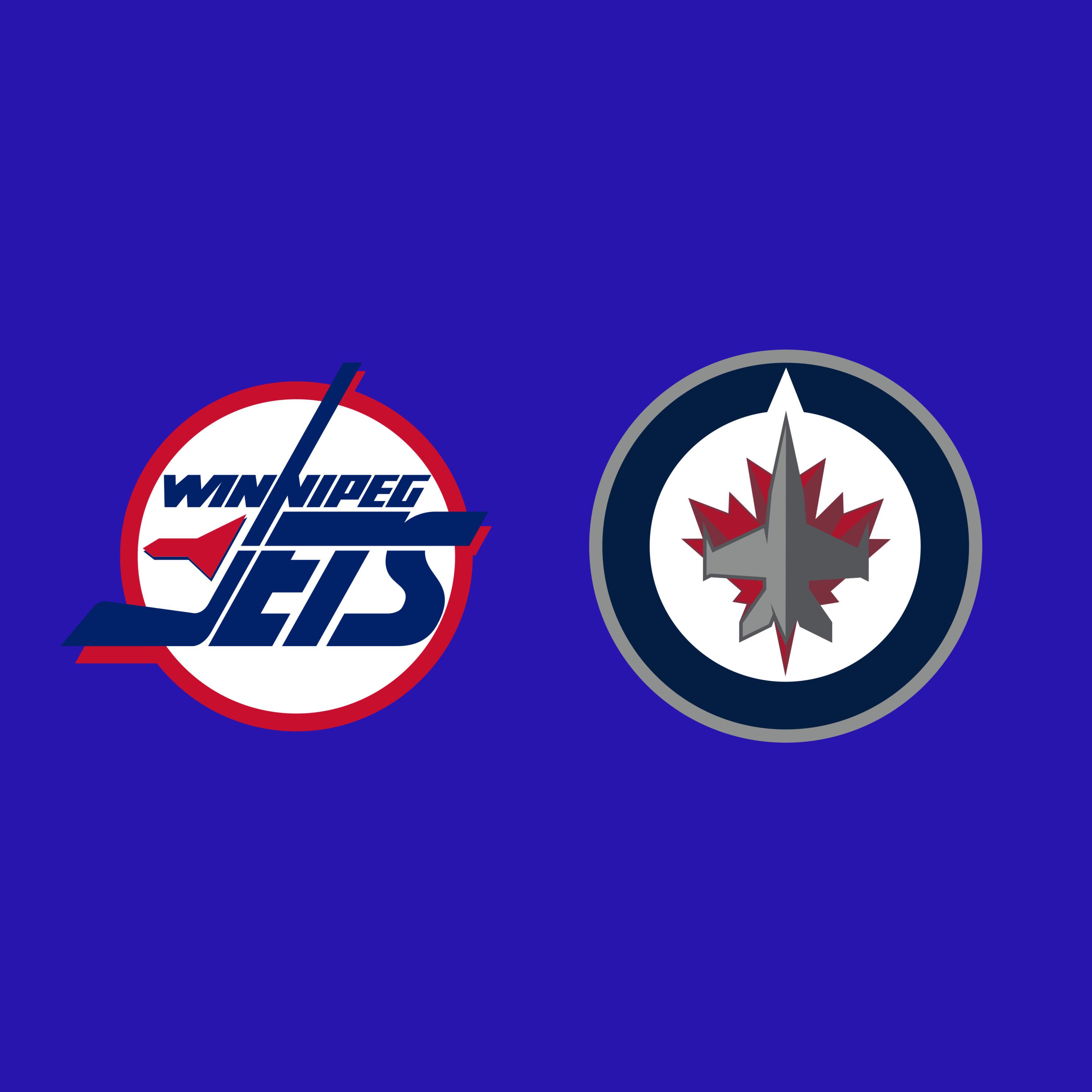
New. I know everyone finds the new one bland but it’s just so clean and I find the text on the old really tacky (though in general I don’t like text on major league logos. Half the teams in the MLB is just picking a font and using the capital letter to represent their teams yuck)
Particular_Tutor_46
New but, I’d really like new with the old
colors.
BubbaSpanks
Old
MrBohannan
Old 100%.
TUNA-19
When the new logo came out I was all about the old one for years but now looking at it 10+ years later, I actually really like the new one much better
Randy_Butternubs666
Old old old old old old old old
TJTrapJesus
Don’t care for either tbh, if you were to somehow remove nostalgia from the equation don’t think the old would hold up nearly as well as other logos of that time like the Whalers/Nordiques, etc. I do kind of like the compass/True North aspect of the new one, even if I don’t love it as a whole ( I just don’t think the jet/maple leaf overlay works that well, and don’t like how dark of blue they went). New, I guess
tomplum68
the old all the way
GoRangers5
Old, I like any logo that includes a hockey stick.
cheezturds
Old with new colors. Use new as a shoulder patch.
murphydcat
New is boring AF. Looks more like something the RCAF would wear rather than a hockey club. Gimme the old logo any day.
stankonia1988
Definitely prefer the old, but the new with old colors might change my mind
Educational_Hat_
I like the concept of the new one but its so bland. Old one isn’t much better
LouisWu987
I prefer the original logo, where the stick was still all inside the circle.
After that, the new one, then the one pictured above. I like it the least because it reminds me of Tkachuk.
Persianx6
Old, that logo FUCKS.
LogieThePerogie
Old logo
jarpio
I love all 3 jets logos
Marquis-Lafayette
The old one
Chewie_i
The new one is better. People just like the old one because nostalgia.
Frankankankankank
Old and it was never even close
Pretend-Cow2516
New one because I think the incorporation of the Royal Canadian Air Force’s logo is cool, but the old coloring and those heritage classic uniforms are just 🤌 makes it hard to choose. I think their best option is to roll with both, make either an alternate.
I think they do need to refresh their main uniforms though if they continue to use the current logo.
outofdate70shouse
Old 100%
hackmastergeneral
Go even farther back to the Jets original NHL logo. That’s the good shit!
lurkns
Old easy
Petrol1991
I like both, but old
igirisujin
Old. Newer one is dreadful, looks like something a 12 year old designed for their Command & Conquer strike team.
ziggyjoe212
New. Too many people like old ones. Nostalgia is only worth so much.

31 Comments
New but only because I love planes
Old and personally, I don’t think it’s close
Old is very dated so I’m going new
New
New. I know everyone finds the new one bland but it’s just so clean and I find the text on the old really tacky (though in general I don’t like text on major league logos. Half the teams in the MLB is just picking a font and using the capital letter to represent their teams yuck)
New but, I’d really like new with the old
colors.
Old
Old 100%.
When the new logo came out I was all about the old one for years but now looking at it 10+ years later, I actually really like the new one much better
Old old old old old old old old
Don’t care for either tbh, if you were to somehow remove nostalgia from the equation don’t think the old would hold up nearly as well as other logos of that time like the Whalers/Nordiques, etc. I do kind of like the compass/True North aspect of the new one, even if I don’t love it as a whole ( I just don’t think the jet/maple leaf overlay works that well, and don’t like how dark of blue they went). New, I guess
the old all the way
Old, I like any logo that includes a hockey stick.
Old with new colors. Use new as a shoulder patch.
New is boring AF. Looks more like something the RCAF would wear rather than a hockey club. Gimme the old logo any day.
Definitely prefer the old, but the new with old colors might change my mind
I like the concept of the new one but its so bland. Old one isn’t much better
I prefer the original logo, where the stick was still all inside the circle.
After that, the new one, then the one pictured above. I like it the least because it reminds me of Tkachuk.
Old, that logo FUCKS.
Old logo
I love all 3 jets logos
The old one
The new one is better. People just like the old one because nostalgia.
Old and it was never even close
New one because I think the incorporation of the Royal Canadian Air Force’s logo is cool, but the old coloring and those heritage classic uniforms are just 🤌 makes it hard to choose. I think their best option is to roll with both, make either an alternate.
I think they do need to refresh their main uniforms though if they continue to use the current logo.
Old 100%
Go even farther back to the Jets original NHL logo. That’s the good shit!
Old easy
I like both, but old
Old. Newer one is dreadful, looks like something a 12 year old designed for their Command & Conquer strike team.
New. Too many people like old ones. Nostalgia is only worth so much.