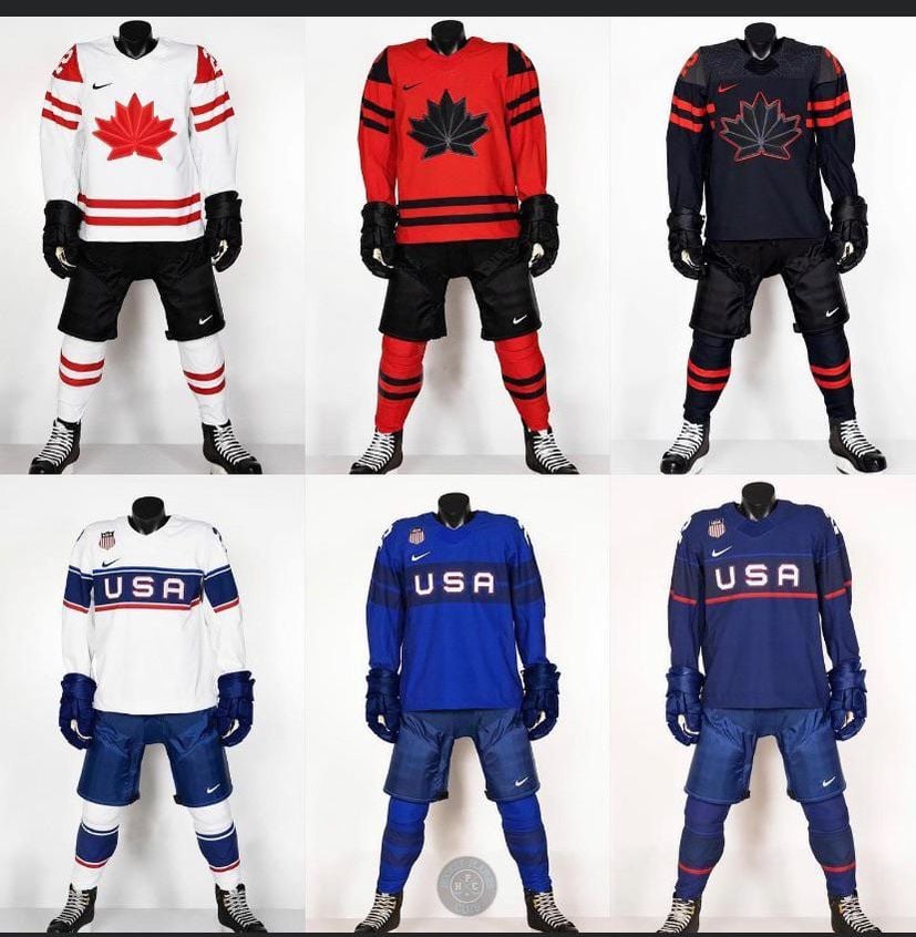
As great as Black and Red go together, I never understood why Team Canada has a black kit lol
Parking-League-3176
I miss the usa wavy flag logo
GoBirds_1933
Like Canada’s better
ChaoticKeys
I always feel like Team USA under uses red for their jerseys (in any sport). It’s just as big of a color in our flag but is never more than just a third/accent color.
M1ckyy_
I don’t really like any of these. Seems like they’re trying to make them look like soccer jerseys.
Lcmotiv
Canadian ones are beauts. USA looks like they are hopping back to the 40s and 50s in true USA fashion.
PsychoWarper
Team Canada’s looks fantastic.
Team USA’s looks mid tbh.
_petasaurus_
Ooohhhhhhh, the black with red striping is hawt!
JadedCanuckFan
I would like to see the Canadian jerseys with the Pearson Pennant (google it) worked into the design.
ogfuelbone12
Ah, right, the turkey butthole. Forgot about that.
1&5 are sweet
Fisch_Man
The first uniforms for both are best.
Dry_Yam_8049
Nothing beats clean whites on both
KeyserSoze_atlarge
Team Canada for the win. Sorry, we tend to do that in hockey.
Nice participation though buds.
StumptownRetro
Team USA just need to go back to ripping off the Rangers jerseys like they did in the 80s.
Eaglejelly
Aren’t the next Winter Olympics in 2026? They are already releasing jerseys for them?
PlusCry1098
Where are the heads?
that_madcow
jesus those are some ugly jerseys
Kinda-Reddish
Usual Nike dreck.
_FlyingSquirrel
I must be getting old because I hate all six
JBerry_Mingjai
Isn’t this what they just wore at last Olympics?
_Retired_
I like both white jerseys. I very much dislike all 4 dark jerseys.
freestyle43
Cannot stand when Canada adds black to their kits. There is no black in the National colors. God forbid they add some blue for the French.
Imagine if USA had a jersey that was all black with a red « USA ». It looks just as stupid when Canada always does it.
Npucks
Those are from the last olympics.
Rustyz_
These kind of all are ass
Wizdad-1000
Not a fan of the Canadian team logo. The 3D Embossed maple leaf was better. Also the Niike white jefsey with black shoulders was cooler imho.
BlunGold
Once you go black. You never go back.
Darth_Vicious
Still bitchin’
Yung_Corneliois
Am I the only one who likes the US one better?
tellurdogisayhello
Aren’t these the same as the last ones? I loved the look of team canada’s, and still do. Definitely gonna have to order me a red MacKinnon.
Sandbartender
Both are underwhelming. Did they borrow that leaf from the 1930s? Maple leafs make a great logo, somehow this doesn’t.
USA looks like they gave the job to a junior designer at 4 o’clock on a Friday and said get this done by days end, no OT. Actually both uniforms look that way.
jarbarf
Loving me some coke zero team canada jersey
No_Good2934
I like Canadas. USAs kinda suck. Just ugly letters saying USA… seems like it could be better.
mmpa78
Those Canada jerseys are probably the ugliest I’ve ever seen holy hell
PlatosCaveSlave
Beyond boring. Bring back the 80s style
Fox33__
Nice, they’re both shit 😀
ViacomCEO
That red Canada kit is dope as hell.
TheFederalRedditerve
Canada solos for sure.
dudebroguyman09
Forget the center jerseys for both teams. The wings are where it’s at.
KolhiiHead69
Would prefer white instead of black on the Red Canada jersey.
canchin
Never been a fan of a black logo on a black jersey. It doesn’t translate well on tv. Imagine how good the black kit would be if it had the red logo with black trim
naked_avenger
That middle blue for USA looks kind of uggo here but I bet will look incredible on the ice.

43 Comments
Team Canada uniforms are gorgeous.
As great as Black and Red go together, I never understood why Team Canada has a black kit lol
I miss the usa wavy flag logo
Like Canada’s better
I always feel like Team USA under uses red for their jerseys (in any sport). It’s just as big of a color in our flag but is never more than just a third/accent color.
I don’t really like any of these. Seems like they’re trying to make them look like soccer jerseys.
Canadian ones are beauts. USA looks like they are hopping back to the 40s and 50s in true USA fashion.
Team Canada’s looks fantastic.
Team USA’s looks mid tbh.
Ooohhhhhhh, the black with red striping is hawt!
I would like to see the Canadian jerseys with the Pearson Pennant (google it) worked into the design.
Ah, right, the turkey butthole. Forgot about that.
1&5 are sweet
The first uniforms for both are best.
Nothing beats clean whites on both
Team Canada for the win. Sorry, we tend to do that in hockey.
Nice participation though buds.
Team USA just need to go back to ripping off the Rangers jerseys like they did in the 80s.
Aren’t the next Winter Olympics in 2026? They are already releasing jerseys for them?
Where are the heads?
jesus those are some ugly jerseys
Usual Nike dreck.
I must be getting old because I hate all six
Isn’t this what they just wore at last Olympics?
I like both white jerseys. I very much dislike all 4 dark jerseys.
Cannot stand when Canada adds black to their kits. There is no black in the National colors. God forbid they add some blue for the French.
Imagine if USA had a jersey that was all black with a red « USA ». It looks just as stupid when Canada always does it.
Those are from the last olympics.
These kind of all are ass
Not a fan of the Canadian team logo. The 3D Embossed maple leaf was better. Also the Niike white jefsey with black shoulders was cooler imho.
Once you go black. You never go back.
Still bitchin’
Am I the only one who likes the US one better?
Aren’t these the same as the last ones? I loved the look of team canada’s, and still do. Definitely gonna have to order me a red MacKinnon.
Both are underwhelming. Did they borrow that leaf from the 1930s? Maple leafs make a great logo, somehow this doesn’t.
USA looks like they gave the job to a junior designer at 4 o’clock on a Friday and said get this done by days end, no OT. Actually both uniforms look that way.
Loving me some coke zero team canada jersey
I like Canadas. USAs kinda suck. Just ugly letters saying USA… seems like it could be better.
Those Canada jerseys are probably the ugliest I’ve ever seen holy hell
Beyond boring. Bring back the 80s style
Nice, they’re both shit 😀
That red Canada kit is dope as hell.
Canada solos for sure.
Forget the center jerseys for both teams. The wings are where it’s at.
Would prefer white instead of black on the Red Canada jersey.
Never been a fan of a black logo on a black jersey. It doesn’t translate well on tv. Imagine how good the black kit would be if it had the red logo with black trim
That middle blue for USA looks kind of uggo here but I bet will look incredible on the ice.
Are we back in 2022? « Upcoming ».