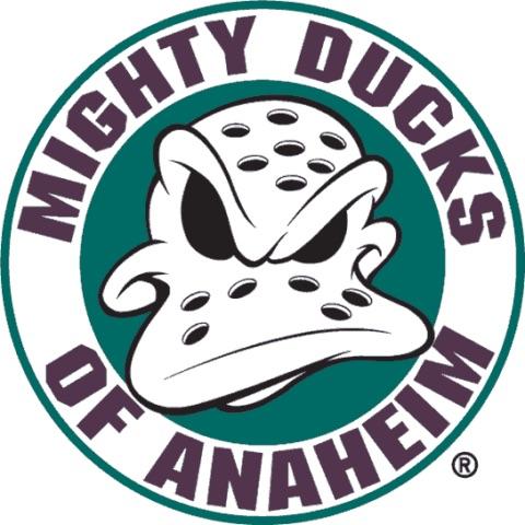
Anaheim is wearing this tonight, and I always thought the old logos were so damn cool. Made me curious what the fans think.
protein_extremist
not an anaheim fan, but i will say the older logo is cooler than the footprint, personally
Ecstatic-Sense5115
Not a ducks fan but, this is WAY better than the current logo.
Nismotech_52
If you don’t know Bombay, or the cartoon, this logo doesn’t hit the same…
FartfaceMacGee
As someone who was a kid in the 90’s, I might be biased, No question this is the better logo. Love the original colours and logo
comacove
there is only one ducks logo. it aint this, or their current monstrosity.
_5GOLDBLOODED2_
Nope
DirtlessEye
This one’s not bad – but I much prefer the one with the hockey sticks behind the mask
Neon_Sternum
TIL that it’s a fucking footprint
cha-cha_dancer
I guess I understand the rebrand since this style mask is basically like leather helmets in football now but dammit it looks good
NickFotiu
Does it really matter when you’re basically the Minnesota Mulans?
The-G-89
No.
Ballsahoy72
Swiss Cheese Monsters?
buckyhermit
Personally, I do like the footprint because it’s the logo for the team’s glory years. The MD logo had a lot of miserable years involved. I still have horrible memories of being mocked for being a « Disney team. »
Also, a « sea of orange » pops a lot more on HDTV than a sea of eggplant/jade.
I’m also not a fan of copy-and-paste designs from the past. However, I do love it when it’s a modern spin on an old look, so I love the 30th anniversary jerseys (and I also liked the 25th anniversary ones). I do NOT want to see them simply recycle the 1990s design.
And I do believe the Ducks need to refresh their look. The current home/away jerseys have run their course. I was hoping they’d promote their Reverse Retro 2.0 jerseys to full-time, with modern number fonts.
MtSilverR3d
I didn’t even know that’s what their current one was supposed to be
GroundbreakingCow775
Cake eaters
brandawesome
Nope… wish they would go back to the old color scheme and logo
iforgotguy
I was uninterested in hockey as a kid. My family was super into the habs and the blues (from different places you see), and I didn’t give a heck. I liked the mighty ducks for a solid 4-5 years solely on the movie recognition alone until I was old enough to actually understand the game.
CaptainSaladbarGuy
No we don’t like the duck foot. We all want the original logo back but the Samuelis have been cucking us for the last 7 seasons or so with the old logo. Make the ducks mighty again
Neteni_
my favorit is the small footprint with the ducks wordmark, but its probably bcs their jersey were really cool (2007-08 jersey)
tittyflavrdsprinkles
Footprint is the worst logo in the nhl
Hrenklin
I lived the origional eggplant and teal jerseys
reddest_of_trash
You need a Snickers, Donald?
DJP-MTL
Yes
TiredReader87
God, no
truemt1
I like the footprint D. I’m not a huge fan of the jersey design though. I would like to see a refresher there. Keep the side stripes since so few teams use it, but try to emphasize the wing effect on the sleeves a bit more?
People always want to go with nostalgia and revert to older stuff. Their new alt is a nice nod to the past while being new. It’s pretty cool. I don’t like it as much as the orange alt, but I like it more than if they went back to their classic jerseys.
dunkan799
No. We want the og eggplant and jade but we are okay with that logo. The webbed D is hated league wide but it’s only because we had such a great logo first otherwise it would be as forgettable as the wild’s logo. It’s okay but just not as good as the original
girhen
I’m pretty sure it’s about as close to universal as you get that no one likes the boomerang logo over the older Ducks logos. Cross sticks is better loved than this one though.
ArmFirm972
Ducks fan here. The vast majority of Ducks fans want the old school logo and colors back. The duck foot is not it. I haven’t met one Ducks fan that likes the D foot over the wild wing mask.
Waterbug314
The footprint lacks character. But the Mighty Ducks ones feel cartoony and overly nostalgic.
“Ducks” is a great team name, I wouldn’t mind seeing a new original kit / logo.
Complex-Tangerine628
Not a ducks fan but I think the duck foot is one of the best logos in the game. The jerseys tho? Need a refresh
Terrible-Option505
Why does it remind me of the Starbucks logo😂
CarIsson
No, I love this logo. Wish it was our home kit.
TexasYankee212
I like the old giant duck’s beak. That made them look nasty.
lostinrabbithole12
Not a ducks fan- but yes. I’m not a webfoot hater (hated the word mark on the jerseys though) but this rules.
Roddy_Piper2000
I fucking hated the « Disneyfication » of the NHL. If southern USians don’t want to watvlch hockey, that’s fine with me. Maybe it doesn’t *have to* be on par with the NBA or NFL. Maybe we just enjoy the game without the commercial bullshit.
Theglizzatron
This looks bland
nodnarb_thebarista
The footprint is the bane of our existence.
HeisenbergsSon
The footprint would be a great logo!(if the OG didn’t exist)
cgill24
The webbed foot needs to go. I don’t really like this new one, but it’s better than the D. Nothing beats the MD logo though.

40 Comments
Anaheim is wearing this tonight, and I always thought the old logos were so damn cool. Made me curious what the fans think.
not an anaheim fan, but i will say the older logo is cooler than the footprint, personally
Not a ducks fan but, this is WAY better than the current logo.
If you don’t know Bombay, or the cartoon, this logo doesn’t hit the same…
As someone who was a kid in the 90’s, I might be biased, No question this is the better logo. Love the original colours and logo
there is only one ducks logo. it aint this, or their current monstrosity.
Nope
This one’s not bad – but I much prefer the one with the hockey sticks behind the mask
TIL that it’s a fucking footprint
I guess I understand the rebrand since this style mask is basically like leather helmets in football now but dammit it looks good
Does it really matter when you’re basically the Minnesota Mulans?
No.
Swiss Cheese Monsters?
Personally, I do like the footprint because it’s the logo for the team’s glory years. The MD logo had a lot of miserable years involved. I still have horrible memories of being mocked for being a « Disney team. »
Also, a « sea of orange » pops a lot more on HDTV than a sea of eggplant/jade.
I’m also not a fan of copy-and-paste designs from the past. However, I do love it when it’s a modern spin on an old look, so I love the 30th anniversary jerseys (and I also liked the 25th anniversary ones). I do NOT want to see them simply recycle the 1990s design.
And I do believe the Ducks need to refresh their look. The current home/away jerseys have run their course. I was hoping they’d promote their Reverse Retro 2.0 jerseys to full-time, with modern number fonts.
I didn’t even know that’s what their current one was supposed to be
Cake eaters
Nope… wish they would go back to the old color scheme and logo
I was uninterested in hockey as a kid. My family was super into the habs and the blues (from different places you see), and I didn’t give a heck. I liked the mighty ducks for a solid 4-5 years solely on the movie recognition alone until I was old enough to actually understand the game.
No we don’t like the duck foot. We all want the original logo back but the Samuelis have been cucking us for the last 7 seasons or so with the old logo. Make the ducks mighty again
my favorit is the small footprint with the ducks wordmark, but its probably bcs their jersey were really cool (2007-08 jersey)
Footprint is the worst logo in the nhl
I lived the origional eggplant and teal jerseys
You need a Snickers, Donald?
Yes
God, no
I like the footprint D. I’m not a huge fan of the jersey design though. I would like to see a refresher there. Keep the side stripes since so few teams use it, but try to emphasize the wing effect on the sleeves a bit more?
People always want to go with nostalgia and revert to older stuff. Their new alt is a nice nod to the past while being new. It’s pretty cool. I don’t like it as much as the orange alt, but I like it more than if they went back to their classic jerseys.
No. We want the og eggplant and jade but we are okay with that logo. The webbed D is hated league wide but it’s only because we had such a great logo first otherwise it would be as forgettable as the wild’s logo. It’s okay but just not as good as the original
I’m pretty sure it’s about as close to universal as you get that no one likes the boomerang logo over the older Ducks logos. Cross sticks is better loved than this one though.
Ducks fan here. The vast majority of Ducks fans want the old school logo and colors back. The duck foot is not it. I haven’t met one Ducks fan that likes the D foot over the wild wing mask.
The footprint lacks character. But the Mighty Ducks ones feel cartoony and overly nostalgic.
“Ducks” is a great team name, I wouldn’t mind seeing a new original kit / logo.
Not a ducks fan but I think the duck foot is one of the best logos in the game. The jerseys tho? Need a refresh
Why does it remind me of the Starbucks logo😂
No, I love this logo. Wish it was our home kit.
I like the old giant duck’s beak. That made them look nasty.
Not a ducks fan- but yes. I’m not a webfoot hater (hated the word mark on the jerseys though) but this rules.
I fucking hated the « Disneyfication » of the NHL. If southern USians don’t want to watvlch hockey, that’s fine with me. Maybe it doesn’t *have to* be on par with the NBA or NFL. Maybe we just enjoy the game without the commercial bullshit.
This looks bland
The footprint is the bane of our existence.
The footprint would be a great logo!(if the OG didn’t exist)
The webbed foot needs to go. I don’t really like this new one, but it’s better than the D. Nothing beats the MD logo though.