Well, I was there at the Coliseum when they were yelling « no more fishsticks » so there ya go.
Green_Xero
I can still hear the crowds back in the day. « WE WANT FISH STICKS!!! » Lol
Isernogwattesnacken
I do agree. That’s why I bought it.
oliver826
As a Rangers fan, I agree
Fragrant_War_7105
Gorton’s fisherman
Sadiq_Sabonis
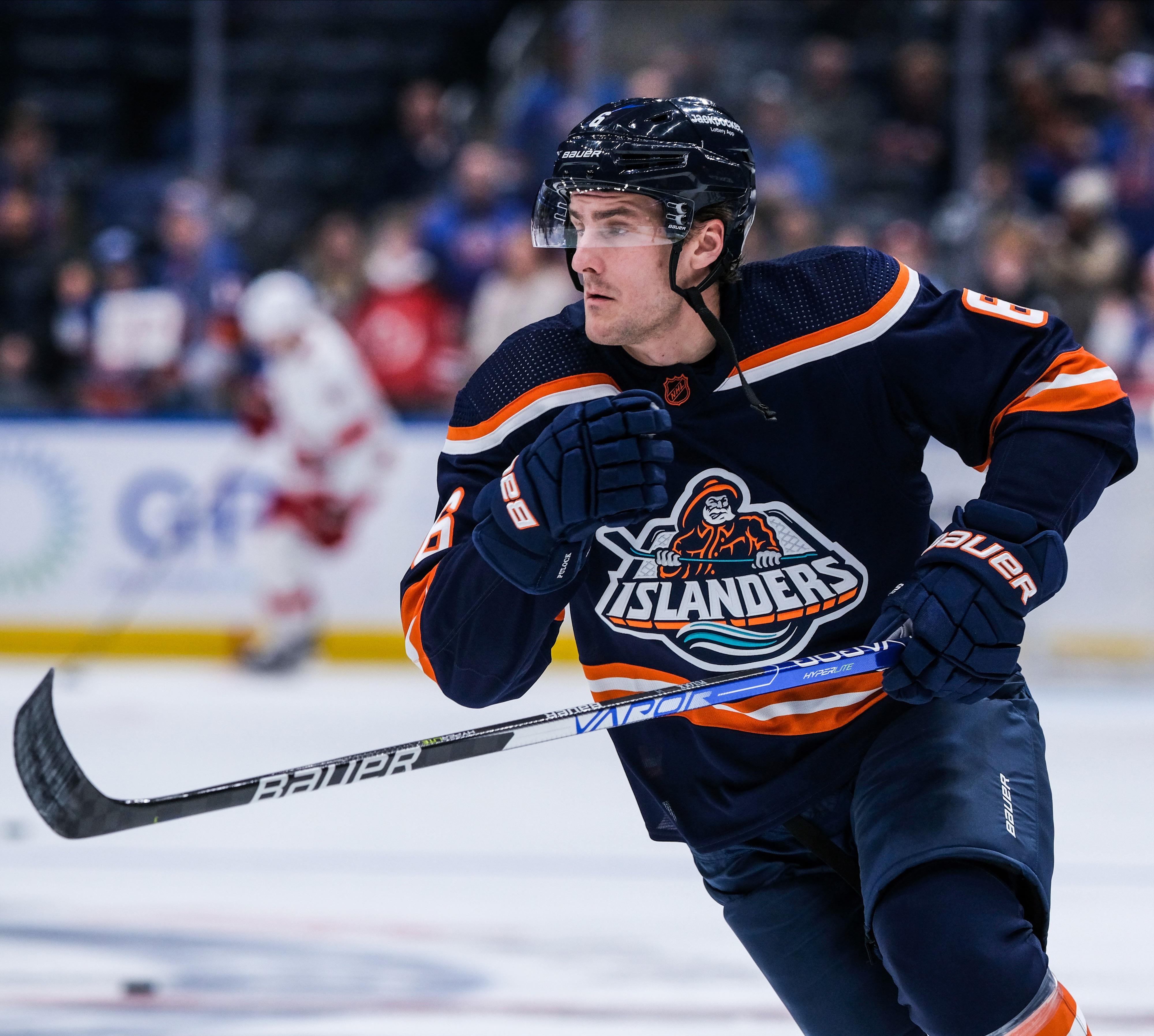
Yes beautiful logo aside I think the dark navy blue matches well
gooch_norris_
Nah. It’s not bad or anything but the original is one of the best in the league
Crispysnipez
What other standpoint is there?
Particular_Tutor_46
For a year or two they worse this jersey with the current/historical logo and it looked pretty good.
Brilliant-Chapter202
I like it… however, it reminds me of being heckled by rags fans with fish sticks chants… so while I like it, it give me negative memories lol I would be open to it being our third jersey.
I like our current jerseys honestly, I just would like the lighthouse on the shoulders.
I really don’t like the “NY” third jersey. It looks lazy and I’m just not a fan. I mean the chrome outline in the stadium series jersey was okay but it was a one game thing and I could live with it once lol
Boring_Pace5158
I think so many Isles fans hate it is because it was a dark period in the team’s history. You have the whole Spano debacle, Milbury, etc.
Personally, I like the current renditions.
AintIGR8
Please rerelease this classic
clonicle
The demographic who love this version of the uniform is the same demographic as those who love the Star Wars prequels.
petoskey_stone
Not even the best version of that jersey….
shouldvekeptlurking
I love this uniform. Wish I had a smart ass joke, but it’s true. That’s some Downeaster Alexa shit right there.
DonCorlealt
Idk their regular shmegular home jerseys with their normal logo are my personal favorite
The object worst is their jerseys with the crusty and insanely basic “NY” logo that looks like it was cooked up in 30 seconds in MS paint
Gold-Stomach-4657
The RR definitely improved on the colours, making the logo look much more mature and respectable. I liked the only one too, but the RR is better.
Interplay29
Replace the fisherman with the lighthouse!!!!
Sdwingnut
Oof
CONABANDS
False
mattcojo2
The main one they’ve worn on and off for most of their history lol
The colors are great and the logo is iconic
Tutelage45
What other standpoint is there?
Murky-Perceptions
Actually like the fishdick guy uni’s
WishRepresentative28
This was always my favourite Islanders logo.
SyrinxCounterparts1
Striping was good. The logo was horrible.
HajdukNYM_NYI
Better than the original which I actually own, remember buying one for cheap at some sporting goods store in NYC a few years after they discontinued it. The problem was the team was awful during that period
Kench_Allenby
Kinda looks amateurish
Ballgame4
Gorton’s fisherman.
gargar10
Hartford Whalers best uniform
Sc00tzy
I remember how hated this sweater was
Toads24
The Gorton’s Fisherman! How did they miss this cross promotion?
Shiny_Mew76
Best Islanders logo in my opinion as well.
DEATHbyBOOGABOOGA
Hells yes
Additional_Brief670
Wrong logo tho
PapasvhillyMonster
The original is better . The Islanders flopped hard on this and should of added more colors and shoulder patches
Snts6678
Sure. If you like frozen feesh steeks.
isles84
Hell no give me the white home jersey with the orange numbers
jchad12
Still think it needed a bit more teal, but it was nice to get a specialty jersey that wasn’t boring as hell

38 Comments
Well, I was there at the Coliseum when they were yelling « no more fishsticks » so there ya go.
I can still hear the crowds back in the day. « WE WANT FISH STICKS!!! » Lol
I do agree. That’s why I bought it.
As a Rangers fan, I agree
Gorton’s fisherman
Yes beautiful logo aside I think the dark navy blue matches well
Nah. It’s not bad or anything but the original is one of the best in the league
What other standpoint is there?
For a year or two they worse this jersey with the current/historical logo and it looked pretty good.
I like it… however, it reminds me of being heckled by rags fans with fish sticks chants… so while I like it, it give me negative memories lol I would be open to it being our third jersey.
I like our current jerseys honestly, I just would like the lighthouse on the shoulders.
I really don’t like the “NY” third jersey. It looks lazy and I’m just not a fan. I mean the chrome outline in the stadium series jersey was okay but it was a one game thing and I could live with it once lol
I think so many Isles fans hate it is because it was a dark period in the team’s history. You have the whole Spano debacle, Milbury, etc.
Personally, I like the current renditions.
Please rerelease this classic
The demographic who love this version of the uniform is the same demographic as those who love the Star Wars prequels.
Not even the best version of that jersey….
I love this uniform. Wish I had a smart ass joke, but it’s true. That’s some Downeaster Alexa shit right there.
Idk their regular shmegular home jerseys with their normal logo are my personal favorite
The object worst is their jerseys with the crusty and insanely basic “NY” logo that looks like it was cooked up in 30 seconds in MS paint
The RR definitely improved on the colours, making the logo look much more mature and respectable. I liked the only one too, but the RR is better.
Replace the fisherman with the lighthouse!!!!
Oof
False
The main one they’ve worn on and off for most of their history lol
The colors are great and the logo is iconic
What other standpoint is there?
Actually like the fishdick guy uni’s
This was always my favourite Islanders logo.
Striping was good. The logo was horrible.
Better than the original which I actually own, remember buying one for cheap at some sporting goods store in NYC a few years after they discontinued it. The problem was the team was awful during that period
Kinda looks amateurish
Gorton’s fisherman.
Hartford Whalers best uniform
I remember how hated this sweater was
The Gorton’s Fisherman! How did they miss this cross promotion?
Best Islanders logo in my opinion as well.
Hells yes
Wrong logo tho
The original is better . The Islanders flopped hard on this and should of added more colors and shoulder patches
Sure. If you like frozen feesh steeks.
Hell no give me the white home jersey with the orange numbers
Still think it needed a bit more teal, but it was nice to get a specialty jersey that wasn’t boring as hell