I gotta say, it looks a lot better than expected. The reasoning behind the details sells it for me.
SK-097
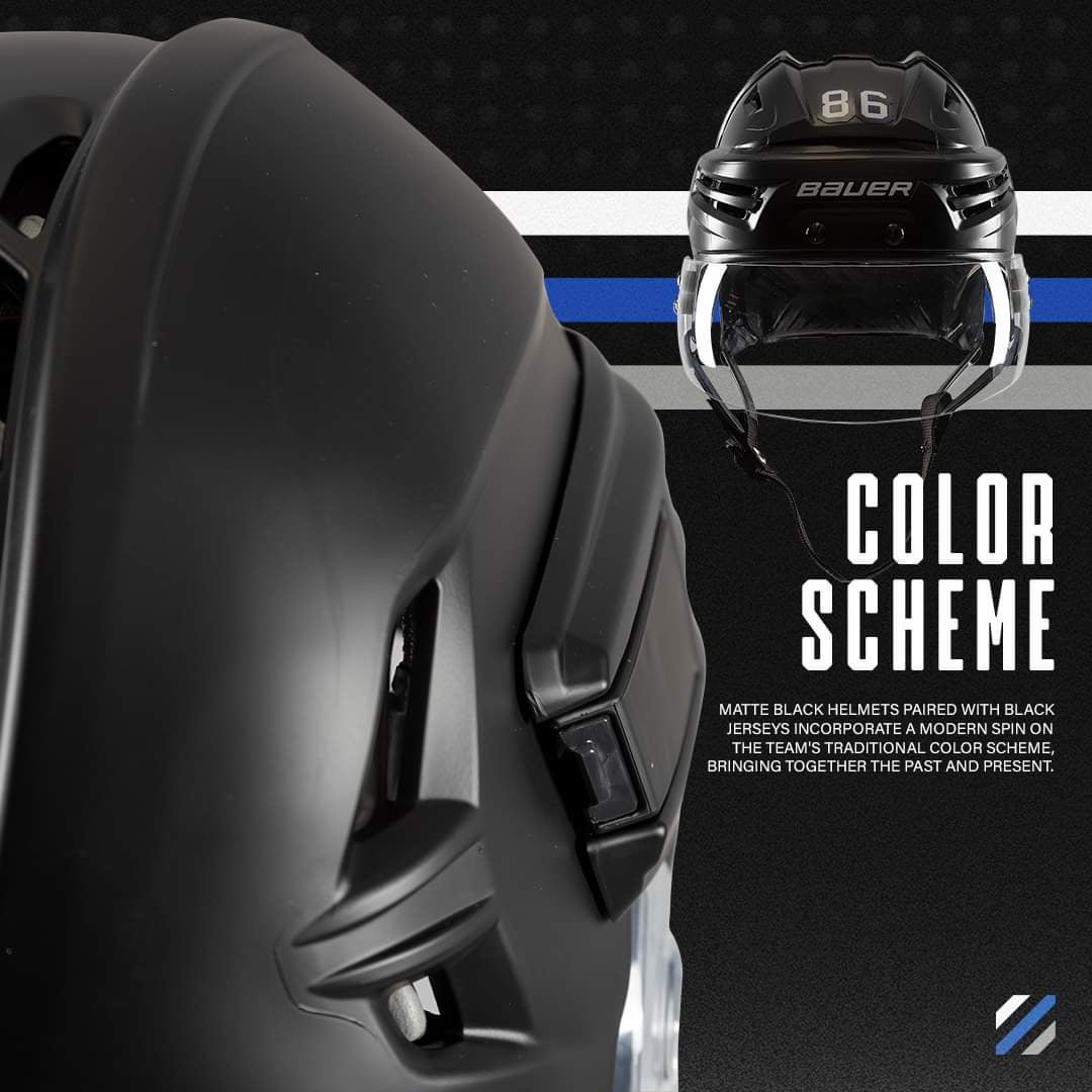
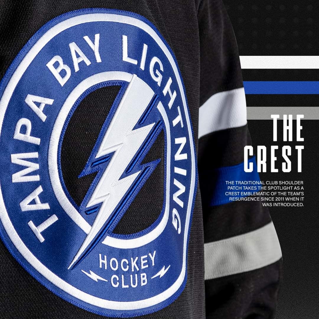
not a huge fan of the shoulder patch as the logo but absolutely love the 3D numbers and matte black helmets.
pretty clean, not super exciting, but i don’t hate em
Wayf4rer
Gloves are sick but the jersey itself looks pretty bad. I think more white would’ve been a better look here, similar issue to the black ‘bolts’ jerseys.
humanist-misanthrope
Damnit, I told my wife I was done buying jerseys…
8008luver
This shit sucks. Lmao. Another knock off Toronto jersey.
OldGuyInFlorida
What if we took a nondescript shoulder-patch and built an entire new sweater around it?
Enough-Register5313
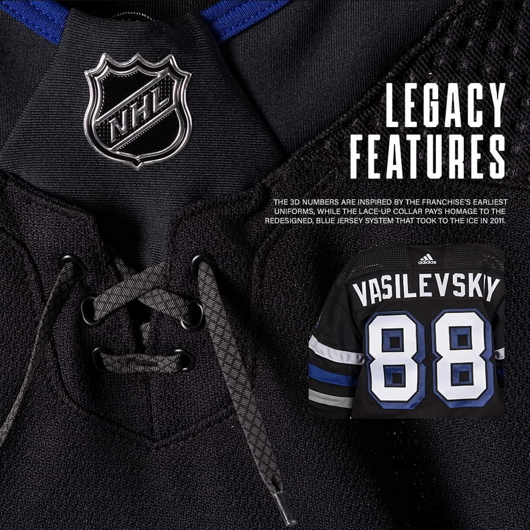
The laces is a must have detail👌🏽
aetuf
Has there been an NHL jersey with 5+ words on the front logo before?
Skroskznik_
This in my opinion is a whole lot better than the last all black ones and maybe even better the late 2000s jersey era
MonarchChonarch
The matte black helmets go HARD
Extreme_Peach3201
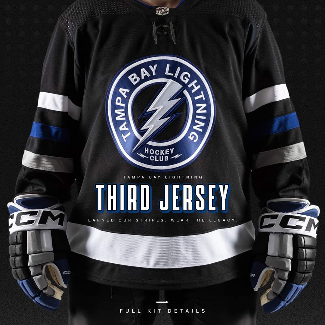
I am not a fan of words on the front of hockey jerseys. The logo should be enough.
eye_no_nuttin
Is it really going to say “Third Jersey” and we earned our stripes on the front or is that just for pics? Yes , I know , I’m that stupid I really have to ask…
Puck68
« I told you we could come up with a design over lunch… we just made it very plain – I mean simple – I mean ‘elegant.’ We’ll justify it with some marketing BS. »
« But you couldn’t decide between the NHL shield or laces? »
« Screw it, we did both, but we made the laces so dark nobody can see them anyway. »
« Good plan. Doesn’t matter, though… the throwback 3D numbers are the coolest part. »
« Exactly, and they have to pay an extra $100 for the numbers just to make the jersey not look exactly like a practice jersey. Brilliant. »
akairoketto
I want it, but it’s hard to justify $400 CAD for a jersey
AllHailRedheads
Should have put the normal logo on the shoulders…
cg_1979
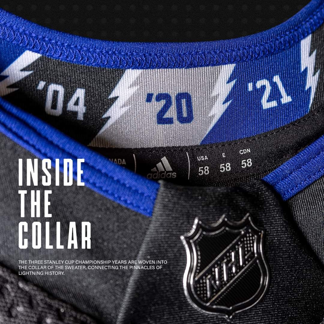
I’m the odd duck, but I think it’s great except for the NHL neck tie that they have going on.
I always preferred the colored jerseys, whether they were away jerseys or home jerseys. Why not black? It’s nighttime when 90% of the games start, lightning storms are dark with the pop of white/blue lightning. Additionally, we could incorporate Back In Black into the hype music.
The shoulder crest logo I never understood why this is on their regular jerseys, it seems odd. Personally, I think they should be reversed. Put the bland stylized CarolinaTorontoBolt on the shoulder & this one on the chest. I do understand that many like the clean modern look on the front with no words, but we are the TAMPA BAY MOTHER FUCKING LIGHTNING! I also come from an era when this team had 2 different fonts on the chest & a 3rd across the back (I never understood that choice though). This crest is a happy medium, & I prefer it to our current.
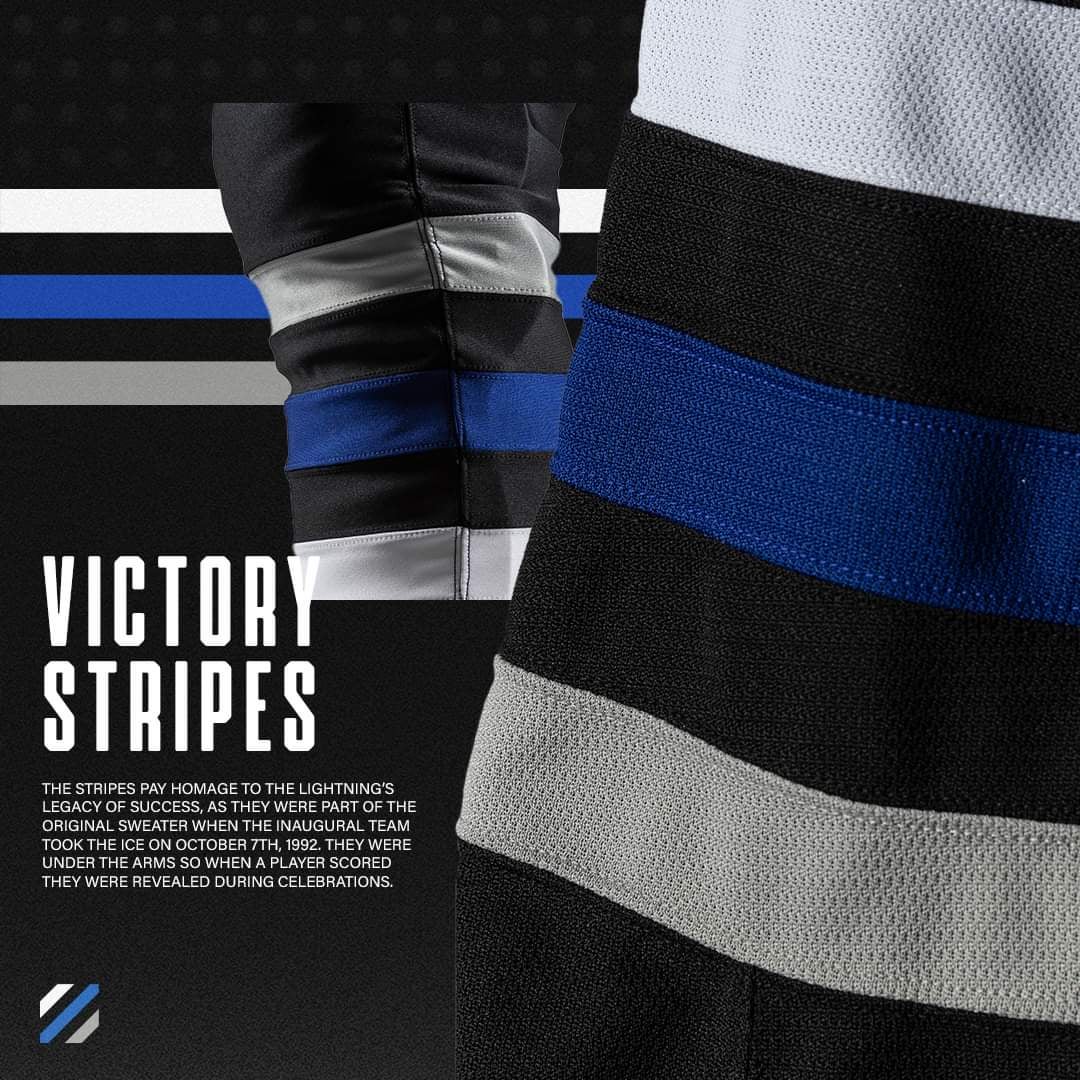
The victory stripes I’m confused about. To me, these are the stripes under the armpit, which I don’t believe any team has, the arms go up after a goal & victory & the stripes are visible. Kind of a dumb thing, but whatever. Tough subject to Google, & I’m probably wrong in what I always thought. However, I like what I see on these jerseys, it’s throwback, & is better than their primary jerseys.
Again, places belong on a jersey. Why are they black? They should provide an additional white lace. They were almost always a contrasting color except if it was white on white from my recollection.
Anyways, that’s my 2 cents.
KodiakJedi
Honestly…I think it’s probably the best black alternate jersey we have had since they brought them back. I would have liked to see a shoulder patch of some kind…maybe the old FL patch with the bolt through it. I think it would have been better with the current logo in blue with maybe some white or silver outline and then throw that center patch back on the shoulder. It’s a little busy. I don’t love it…but it’s good. Very solid third jersey.
travelwithnolan
This of course is the MIC 🇨🇦 and the one that will be available will most certainly have a cheaper made chest piece. I have to admit, I love it…and I didn’t want to damn it.
EleanorrRigbyy
They look nice and I like the black jerseys they’ve come out with, but I just can’t unsee the thin blue line flag in the stripes.
Etheryelle
# LACES!!!!
dolewhiplash
I absolutely rock with these and can’t wait to see them in play.
Now the only question is who’s do I get?
AssBoon92
I missed out on RR 1.0 and am kinda kicking myself over it. I didn’t love it, but now I wish I had it.
So… new Hagel jersey purchased this morning.
Hoid-the-Wit
Does it have victory stripes in the armpits too? The shoulder patch for the chest isn’t my fave but tbh it is growing on me the more I look at it. Always happy for laces, collar is sick. Pretty simple and safe, I like it but not fired up for it.
TheLastRaysFan
Love the colors, love the stripes, not a big fan of the chest crest.

24 Comments
I gotta say, it looks a lot better than expected. The reasoning behind the details sells it for me.
not a huge fan of the shoulder patch as the logo but absolutely love the 3D numbers and matte black helmets.
pretty clean, not super exciting, but i don’t hate em
Gloves are sick but the jersey itself looks pretty bad. I think more white would’ve been a better look here, similar issue to the black ‘bolts’ jerseys.
Damnit, I told my wife I was done buying jerseys…
This shit sucks. Lmao. Another knock off Toronto jersey.
What if we took a nondescript shoulder-patch and built an entire new sweater around it?
The laces is a must have detail👌🏽
Has there been an NHL jersey with 5+ words on the front logo before?
This in my opinion is a whole lot better than the last all black ones and maybe even better the late 2000s jersey era
The matte black helmets go HARD
I am not a fan of words on the front of hockey jerseys. The logo should be enough.
Is it really going to say “Third Jersey” and we earned our stripes on the front or is that just for pics? Yes , I know , I’m that stupid I really have to ask…
« I told you we could come up with a design over lunch… we just made it very plain – I mean simple – I mean ‘elegant.’ We’ll justify it with some marketing BS. »
« But you couldn’t decide between the NHL shield or laces? »
« Screw it, we did both, but we made the laces so dark nobody can see them anyway. »
« Good plan. Doesn’t matter, though… the throwback 3D numbers are the coolest part. »
« Exactly, and they have to pay an extra $100 for the numbers just to make the jersey not look exactly like a practice jersey. Brilliant. »
I want it, but it’s hard to justify $400 CAD for a jersey
Should have put the normal logo on the shoulders…
I’m the odd duck, but I think it’s great except for the NHL neck tie that they have going on.
I always preferred the colored jerseys, whether they were away jerseys or home jerseys. Why not black? It’s nighttime when 90% of the games start, lightning storms are dark with the pop of white/blue lightning. Additionally, we could incorporate Back In Black into the hype music.
The shoulder crest logo I never understood why this is on their regular jerseys, it seems odd. Personally, I think they should be reversed. Put the bland stylized CarolinaTorontoBolt on the shoulder & this one on the chest. I do understand that many like the clean modern look on the front with no words, but we are the TAMPA BAY MOTHER FUCKING LIGHTNING! I also come from an era when this team had 2 different fonts on the chest & a 3rd across the back (I never understood that choice though). This crest is a happy medium, & I prefer it to our current.
The victory stripes I’m confused about. To me, these are the stripes under the armpit, which I don’t believe any team has, the arms go up after a goal & victory & the stripes are visible. Kind of a dumb thing, but whatever. Tough subject to Google, & I’m probably wrong in what I always thought. However, I like what I see on these jerseys, it’s throwback, & is better than their primary jerseys.
Again, places belong on a jersey. Why are they black? They should provide an additional white lace. They were almost always a contrasting color except if it was white on white from my recollection.
Anyways, that’s my 2 cents.
Honestly…I think it’s probably the best black alternate jersey we have had since they brought them back. I would have liked to see a shoulder patch of some kind…maybe the old FL patch with the bolt through it. I think it would have been better with the current logo in blue with maybe some white or silver outline and then throw that center patch back on the shoulder. It’s a little busy. I don’t love it…but it’s good. Very solid third jersey.
This of course is the MIC 🇨🇦 and the one that will be available will most certainly have a cheaper made chest piece. I have to admit, I love it…and I didn’t want to damn it.
They look nice and I like the black jerseys they’ve come out with, but I just can’t unsee the thin blue line flag in the stripes.
# LACES!!!!
I absolutely rock with these and can’t wait to see them in play.
Now the only question is who’s do I get?
I missed out on RR 1.0 and am kinda kicking myself over it. I didn’t love it, but now I wish I had it.
So… new Hagel jersey purchased this morning.
Does it have victory stripes in the armpits too? The shoulder patch for the chest isn’t my fave but tbh it is growing on me the more I look at it. Always happy for laces, collar is sick. Pretty simple and safe, I like it but not fired up for it.
Love the colors, love the stripes, not a big fan of the chest crest.
I will still 100% buy one though.