CECI aurait dû être le 3ème maillot du nouveau Lightning… Le simple fait d’échanger le logo a fait toute la différence !
—
00sgamer

CECI aurait dû être le 3ème maillot du nouveau Lightning… Le simple fait d’échanger le logo a fait toute la différence !
—
00sgamer
11 Comments
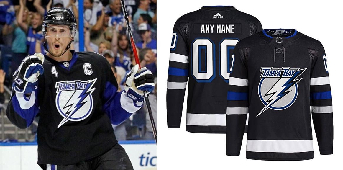
With their recent release of 3rd jersey, looks like they are trying everything to avoid using this logo… Personally felt this was their best logo and look by far.
I’m really quite a fan of what they have based on game results wearing them so far.
I approve of this
Frankly, even the white version of their modern logo would have been better. It’s a good looking uniform but they made a bad decision on that front.
I keep seeing the Grateful Dead logo but I enjoy this uniform
That should be their main logo for every jersey. Its the Perfect balance between a new fresh look and their old cartoonie logo
Team Estonia jerseys
That logo is commonly associated with a very dark time for the franchise and is generally hated among Lightning fans. It wouldn’t sell.
Wrong. This should have been the Lightning’s new home jersey.
always thought this 3rd jersey and name font were the sex.
https://www.nhluniforms.com/Lightning/Lightning04.html
That’s perfect