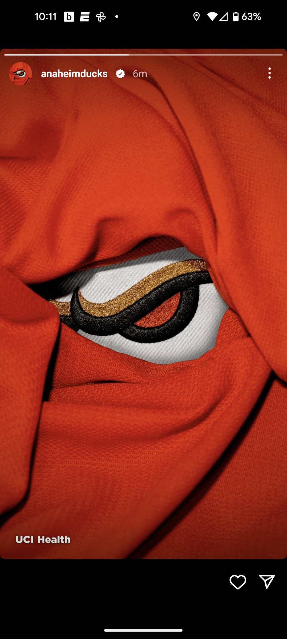
Might be a reach but kind of giving me “Bulls” brow from their logo
No_Departure102
I need to see the whole thing before I can judge
nopantts
GIMMIE MORE INFO I’M DYING
dbag3o1
Jeez even with the world’s coolest logo, they are still finding ways to mess it up.
International-Elk986
Looks like the Asus ROG logo
Content_Morning3064
I like it so far
CDROMantics
Just go back to being the Mighty Ducks, you cowards.
Tootsmagootsie
I’ve never been able to take this franchise seriously… from the Disney inception, to the Disney homer fanbase, and even after Disney pulled out… the Fanbase and origin are still the same.
As a life long Sharks fan (and before that Kings) I got plenty of hate for LA, but at least I can respect them as an organization and fanbase… Anaheim on the other hand will always be a joke to me.
Furthermore, Edmonton is already orange. Could you be any less original?
VinPickles
If you call them a joke, what do you think they call you 😂
ILSmokeItAll
Dark Wing duck makes a return on the current colors? I did it. Especially if they throwback with the old purps.
GameOfBears
Something tells me it’s going to look like a duck again and not a ducks foot for once.
Relation-Fearless
Excited to see
Hattrick_Swayze2
The Might Be Ducks
finner333
If it’s not eggplant don’t bother
cantbelievethename
Completely ignoring what hockey fans want. Still excited to see what they came up with though
Pwnacious
Quack.
SINY10306
still trying to be the Anaheim Flyers
OpinionOwn6727
Grrrrr!…
Benjamin_Huxley
FLYING VVVVVVVVVV
AG74683
Kind of reminds me of the logo for Mighty Ducks: The Animated Series.
Canucks-1989
New logo should be good, but go back to the OG colour scheme you cowards!
kleptorabbit
I feel like i may be one of the few who looks forard to going back to the old Duck Mask logo…Is it really that hated?
JKthePolishGhost
Spoiler: new logo is angry Howard the Duck
defreal100
Kraken 2.0
easterHALTS
Duckse
Pisscats_R_Trash
If this was the entire logo just like that it’s already way better than the webbed D
Emjoria
can they just move the ducks bruh, even Vegas has better looking jerseys. Down vote if u want just because I didn’t grow up with the movie so there’s no nostalgia clouding my judgement.
Dry-Detective-264
Quack, Quack, Quack, give us the Flying V!!!!!
mattcojo2
Icethetics said it would be a revised hockey mask logo. If this is the altered part of it that’s sick as heck.

30 Comments
Might be a reach but kind of giving me “Bulls” brow from their logo
I need to see the whole thing before I can judge
GIMMIE MORE INFO I’M DYING
Jeez even with the world’s coolest logo, they are still finding ways to mess it up.
Looks like the Asus ROG logo
I like it so far
Just go back to being the Mighty Ducks, you cowards.
I’ve never been able to take this franchise seriously… from the Disney inception, to the Disney homer fanbase, and even after Disney pulled out… the Fanbase and origin are still the same.
As a life long Sharks fan (and before that Kings) I got plenty of hate for LA, but at least I can respect them as an organization and fanbase… Anaheim on the other hand will always be a joke to me.
Furthermore, Edmonton is already orange. Could you be any less original?
If you call them a joke, what do you think they call you 😂
Dark Wing duck makes a return on the current colors? I did it. Especially if they throwback with the old purps.
Something tells me it’s going to look like a duck again and not a ducks foot for once.
Excited to see
The Might Be Ducks
If it’s not eggplant don’t bother
Completely ignoring what hockey fans want. Still excited to see what they came up with though
Quack.
still trying to be the Anaheim Flyers
Grrrrr!…
FLYING VVVVVVVVVV
Kind of reminds me of the logo for Mighty Ducks: The Animated Series.
New logo should be good, but go back to the OG colour scheme you cowards!
I feel like i may be one of the few who looks forard to going back to the old Duck Mask logo…Is it really that hated?
Spoiler: new logo is angry Howard the Duck
Kraken 2.0
Duckse
If this was the entire logo just like that it’s already way better than the webbed D
can they just move the ducks bruh, even Vegas has better looking jerseys. Down vote if u want just because I didn’t grow up with the movie so there’s no nostalgia clouding my judgement.
Quack, Quack, Quack, give us the Flying V!!!!!
Icethetics said it would be a revised hockey mask logo. If this is the altered part of it that’s sick as heck.
Looks like the Chicago Bulls, but ok