
Cela fait deux ans et je suis toujours en colère que l’équipe n’ait pas fait ça pour le deuxième Reverse Retro. Ça aurait été mon maillot préféré des Sénateurs. Ils devaient juste ajouter du blanc… pourquoi n’ont-ils pas ajouté du blanc… [mockup courtesy N96Network]
—
ricky-robie
17 Comments
I think this could even be improved, switch the red and white and it’s even more true to the original swoosh
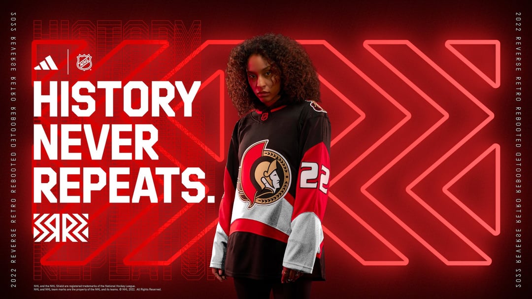
~~History Never Repeats?~~
~~How many years in a row now have we seen articles with headlines like « The Senators are who the numbers say they are? »~~
~~I know those streaks of garbage hockey have been occasionally interrupted by a decent season here and there, but talk about a swing and a miss by the the marketing team on this one lol. History USUALLY repeats with the Senators.~~
Edit: I am stupid idiot who doesn’t know nothing.
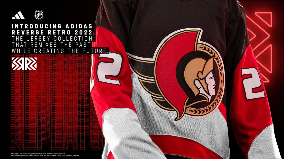
The actual miss was not including laurels
I was upset they didn’t do a red version of the senagoth jersey. Would have been absolute fire
That is an atrocious jersey. A hot mess if I ever saw one. Dumpster fire material. In other words, perfect for retro reverse. But I’m still happy that it didn’t make it past Photoshop.
That has to be one of the worst mockups I’ve ever seen. I’d even take a SNES jersey over this one.
I hate that we have the best uniform set up that we’ve ever had and people are still complaining.
Personally not a fan, so Im glad it wasnt done lol
Not sure you can have half a home jersey and half an away jersey all in one jersey. Probably a rule you can’t have half white/half dark.
I’m still mad they didn’t use the Senagoth
I agree!
That ain’t it.
Did we just sign her
wow those are ugly
Idk why they didn’t just take the black Senagoth jersey and make it white. Would have been an easy win for all involved.
These would at least be memorable as the worst sweater the team has ever worn
This ain’t it.