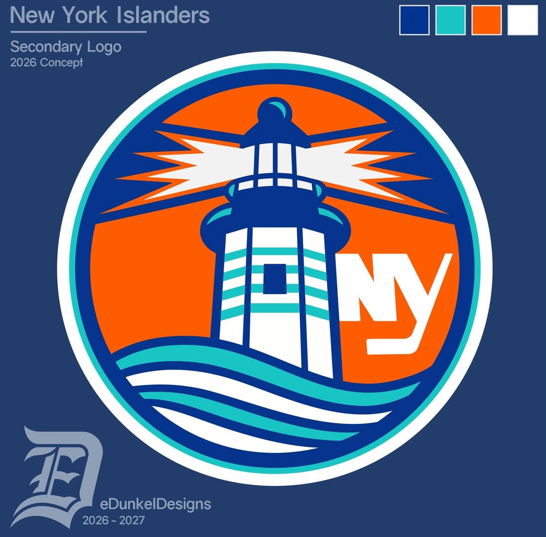
I love the lighthouse logo! I can’t help but think something feels a little off about the NY. Lack of balance, maybe? I’m no designer, but how about the outline of LI behind the lighthouse instead?
grizzroots
Meh.
yoyok36
what about moving the NY down and to the left 45 degrees so the left leg of the N is that bottom right white part of the lighthouse?

3 Comments
I love the lighthouse logo! I can’t help but think something feels a little off about the NY. Lack of balance, maybe? I’m no designer, but how about the outline of LI behind the lighthouse instead?
Meh.
what about moving the NY down and to the left 45 degrees so the left leg of the N is that bottom right white part of the lighthouse?