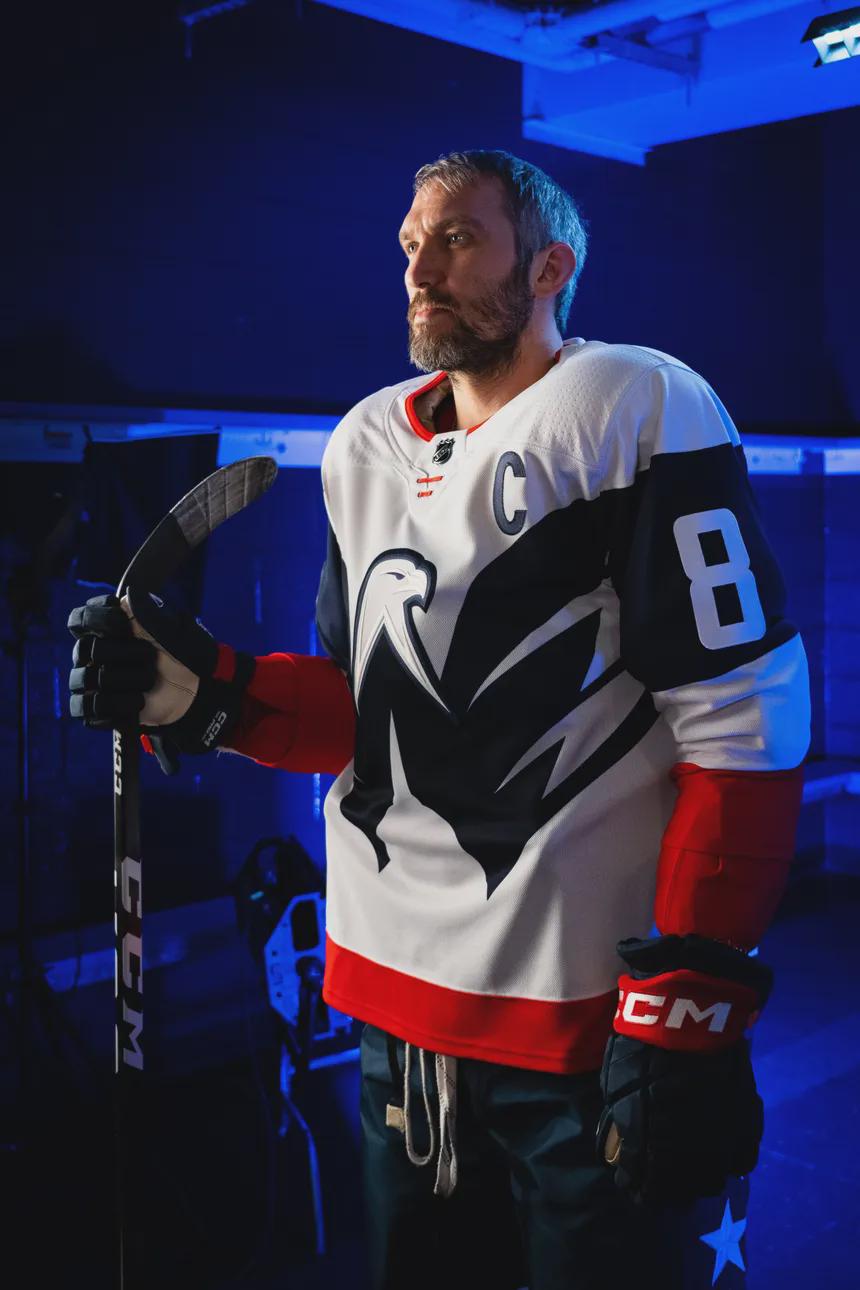
Love the Weagle, as a general rule, but it’s like it’s sticking its wings all up in his armpits, which is weird.
*Tickle tickle*
Smileypen
I for one do not care for them. The weagle being so large looks wrong to me. I don’t understand why it couldn’t be a crest logo.
ItsHobag
I personally love it. I love the Weagle. I wish they would do a red Weagle jersey.
ThePickleOrTheEgg
One of the coolest Washington jerseys ever made. Shows where we can go without the wordmark
Rozez
That is to say that they’re before my time as a fan of the Caps/hockey in general. I recently learned about the Stadium Series through a Bruins friend and that they have special jerseys for these games.
I know there’s been a longstanding discussion of people wanting the weagle as the main logo, several fan attempts at making it so, and said attempts instead convincing people that the weagle shouldn’t be anything more than the secondary logo. But I actually quite like these stadium series jerseys.
Stryk-Man
Reception was definitely mixed on release, but it was an instant buy for me. I think this jersey will only continue to grow in its perception by the fan base.
ImpressiveScale2820
Amazing.
Beatles397
Loved it when it came out, bought it blank and wore to the game in Carolina. Shitty outcome losing 4-1 but had to get it custo’d with the only guy to score in the jersey in the 2 games played. Havent really worn it since
I think people were excited for the weagle to finally be on a jersey. These days though, I don’t see a ton of people talking about them.
The weagle works as a secondary. But as a primary, nah.
garyblahblah
Looks like a street hockey jersey to me.
pantsattack
As with a lot of Caps jerseys, it’s close but it tries to do too much. The extra large weagle is awkward and probably makes the franchise think a lot of us aren’t still waiting for a proper weagle jersey when we are.
Brmats
I liked them. But we got stomped and Ovi didn’t play. So I wonder if that has hurt their popularity a bit.
holy_cal
Most stadium series jerseys are met with some type of mixed emotions. I like them, bought one on release day and wore it at that game too.
Hayden8184
Reception was mixed. Personally, I think it was a miss. Logo is too big. Red half sleeves look weird. Looks like a fun sweatshirt but otherwise a bad jersey.
mamakos84
I like that they’re different and bold, but as a slob I hate wearing white jerseys.
RainingKyoto
Not a fan, they look like a practice jersey
wikipuff
Horrible. Absolutely horrible.
Dull_Swimming_5407
I don’t remember, but Ovie looks great in the jersey!
vish_knew
I think the reception wasn’t that good, but I personally love them.
tokenincorporated
I normally don’t buy away white jerseys but I have this in my collection, love it.
smackrock420
Love the jersey. Hate wearing white to games. I’m too drunk to wear white.
wtf703
I like them. Couldn’t commit to a legit version but I bought a knock off just for funzies
I have one solely cos Adidas or Fanatics (can’t remember which) were trying to get rid of them for $30 each, got one for my buddy who’s a long time caps fan too.
DagetAwayMaN421
It was a cool concept, but it also looked like it was thrown together last minute.
Behind the scenes, the Caps did not want this outdoor game. When Carolina was selected as the 2021 outdoor game host, the Caps told the NHL they did not want to do it. When it got moved to 2023, the Pens were originally going to do it, but then Fenway Sports Group bought the Pens and they wanted a game at Fenway. The Canes were waiting for an opponent and it ended up being the Caps. The Pens-Bruins game was going to be either the 2023 Winter Classic or 2024 Winter Classic. It ended up being 2023.
The jersey itself was sort of inspired by the Avalanche 2020 Stadium Series jersey where the front logo wrapped around the arms and the sleeves were styled similarly to the 2022 Preds Stadium Series jersey. I have two of these jerseys that are game-worn, one for the outdoor game and one that was used at home against the Red Wings.
The construction of the jerseys themselves had a lot of sublimation on the chest. Sublimation… outside of the NFL looks very amateur as a lot of minor and junior leagues use sublimated jerseys as specialty jerseys. If you actually look at it, there’s white inbetween the « feathers » of the wings and it just jams into a blue sleeve for the numbers. Also, the material and color is different between the torso and the sleeves… the torso of the jersey is very transparent. Again, I think the concept is cool, but the actual jersey itself does not look like it was put together well.
cccooley24
Love it
BottleKnockers
I bought it because of its uniqueness. I like Stadium series jerseys being over the top.
FeelTall
I liked the direction, but did not like the result
fuzzypyrocat
I remember someone calling it the USPS jersey, but I really like it
Leesburgcapsfan
Wasn’t a fan at the time, but when i see them now, I love them!
bluehairjungle
Personally I didn’t like them. I like a lot more classic branding. Team loyalty aside, I like the Rangers and Bruins jersey aesthetics. And obviously I love the screagle because I’m a 90s kid from the DMV. Something about the Stadium series jerseys does not scratch that itch for me. Didn’t hate them but I didn’t like them. That said, I love their walk in outfits that year when they got off a school bus and were wearing letterman jackets and tossing around a football.
Vye13
Hot take but the Weagle doesn’t really look good as a primary logo in my opinion. The way they did it here is for these jerseys is decent imo, probably the best way to do it but. I think it would look better in red
hurricanecook
Yeah, I’m in favor of moving to the Weagle full time… yeah yeah yeah, I know the mob is lighting their torches for me. LONG LIVE THE WEAGLE
ArbitraryOrder
It’s my favorite Caps Jersey outside of the fact that we lost both games played in it.
Also (not so) fun fact, it is the only Jersey in the Ovechkin era he never wore during a game.
duskdargent
Wasn’t a fan. Love the Weagle, but the overall design wasn’t hittin me the way the previous winter classic jerseys were. Just felt kinda basic.
Beneficial-Bowl-2759
Probably my favorite alt design. Not another retread of an old design.

39 Comments
Love the Weagle, as a general rule, but it’s like it’s sticking its wings all up in his armpits, which is weird.
*Tickle tickle*
I for one do not care for them. The weagle being so large looks wrong to me. I don’t understand why it couldn’t be a crest logo.
I personally love it. I love the Weagle. I wish they would do a red Weagle jersey.
One of the coolest Washington jerseys ever made. Shows where we can go without the wordmark
That is to say that they’re before my time as a fan of the Caps/hockey in general. I recently learned about the Stadium Series through a Bruins friend and that they have special jerseys for these games.
I know there’s been a longstanding discussion of people wanting the weagle as the main logo, several fan attempts at making it so, and said attempts instead convincing people that the weagle shouldn’t be anything more than the secondary logo. But I actually quite like these stadium series jerseys.
Reception was definitely mixed on release, but it was an instant buy for me. I think this jersey will only continue to grow in its perception by the fan base.
Amazing.
Loved it when it came out, bought it blank and wore to the game in Carolina. Shitty outcome losing 4-1 but had to get it custo’d with the only guy to score in the jersey in the 2 games played. Havent really worn it since
https://preview.redd.it/87m7h9pd5ihg1.jpeg?width=2997&format=pjpg&auto=webp&s=556d7af99feb5ce5dd8f324d6aae9d80d51df18b
I think people were excited for the weagle to finally be on a jersey. These days though, I don’t see a ton of people talking about them.
The weagle works as a secondary. But as a primary, nah.
Looks like a street hockey jersey to me.
As with a lot of Caps jerseys, it’s close but it tries to do too much. The extra large weagle is awkward and probably makes the franchise think a lot of us aren’t still waiting for a proper weagle jersey when we are.
I liked them. But we got stomped and Ovi didn’t play. So I wonder if that has hurt their popularity a bit.
Most stadium series jerseys are met with some type of mixed emotions. I like them, bought one on release day and wore it at that game too.
Reception was mixed. Personally, I think it was a miss. Logo is too big. Red half sleeves look weird. Looks like a fun sweatshirt but otherwise a bad jersey.
I like that they’re different and bold, but as a slob I hate wearing white jerseys.
Not a fan, they look like a practice jersey
Horrible. Absolutely horrible.
I don’t remember, but Ovie looks great in the jersey!
I think the reception wasn’t that good, but I personally love them.
I normally don’t buy away white jerseys but I have this in my collection, love it.
Love the jersey. Hate wearing white to games. I’m too drunk to wear white.
I like them. Couldn’t commit to a legit version but I bought a knock off just for funzies
https://preview.redd.it/x0wk8lwo0jhg1.jpeg?width=3024&format=pjpg&auto=webp&s=ce6dc90b143c1809d410de8022348ff8b272be10
The practice version is better
The Capitol looks wonky that big imo
I have one solely cos Adidas or Fanatics (can’t remember which) were trying to get rid of them for $30 each, got one for my buddy who’s a long time caps fan too.
It was a cool concept, but it also looked like it was thrown together last minute.
Behind the scenes, the Caps did not want this outdoor game. When Carolina was selected as the 2021 outdoor game host, the Caps told the NHL they did not want to do it. When it got moved to 2023, the Pens were originally going to do it, but then Fenway Sports Group bought the Pens and they wanted a game at Fenway. The Canes were waiting for an opponent and it ended up being the Caps. The Pens-Bruins game was going to be either the 2023 Winter Classic or 2024 Winter Classic. It ended up being 2023.
The jersey itself was sort of inspired by the Avalanche 2020 Stadium Series jersey where the front logo wrapped around the arms and the sleeves were styled similarly to the 2022 Preds Stadium Series jersey. I have two of these jerseys that are game-worn, one for the outdoor game and one that was used at home against the Red Wings.
The construction of the jerseys themselves had a lot of sublimation on the chest. Sublimation… outside of the NFL looks very amateur as a lot of minor and junior leagues use sublimated jerseys as specialty jerseys. If you actually look at it, there’s white inbetween the « feathers » of the wings and it just jams into a blue sleeve for the numbers. Also, the material and color is different between the torso and the sleeves… the torso of the jersey is very transparent. Again, I think the concept is cool, but the actual jersey itself does not look like it was put together well.
Love it
I bought it because of its uniqueness. I like Stadium series jerseys being over the top.
I liked the direction, but did not like the result
I remember someone calling it the USPS jersey, but I really like it
Wasn’t a fan at the time, but when i see them now, I love them!
Personally I didn’t like them. I like a lot more classic branding. Team loyalty aside, I like the Rangers and Bruins jersey aesthetics. And obviously I love the screagle because I’m a 90s kid from the DMV. Something about the Stadium series jerseys does not scratch that itch for me. Didn’t hate them but I didn’t like them. That said, I love their walk in outfits that year when they got off a school bus and were wearing letterman jackets and tossing around a football.
Hot take but the Weagle doesn’t really look good as a primary logo in my opinion. The way they did it here is for these jerseys is decent imo, probably the best way to do it but. I think it would look better in red
Yeah, I’m in favor of moving to the Weagle full time… yeah yeah yeah, I know the mob is lighting their torches for me. LONG LIVE THE WEAGLE
It’s my favorite Caps Jersey outside of the fact that we lost both games played in it.
Also (not so) fun fact, it is the only Jersey in the Ovechkin era he never wore during a game.
Wasn’t a fan. Love the Weagle, but the overall design wasn’t hittin me the way the previous winter classic jerseys were. Just felt kinda basic.
Probably my favorite alt design. Not another retread of an old design.
I have one. Love it!
My goto for games