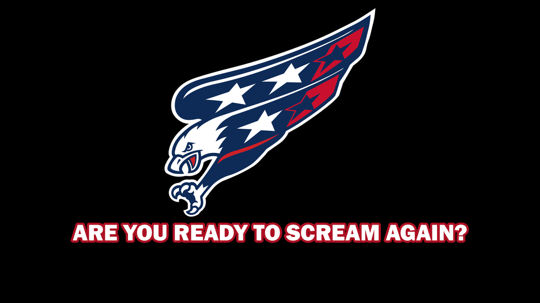
Né d’un devoir scolaire où j’avais besoin d’un logo d’aigle
Slogan: Êtes-vous prêt à crier à nouveau ?
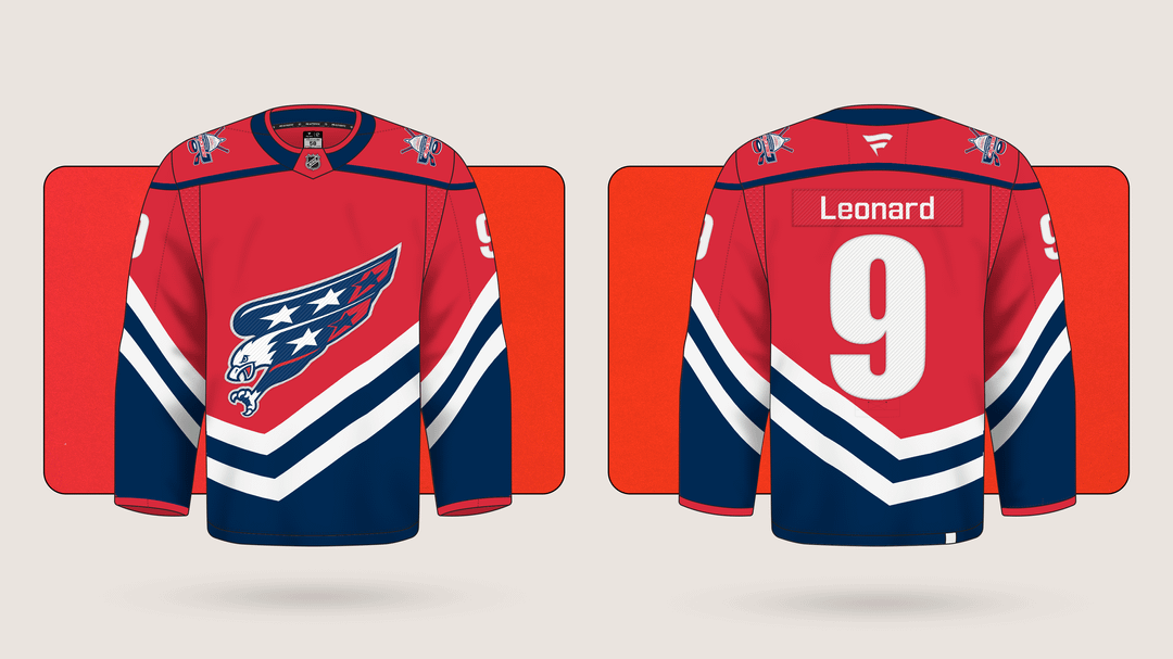
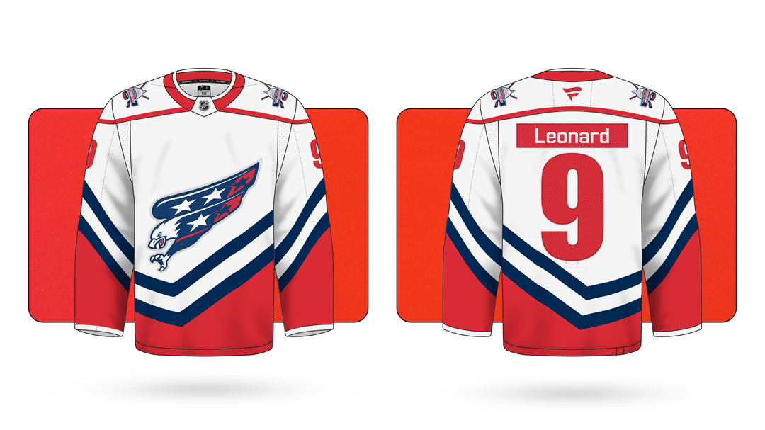
J’ai essayé de m’inspirer des vieux maillots tout en créant quelque chose de tout nouveau. "remixer"
—
RabbiPika

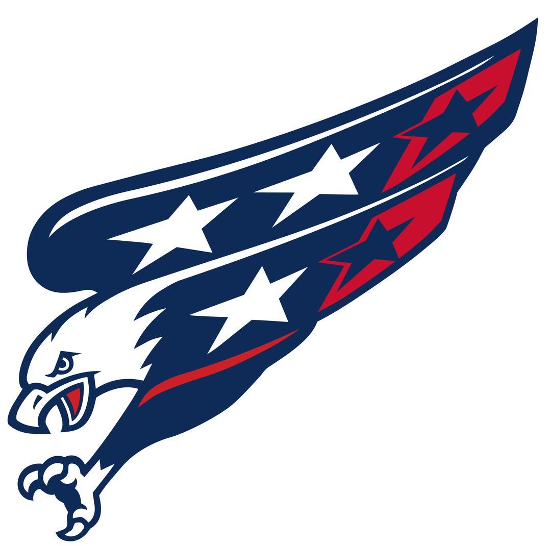
Né d’un devoir scolaire où j’avais besoin d’un logo d’aigle
Slogan: Êtes-vous prêt à crier à nouveau ?
J’ai essayé de m’inspirer des vieux maillots tout en créant quelque chose de tout nouveau. "remixer"
—
RabbiPika
15 Comments
I actually love these lol
They need to find a way to incorporate some red into the screagle, but I don’t get the red ass.
That jersey fucks hard 🔥
I really hope we drop the bright red in the rebrand
Meh. I appreciate the effort but I still feel it’s too angular and too 90’s
Hate the name plates but otherwise not terrible.
Away name plate looks like the Flyers absolutely no. In all seriousness these are really nice tho!
Maybe I’m in the minority, but I want is to go back to black, blue, gold, etc.
I’ve had enough of the red.
This is a jersey I could get behind. Im not sure if you are the person who i asked to make something similar, but either way you did a great job
This is a good start for sure. I say get rid of the bottom torso stripes and just keep stripes on the sleeves, if anything add a single block of color on the bottom hem like the stadium series jerseys have. I don’t like the nameplate being red on the white. The screagle idea with the red wing tips is obviously an homage to the weagle with the red tips, and I dig that.
Both logos look great, but not a fan of the jerseys. The name and number font looks rough, in particular. But I like the concept!
I like it for the most part but I don’t ever want to see lowercase letters on a nameplate.
Way better than the current stuff. I like these a lot
I know you said these are remixes not full on new but they are starting to look like Flyers jerseys that just are nominal tweaks year after year. The teams current third closed the book for me. It’s a red screagle that’s symmetrical not 90s angular. Looks like the original 70s meets the screagle. Perfect imo. We need a real deal weagle or go back to the early 90s big face capitals word mark that pops. Just my two cents
Jerseys are pretty good but I hate the logo by itself