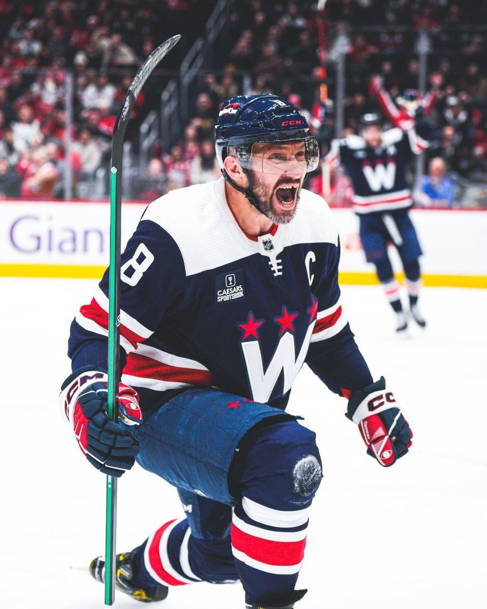
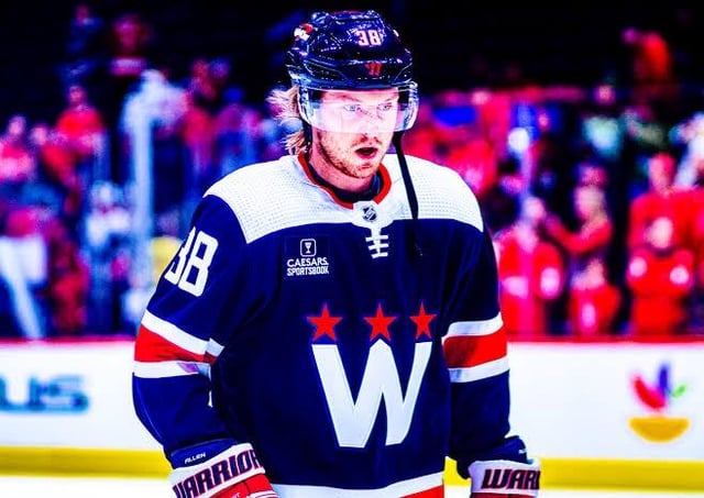
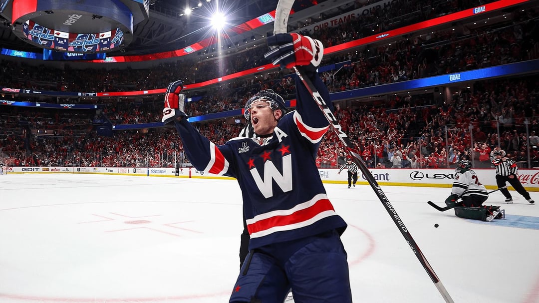
Nous avons peut-être perdu beaucoup de matchs malheureusement, mais nous avions l’air de gagnants 🥹
—
Few-Pomelo-3297

Nous avons peut-être perdu beaucoup de matchs malheureusement, mais nous avions l’air de gagnants 🥹
—
Few-Pomelo-3297
21 Comments
Nah this was one of the least inspired jerseys we have had in awhile. Which says something when most of our jerseys are just re colors of the screaming eagle.
Also I own a blue W this is not me just hating.
Is There Anyway To Get These? I Want One So Badly
I preferred these alternates to the current red/white screaming eagle jersey. However, the black screaming eagle jersey was my favorite of recent years. Though I might be biased bc the black Capitol Building home jerseys are one of my favorites.
I got one on closeout last year for $49, had Protas 21 stitched into it for another $60 from some outfit in WNY, and now it’s my favorite. They seem to be polarizing but I love how distinctive they are.
Do not like these.
*Hindsight
Way way better than the current alternate and would love to see this come back!!
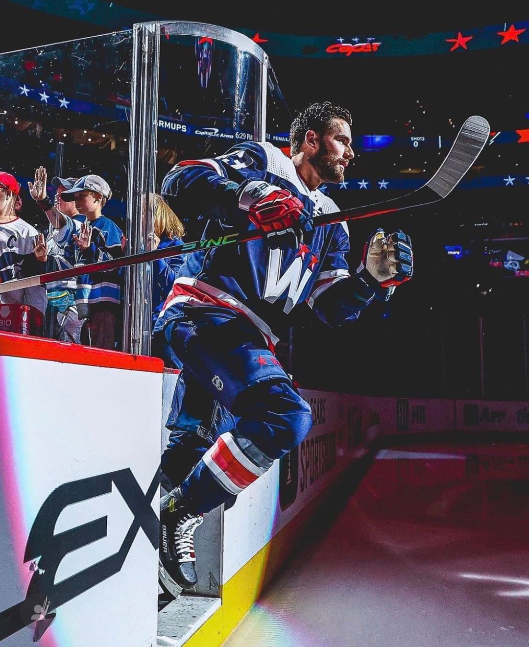
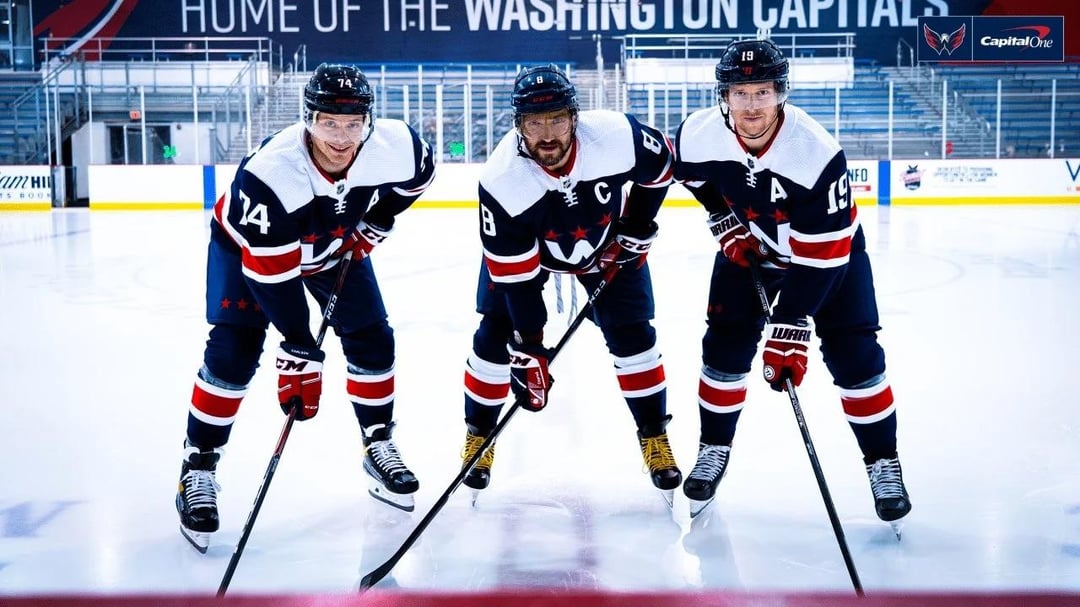
I love the W with the stars. So clean and simple.
Still one of my faves, I love mine.
Still wasn’t
Love those. And blue helmets actually match the rest, unlike the away white shirts
I like them a lot. I like then better than the defaukt « Capitals » wordmark, tbh. (Give us a Weagle-On-the-Chest jersey you cowards)
Still one of their best. Great jersey.
A good use of a secondary color as a primary and a simple clean logo design. New 3rds are basically just an AI composite of every design element they’ve had in their past and use a red that isn’t even in their brand identity. These also had nonfunctional lacing, but it was more subtle. These looked good.
Its a nice kit. Though I’m probably biased only because it reminds me even a little of (IMO) one of the best sweaters of all
[2014 WCs were elite](https://www.si.com/.image/t_share/MTY4MTA2OTQzMzA2MjEyNzM2/winter-classic-jerseys-capitals-2015jpg.jpg)
Absolutely trash logo
I dig the logo and welcome any third that isn’t red, but this could have been done a lot better. The stripes of the DC flag were right there, and they went with a NYTR retread. I don’t hate it, but I find myself missing what could have been.
I hated these, I buy all the alts and did not buy this one
But I’m also only a Caps fan and its pretty similar to other DC logos of teams I’m not a fan of
I like these so much more than any of the screaming eagle jerseys, though I recognize I seem to be in the minority for that. To me, it’s by far the best alternate look and I’d love to see more variations of it, and maybe to even have it as a primary. Screaming eagle feels too 1990s whereas this feels sleek and contemporary.
My favorite of the recent alt jersey designs
Girlfriend still wears her blue « W » Kuemper jersey to games.