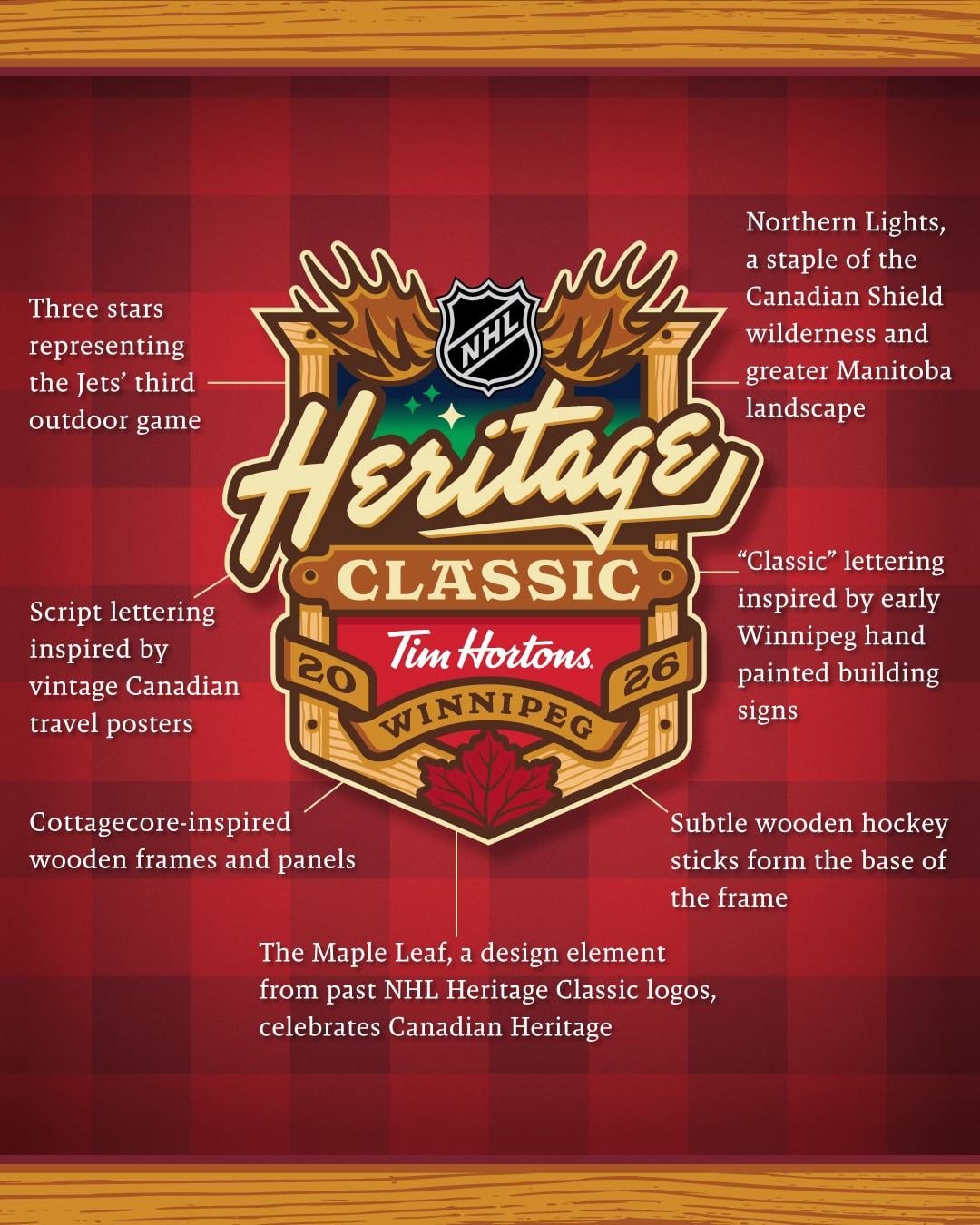
La LNH a présenté le logo de la Classique Héritage LNH 2026 entre les Jets de Winnipeg et les Canadiens de Montréal
—
fittos4310

La LNH a présenté le logo de la Classique Héritage LNH 2026 entre les Jets de Winnipeg et les Canadiens de Montréal
—
fittos4310
19 Comments
Did the NHL really officially use the phrase « cottagecore » lol
Green and red is certainly a choice.
Jerseys are bound to be elite
I am so sick of Tim Hortons pretending it’s a Canadian brand and Canadians actually drinking the maple flavoured kool-aid
I am glad this is happening, but this emblem is not great.
It will be a sick game.
Love they didn’t explain the tim Hortons logo. Truly, this looks like every single tim Hortons cup in the history of time, wouldn’t be shocked if they just whipped this up themselves so that it matched their own marketing taste.
looks like some maple syrup logo or somethin lol
« and this ones got antlers and a leaf on it for Canada »
this feels like a 4th grader presenting a class project
I like it.
Surprised they didn’t explain “hockey stick under lining Heritage to show Canada’s hockey heritage” tho.
I can’t tell if this is parody.
« Tim Hortons » Representing selling our soul to sponsors, from a company that was formerly Canadian and sold it’s soul to American Private Equity Interests who care more about profit than making products that are anywhere near edible.
Aggressively Canadian.
Very Cabane a sucre coded.
« The Tim Hortons logo quietly and tastefully brings the taste of shitty food served with attitude to viewer’s senses »
Missing the label pointing to Tim Hortons, “Script lettering inspired by a once renowned and now infamous US-owned Canadian franchise.”
The logo has a very AI feel too it.
Thanks for the logo explanation, took a real genius to figure out the subtleties here
what about the “Tim Hortons”
This looks like someone in the Tim Hortons marketing department tried to get AI to cram « Canada » things to a corporate brochure. Also, how may fonts can we use on a single logo?
Can they do one fucking logo without an advertisement in the middle of it