
À l’approche du dernier match de la première ronde – une confrontation du septième match entre l’u/canadiensmtl et u/tblightning – Je vous présente l’intégralité de ma Série éliminatoires NHL 2026.
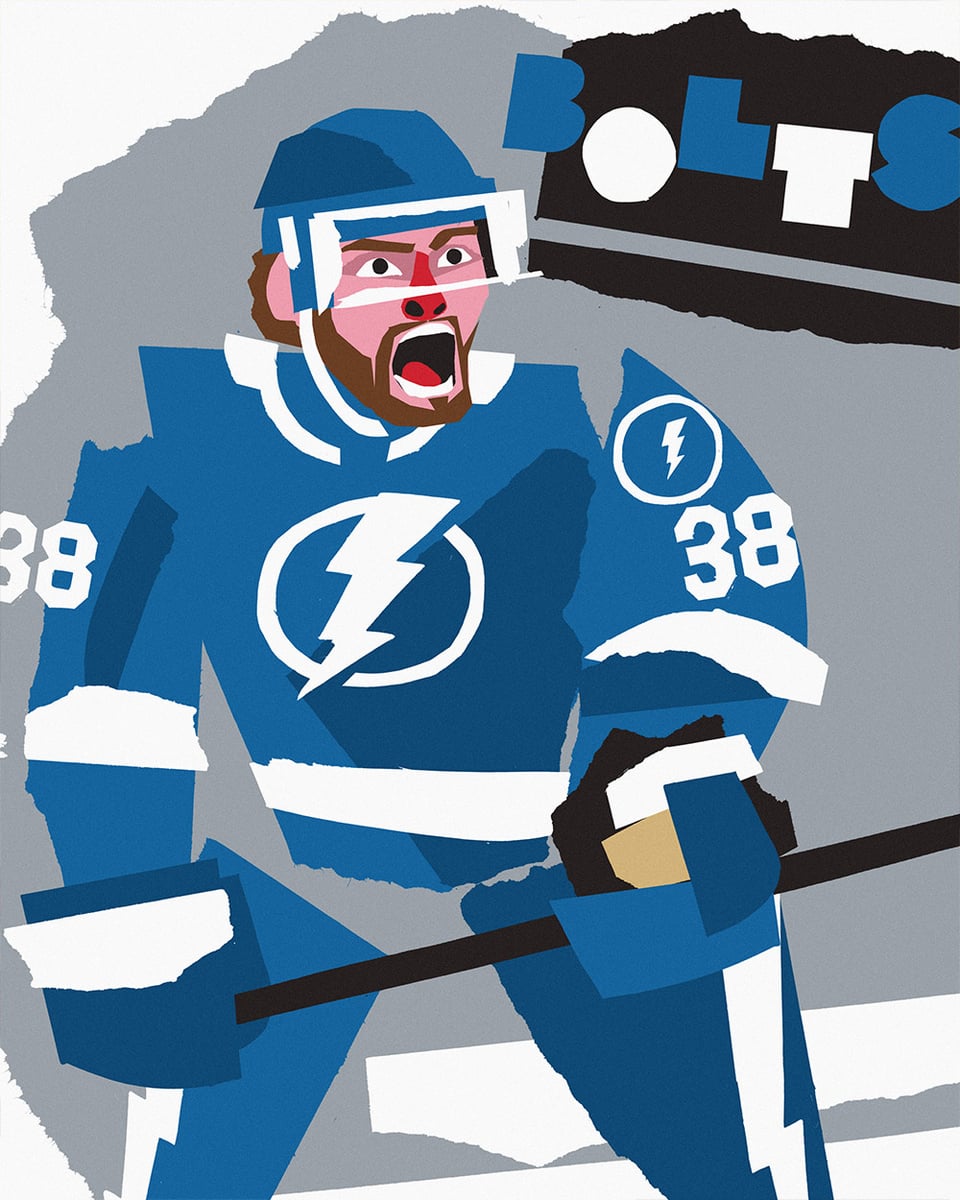
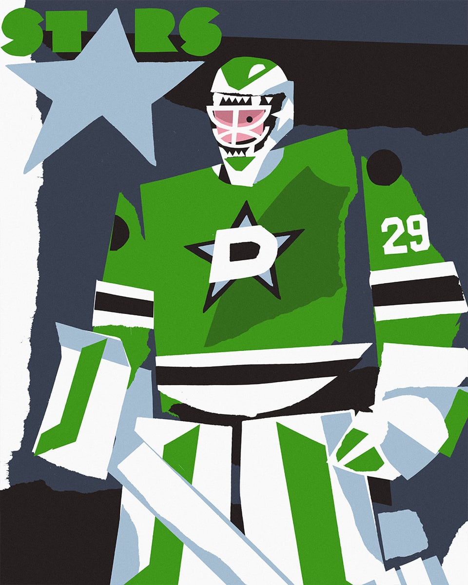
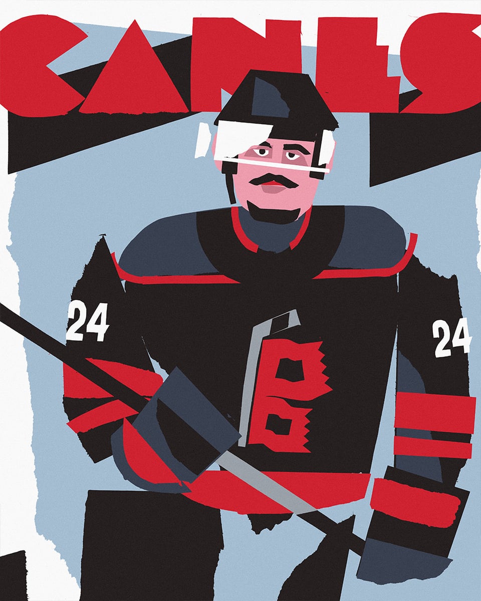
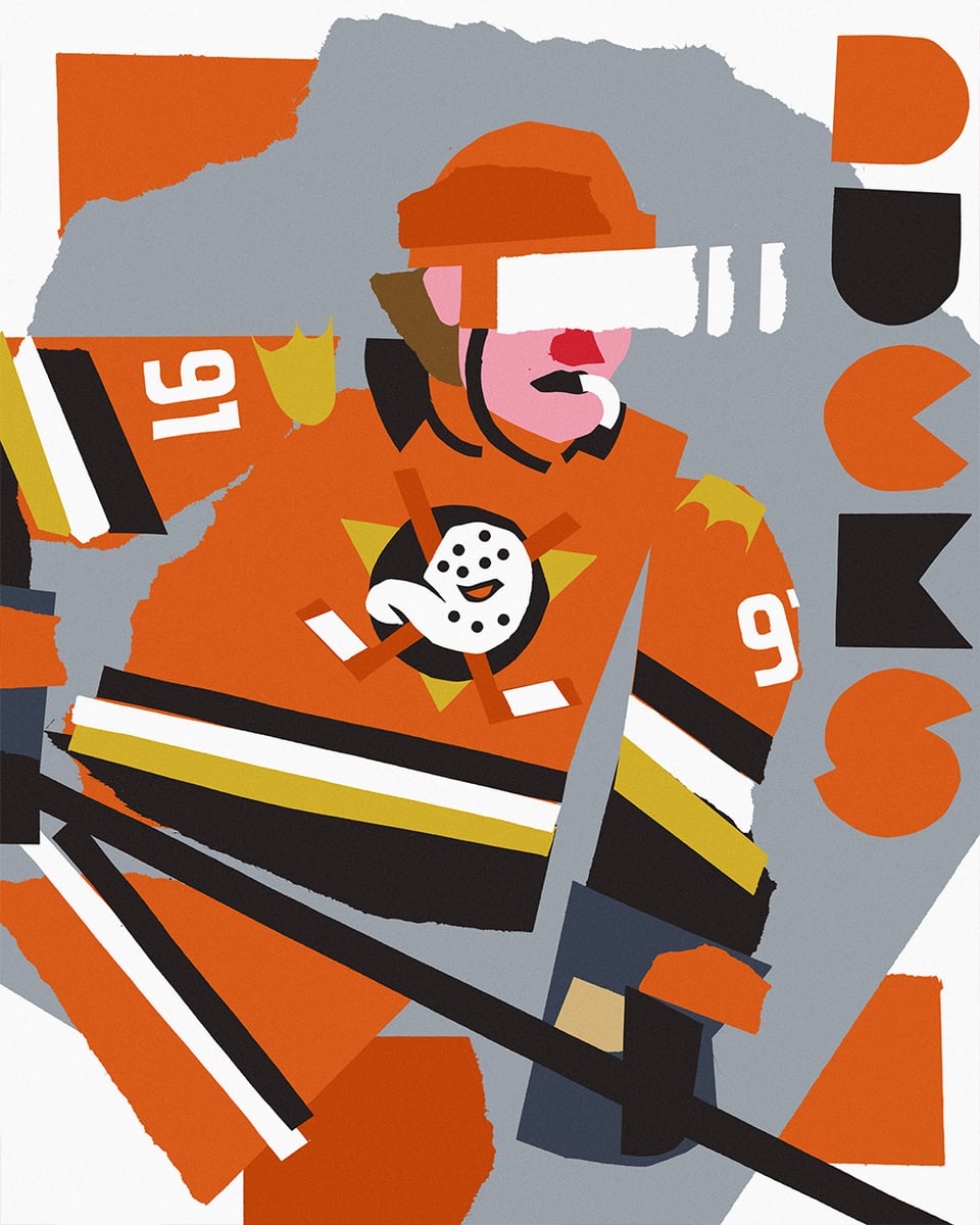
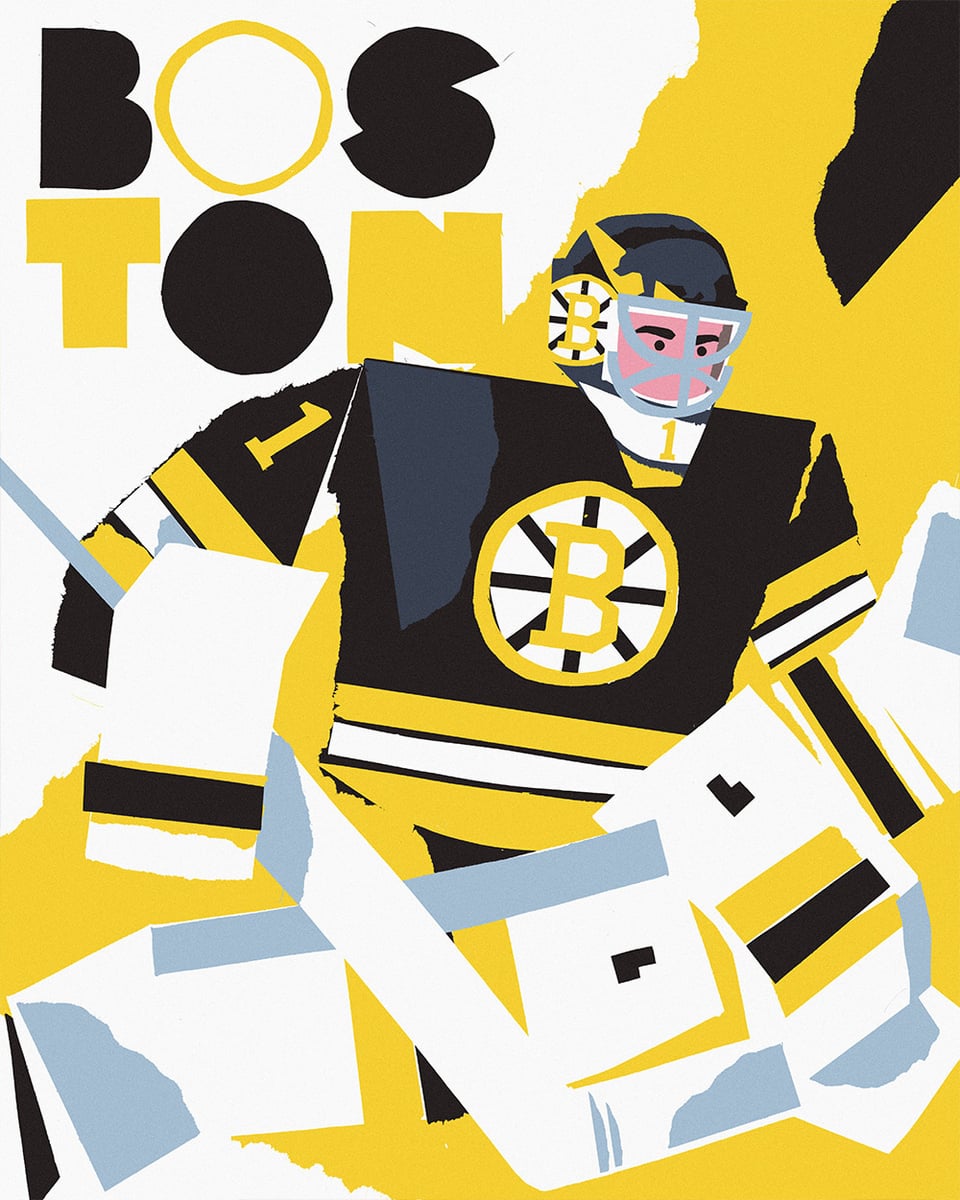
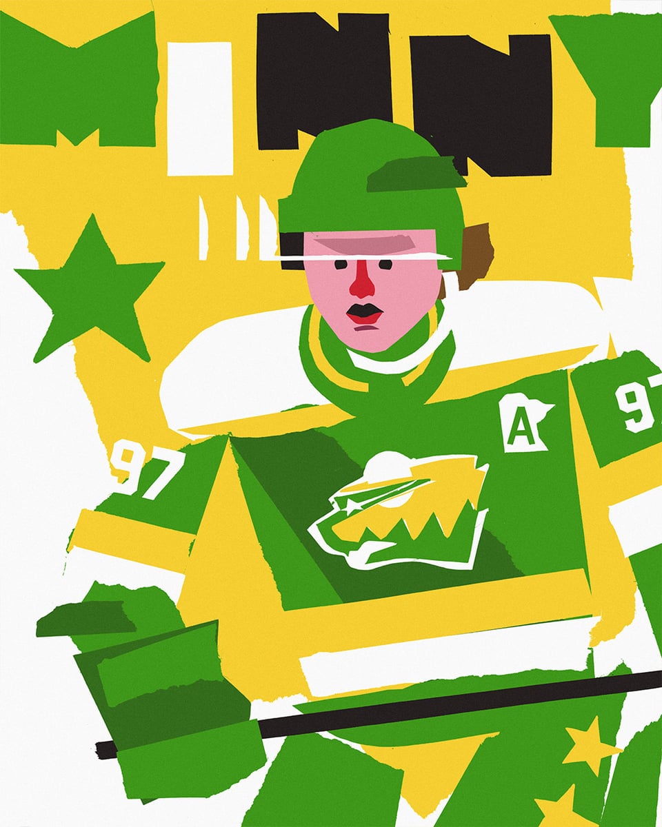
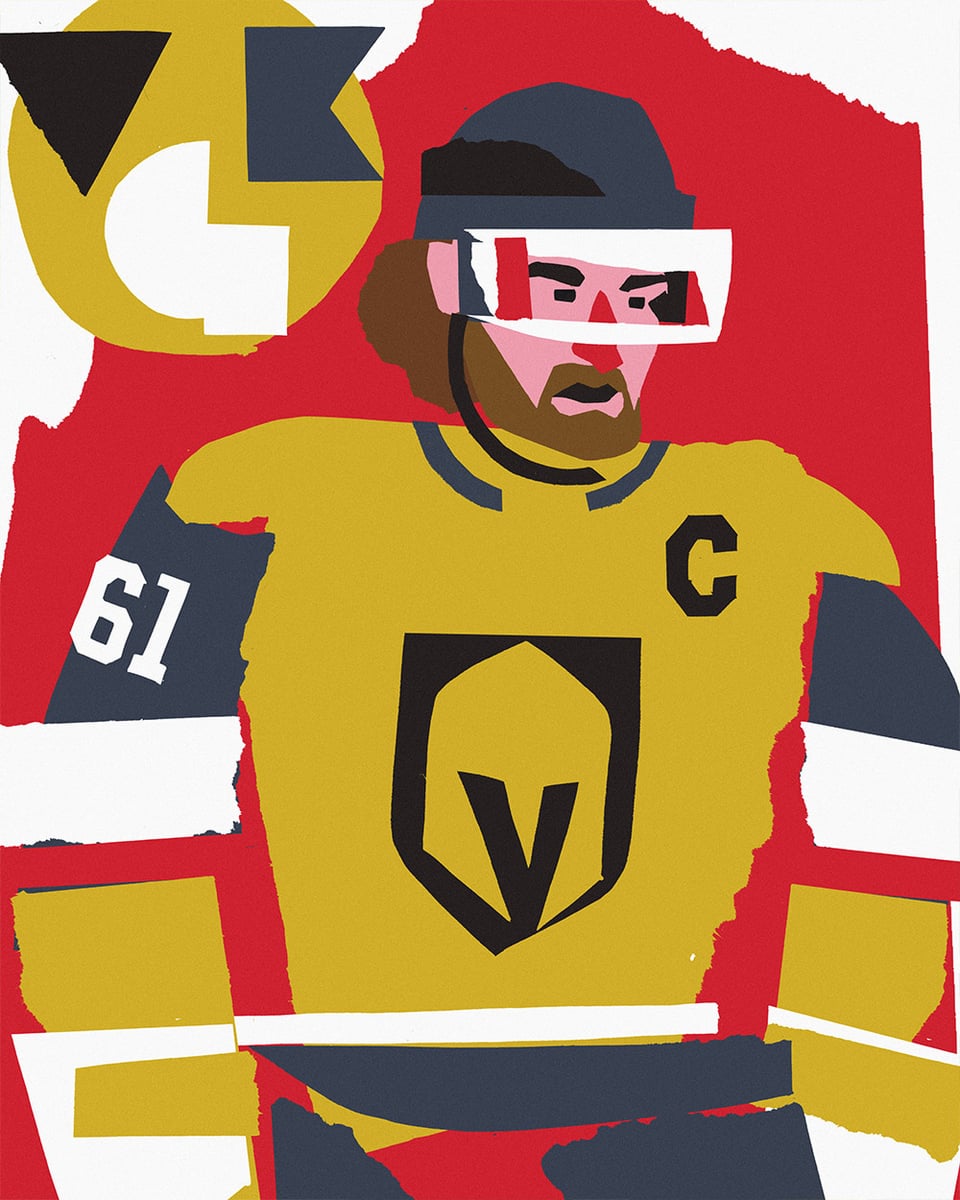
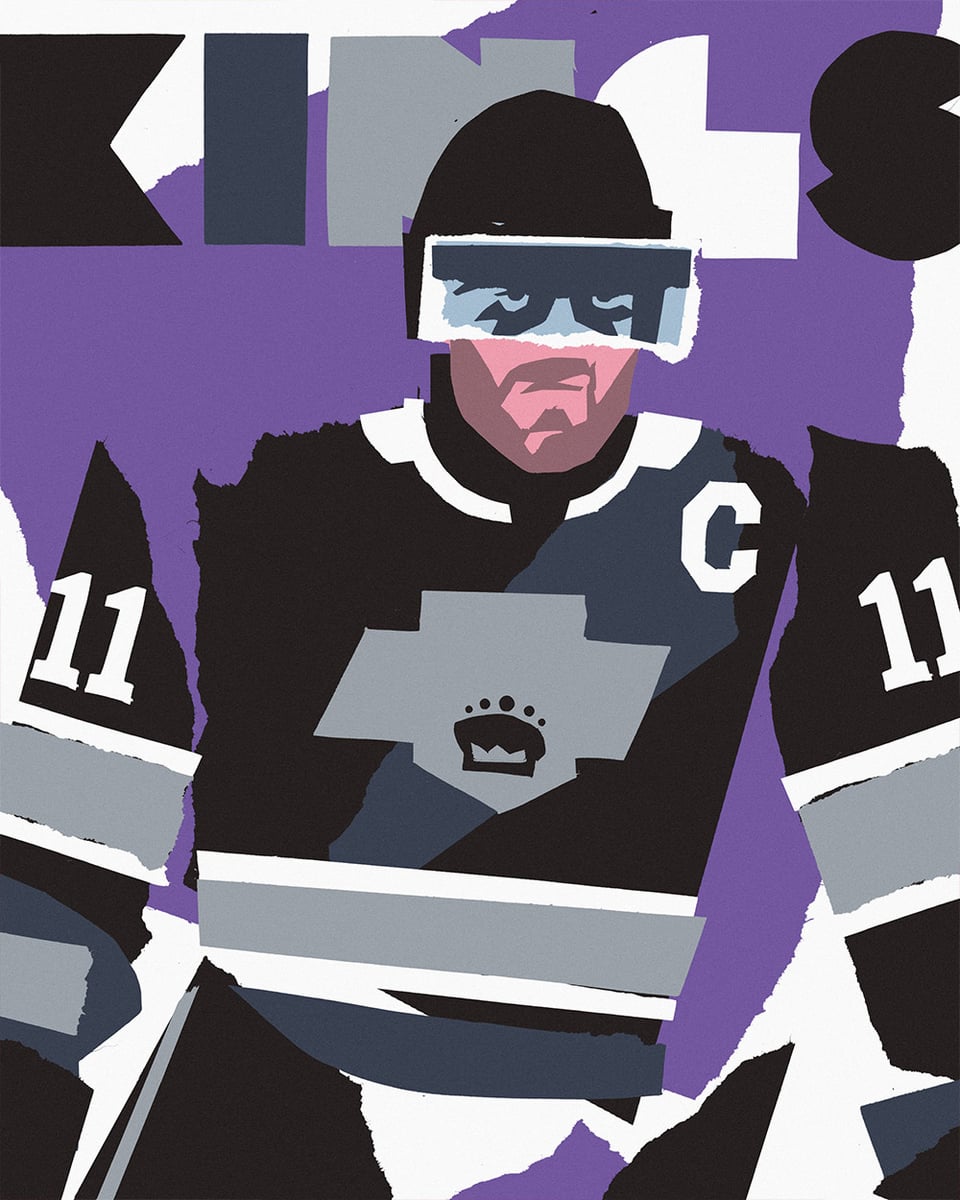
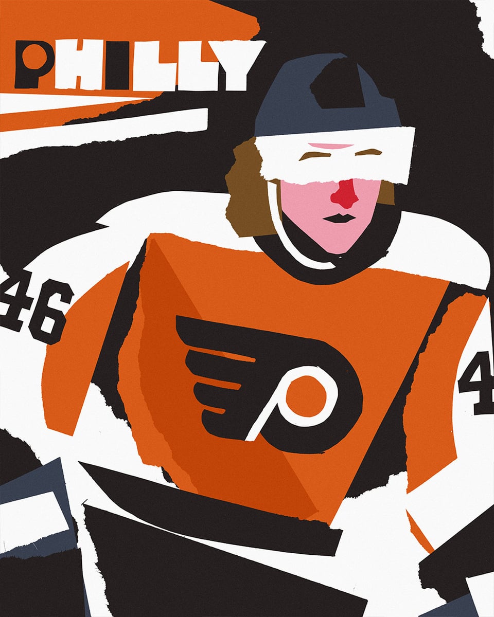
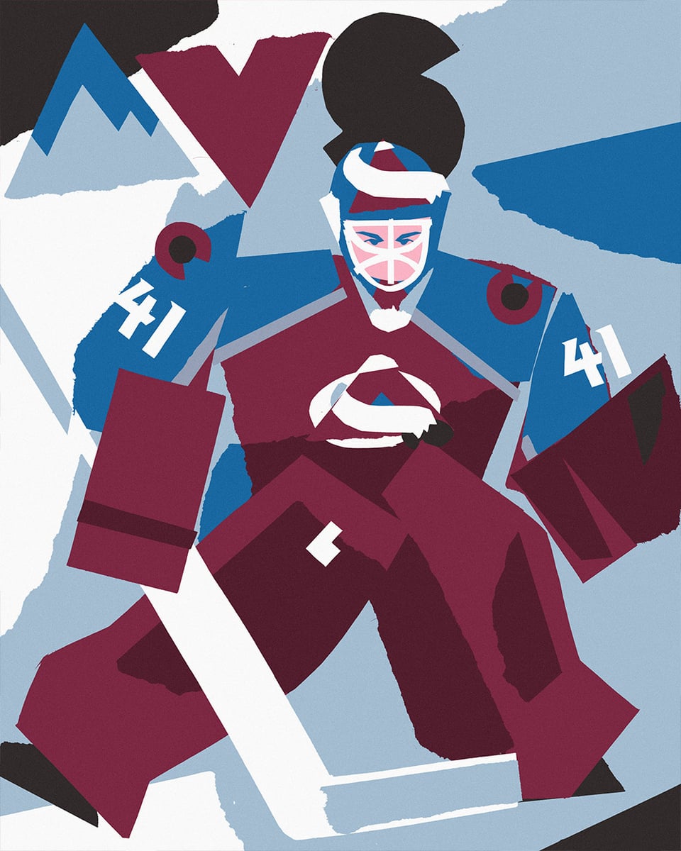
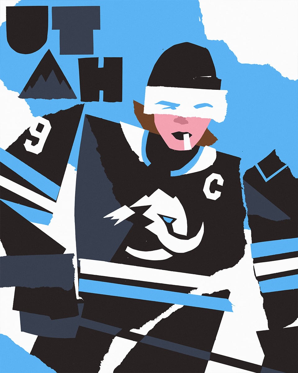
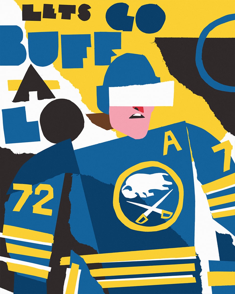
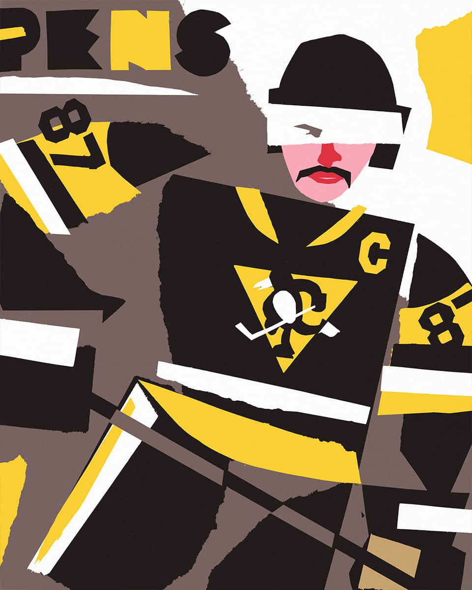
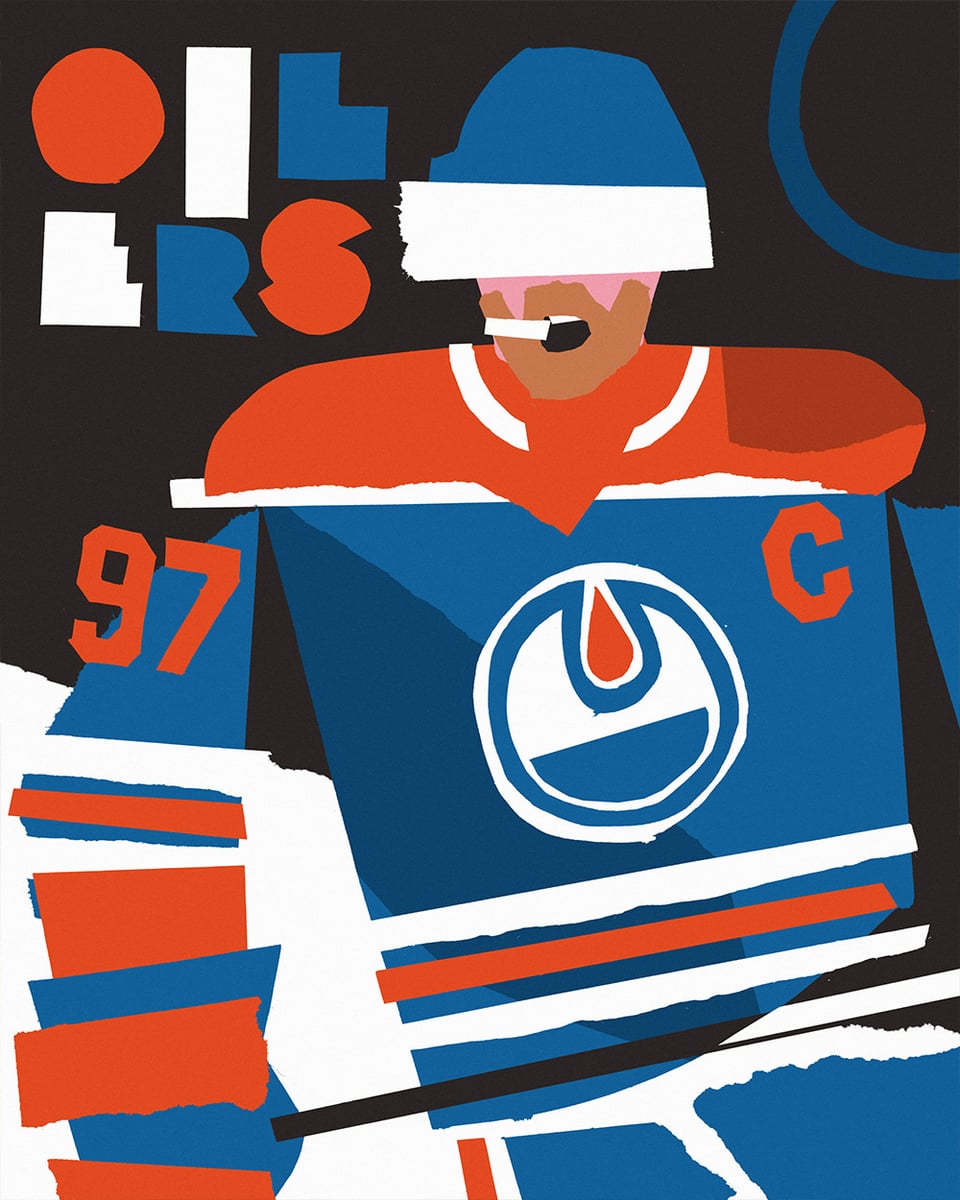
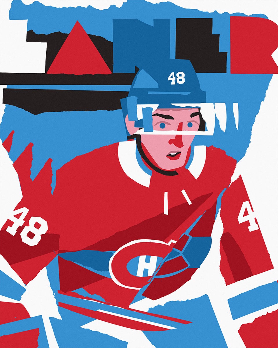
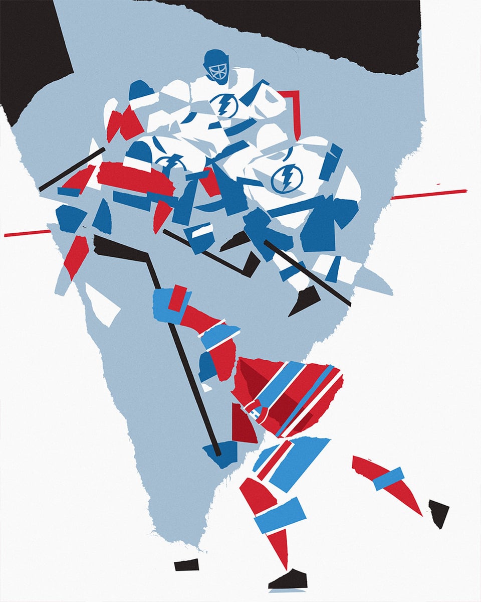
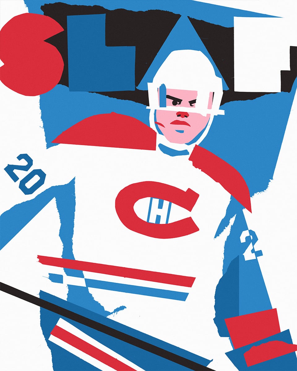
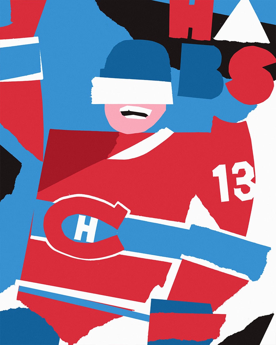
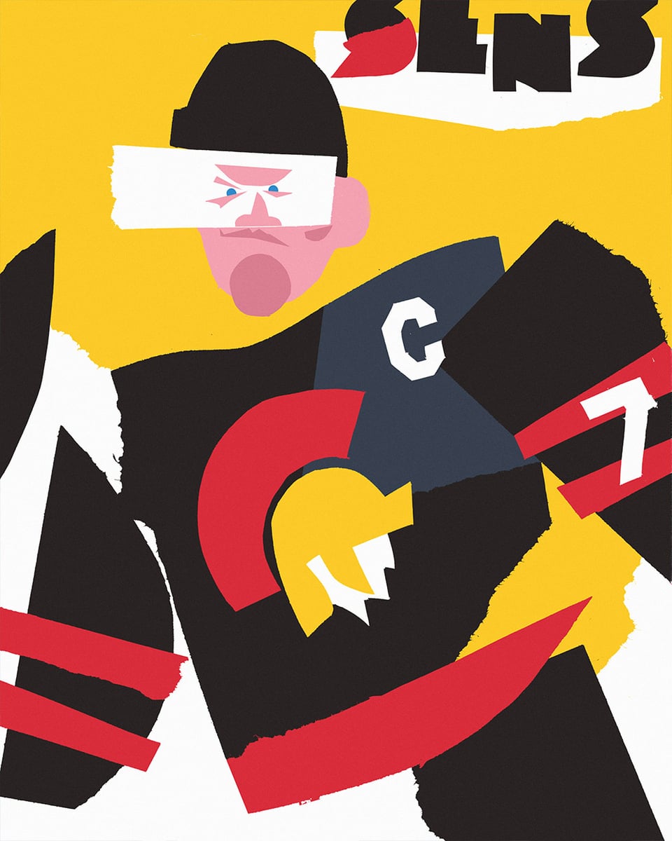
19 pièces – 18 portraits de joueurs et une scène de groupe – réalisées en 14 jours, pour commémorer un joueur remarquable de chacune des 16 équipes qualifiées pour les séries éliminatoires de la Coupe Stanley. Bien sûr, il y a aussi quelques Canadiens supplémentaires dans le mix.
Même si cette série est toujours très amusante pour moi, cette année en particulier a été quelque chose de spécial. En assouplissant mes propres « règles » dans ma façon de travailler et en étant ouvert à l’essai de nouveaux styles et de nouveaux médias, j’ai trouvé une nouvelle inspiration et une nouvelle passion en matière de création. Chaque pièce de cette série est un collage numérique : j’ai coupé, déchiré et numérisé des centaines de morceaux individuels de papier de construction pour créer des bibliothèques de formes parmi lesquelles je pouvais choisir pour créer chaque joueur.
Les chiffres, les logos et les traits du visage ont été découpés à la main, et je me suis permis d’être assez libre en le faisant – dans de nombreux cas, en découpant un contour aveugle du visage d’un joueur tout en regardant une référence sur l’écran de mon ordinateur portable.
J’ai hâte d’en faire plus avec ce style, et j’espère que vous les apprécierez tous autant que j’ai aimé les créer.
—
davemurrayills
40 Comments
Incredible work.
I was hoping when I got to the Penguins it would have been Crosby lying on the ice.
Still incredible work though.
These are fun, great job
The Hutson snapshot one is amazing
The Kopitar is so sick.
I love this! I want to frame all of them
These are awesome and creative.
dig these a lot. wish it didn’t say Minny tho
This art style just does it for me
Amazing, the NHL or some team needs to hire you because this is really so good
I thought the kopitar one was a photograph
These are fire! Love the style!
Great work, as usual
Those are really good.
These are so cool! Now I’m extra sad the caps didn’t make it.
These are so cool! I love the stylistic elements of the mouth guards and visors
As a Bruins fan thank you for choosing Swayman
I love this
It’s funny looking back at them after reading the description – now I can actually notice the jagged edges on shapes. Really cool
Kings and purple just is so right. Why must we suffer black and white:(
McDavid smokin’ a heater *howyadoin’?*
Brilliant
these are fantastic! thanks for sharing your process too
You can tell who every player is. Awesome.
I love it! Seth Jarvis looks so Seth Jarvisy haha
So anyway, here’s Wedgewall
Wow. Amazing portfolio on your IG
Dire Straits vibes
That Hutson slapshot is legendary
I really like these. You rendered each one so well that it’s easy to identify who each player is. Amazing work
Amazing. Love Davo with the ever present mouth guard, thought it was a dart at first lol
At first I thought Leo Carlsson was doing the cartoon stretchy eyes thing
It’s crazy how with such a minimalist style i can still tell who the players are without looking at the numbers
Nailed Hagel’s expression. Good work on all of these, super fun!
Oh this style is so pretty.
Stupid Canucks didn’t make the playoffs so my team isn’t included 🙁
Not cool to just post a picture of Seth Jarvis and call it your illustration
Always amazing work. Was pointing out some of your prints on Ossington today.
Great work. Thank you. Let’s Go Buffalo!!
love it
This is phenomenal.
I’d love to see Upper Deck work with you on these.